Visualize Your Data with Violin Charts!

Dive into the world of violin graph and transform your data analysis with our comprehensive resources.

With QuickGraphAI, Make Beautiful Violin Charts

With an Interactive Violin Chart, data visualization becomes an elegant combination of beauty and transparency. A Violin Chart is a dynamic tool for visualizing data distributions, combining the features of a Box Plot with KDE (Kernel Density Estimation) and a traditional box plot. There are various types of violin charts to explore, each offering unique insights.
The Distribution Violin Chart emphasizes the spread of data, while the Violin-Shaped Box Plot blends traditional box plot elements with density curves. The Violin Density Plot highlights the density estimation, and the Interactive Violin Plot allows dynamic exploration of data.

Key Features Of Violin Chart

A violin chart combines the features of a box plot and a density plot, showing summary statistics and data distribution.
The plot is symmetrical around the central axis, providing a clear visual representation of the data distribution on both sides.
The width of the violin plot at different values represents the density of the data at that value, using kernel density estimation.
The narrow lines from the Interquartile Range indicate the extent of the data, excluding the outliers.
Outliers may be represented as single points beyond the whiskers and give an indication of the range of the data.
Violin plots can be used to compare multiple distributions side by side, making it easy to compare different groups or categories.

Make beautiful violin plots with ease using our simple generator.

Ready to take your data visualization to the next level?
Discover the world of violin charts today!

Process of Making a Violin Chart

A step-by-step guide for creating a Donut Chart through QuickGraphAI Editor:
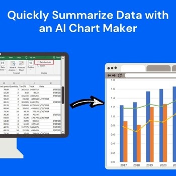
01

line

Data Collection and Preparation

Gather and clean the dataset to ensure it is accurate and free from missing values. Ensure the data includes a continuous variable for density estimation.

02

line

Kernel Density Estimation (KDE)

Apply KDE to estimate the probability density of the data. This process smooths the distribution, enabling a clearer visualization of data spread.

03

line

Plot Violin Shape

Use the density estimates to draw symmetrical, mirror-image plots. Each “violin” shape represents the distribution of the data across a given category.

04

line

Customize the Chart

Enhance the chart by adding labels, titles, and gridlines for better interpretation. You can also adjust the width, color, and orientation for improved clarity.

05

Interpret the Chart

Analyze the shape and spread of the violins to identify patterns. Wider sections indicate higher data density, while narrow sections show fewer data points.

Significance of Violin Chart

Frequently Asked Questions

A violin chart is a data visualization technique that is a combination of a box plot and a kernel density plot. It indicates the shape of the distribution of the data, including the probability density, giving a more expansive view of the distribution of the data than standard box plots.
Violin plots are especially helpful when trying to visualize data distribution, particularly with more than one group. They provide a glimpse of the whole data range, including outliers and the data density, making it simple to compare various sets of data.
Violin plots are best suited for showing the distribution of metric data, particularly when you have more than one group to compare. They are widely applied in biology, finance, and social sciences to show data distributions and detect patterns.
A violin chart displays the distribution of the data along with its density. The wider sections of the violin indicate a higher density of data points, while narrower sections show lower density. The chart also includes a box plot within the violin to show the median and interquartile range.
In case you need any assistance, we have a support staff available to assist. You may reach us via a contact form on our website or reach us by e-mail. We are dedicated to the success and ease of your experience with QuickGraphAI.
Donut-Chart-icon
line-graph-icons

Want to Elevate your Data Visualization?

Get started with QuickGraphAI today and see how our interactive violin charts can enhance your data analysis.