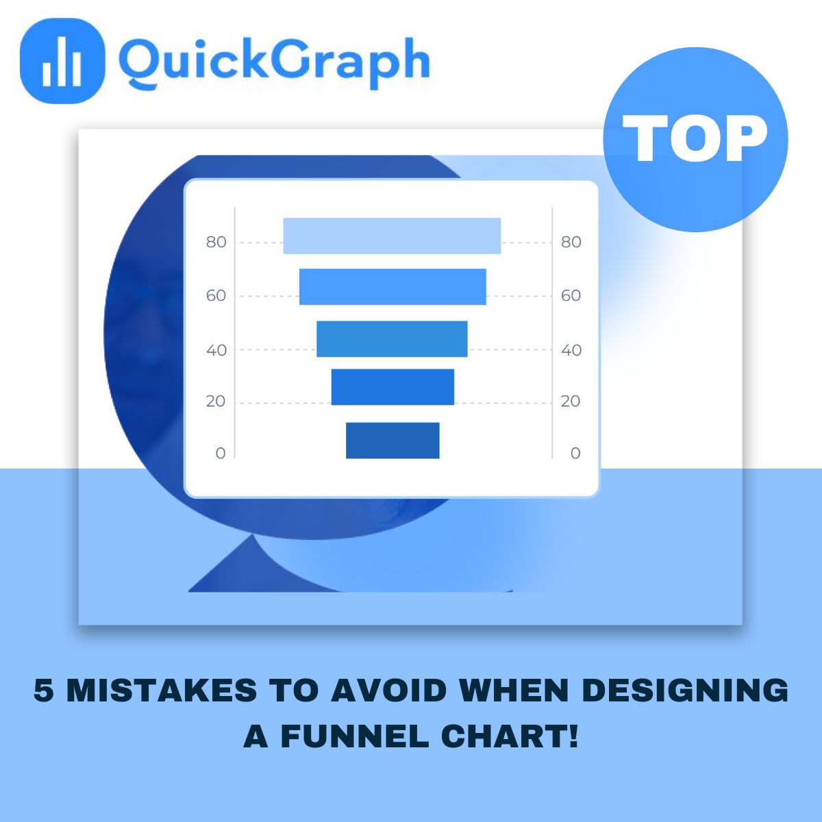
When you’re trying to understand how people move through a process, like signing up for a service or buying a product, a funnel chart is one of the clearest ways to see what’s working and what’s not.
It quickly shows you where users drop off, how many reach the next step, and whether your conversion flow makes sense.
But here’s the catch, a poorly designed funnel chart can tell the wrong story. Small design mistakes can twist the numbers, confuse your audience, or hide the real problem in your funnel.
Let’s go through the top five Custom Funnel Chart Maker design mistakes most people make, and how to avoid them the smart way.
A funnel chart is supposed to represent a journey. If the stages aren’t in the right order, the whole picture falls apart.
Sometimes teams add random steps because the data comes from different sources. But if you mix the order, say, putting checkout before add to cart, your chart stops making sense.
Fix: Always structure stages from top to bottom in the same order your users experience them.
For example: Website Visit → Add to Cart → Checkout → Purchase.
If you skip this, your audience will spend more time decoding your chart than understanding your funnel.
It’s tempting to make your chart “look cool.” 3D shapes, gradient overload, shadows, they all sound nice until you realize nobody can read the numbers.
A funnel chart isn’t an art project. Its job is to communicate data clearly, not decorate a dashboard.
Fix: Keep it clean. Use one consistent color gradient or a few shades of the same palette. The audience should immediately spot drop-offs, not get lost in color chaos.
If you’re using QuickGraph’s Funnel Chart Maker, you can pick predefined color themes that keep things sharp and consistent automatically.
This is one of the biggest silent killers of data accuracy.
If the width of each stage doesn’t match the actual value behind it, your funnel will misrepresent what’s really happening. For example, if 1,000 users look visually the same width as 300 users, that’s misleading — even if your numbers are labeled correctly.
Fix: Make sure each segment’s size or width corresponds exactly to the data.
The chart should make it obvious where users are dropping off without even reading the text.
QuickGraph automatically scales each stage proportionally, so the visuals always match reality.
A funnel chart’s real power lies in showing where people leave the process. Yet many designers skip emphasizing those key gaps.
When all stages look equally calm, the biggest problem goes unnoticed.
Fix: Draw attention to those “trouble zones”.
Use color contrast or percentage labels to show exactly how much of your audience you’re losing at each step.
For instance, highlighting “–42% between Cart and Checkout” instantly tells you where to focus your marketing fix.
We live in a mobile-first world. Yet many funnel charts still break the moment you open them on a phone or tablet.
Narrow screens distort labels, clip percentages, and ruin alignment. That’s enough to make any dashboard unreadable.
Fix: Always check how your chart looks on smaller screens.
Use responsive layouts or horizontal funnel options if your audience views reports on mobile.
QuickGraph automatically optimizes funnel charts for different devices, so your visuals stay clean and legible everywhere.
Even when your funnel is perfectly designed, people still need context.
If your “conversion rate” suddenly dips, add a note or small annotation, maybe a campaign ended, or a price test was running.
These small human explanations turn your funnel chart from a graphic into a real story about performance.
Creating a funnel chart shouldn’t feel like guesswork.
With QuickGraph’s Funnel Chart Maker, you can turn your data into professional-looking funnels in minutes — no coding, no design stress.
Whether you’re analyzing sales leads, app downloads, or website conversions, QuickGraph helps you design a funnel that looks clean, accurate, and presentation-ready.
A good funnel chart doesn’t just show numbers, it tells a story about your audience’s behavior.
Avoid these common mistakes, keep your visuals simple, and always design for clarity.
The cleaner the funnel, the faster your team will spot what’s working, and what’s not.
Try building your next funnel chart with QuickGraph.ai and see the difference yourself.