Most people don’t struggle with collecting data. They struggle with explaining it.
You might have a spreadsheet full of useful insights, but when it’s time to present or share it, things slow down. You start thinking: Which chart should I use? Does this look clear? Will others understand it?
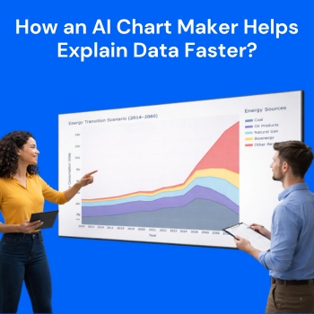
This is exactly where an AI Chart Maker like QuickGraph AI changes the game. It doesn’t just create charts it removes the friction between data and understanding.
Data itself is not valuable until it’s understood.
A sheet full of numbers might make sense to you because you’ve worked on it. But for someone else, it’s just noise. Even simple questions like:
can take minutes to answer when looking at raw data.
An AI chart maker solves this by instantly translating numbers into something visual and obvious.
Instead of manually building a chart, you can simply use a prompt like this:
Prompt:
Create a scatter plot of Position vs. Time using the given dataset. Plot Time on the x-axis and Position on the y-axis. Add a best-fit trend line to show the relationship between the variables. Clearly label both axes and ensure the chart is easy to read.
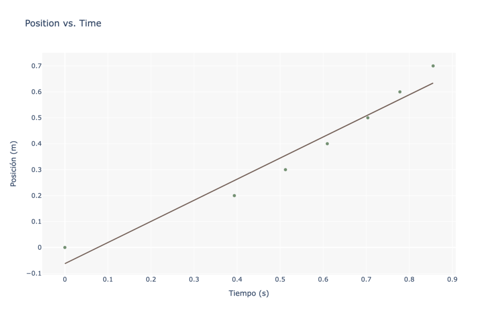
With an AI chart maker like QuickGraph AI, this single prompt instantly generates a clear visual. You don’t need to manually select chart types or adjust settings.
Traditionally, creating charts involves small but time-consuming decisions:
These steps may seem minor, but they add friction. And when you repeat them daily, they slow you down.
With QuickGraph AI, that entire process is compressed into a single action.
You describe your data, and the chart appears already structured in a way that makes sense.
No overthinking. No manual setup.
The biggest advantage isn’t just saving time it’s changing your workflow.
When charts take effort, you avoid creating them unless necessary.
When charts are instant, you use them constantly.
This shift has a big impact:
Instead of asking “Is it worth making a chart for this?”
you simply generate one and move forward.
One underrated benefit of AI chart makers is decision-making.
People often choose charts based on habit, not clarity. For example, using a pie chart when a bar chart would explain things better.
Tools like QuickGraph AI analyze the structure of your data and guide you toward clearer visual formats.
This matters because:
Good visualization is not about decoration it’s about reducing thinking effort for the viewer.
When you use an AI chart maker, something subtle but important happens: explaining becomes easier.
Instead of walking someone through numbers step-by-step, you can point to a visual and say:
The chart does most of the explanation for you.
This is especially useful when:
You spend less time explaining and more time discussing insights.
Manual chart creation often leads to small errors:
These mistakes can affect how your data is perceived.
With QuickGraph AI, automation reduces these risks. The charts are generated consistently, which helps maintain accuracy and trust.
And when you’re working with important data, that reliability matters.
Not everyone is comfortable working with spreadsheets or visualization tools. That’s another barrier AI removes.
You don’t need:
You just need your data or even a simple prompt.
This makes it easier for:
to turn ideas into clear visuals without extra effort.
Speed is not just about saving time. It directly affects decision-making.
When insights take too long to visualize:
But when charts are instant, you can:
That’s the real value of an AI chart maker.
An AI chart maker like QuickGraph AI doesn’t just help you create visuals faster it helps you think and communicate more clearly.
It removes the small barriers that slow you down and replaces them with instant clarity.
And in a world where attention is limited and speed matters, being able to explain data quickly is not just helpful it’s essential.