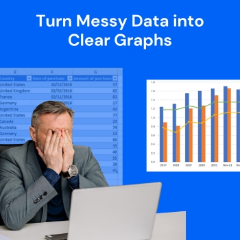
Data plays an important role in modern decision-making. Numerical data serves as a performance measurement tool which businesses, students, researchers, and marketers use to discover patterns and develop future plans. The existence of numerous unstructured numerical data points inside extensive spreadsheet files makes it challenging to work with raw datasets which tend to be untidy and hard to comprehend. The free online AI graph generator provides a solution which enables users to transform intricate data sets into understandable visual charts within a short time period. The AI graph maker enables users to transform their numeric data into understandable visual representations within seconds without needing to perform manual data processing tasks.
To better understand how messy data can be turned into a clear chart, you can easily generate a sample graph using an AI tool. Simply enter a prompt in the AI graph generator and it will create a visual chart based on the data or description you provide.
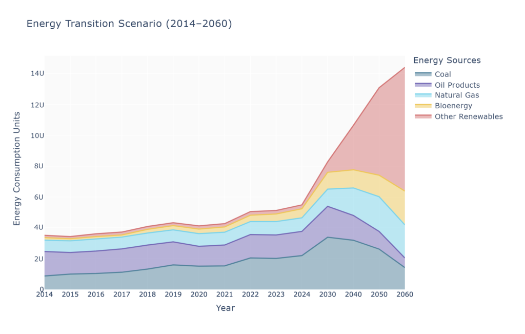
Prompt: Create a chart showing a country’s energy mix evolution from 2014–2024, with projected renewable energy targets for 2030, 2040, 2050, and 2060.
Raw datasets present thousands of values which become unintelligible to viewers who try to understand them through direct observation. The data needs extensive examination to discover hidden patterns when it exists solely as numerical values.
AI graph makers simplify this complexity by converting datasets into visual structures that highlight the most important information.
Key benefits include:
By simplifying complex data, AI tools make analysis more efficient for both beginners and professionals.
Messy datasets often contain inconsistencies which include missing labels and irregular formatting and scattered values that exist in multiple columns. The process of preparing this information requires extensive time for manual work.
AI graph makers reduce this effort by automatically organizing the data before creating charts.
Common tasks handled by AI include:
This automated organization helps users avoid errors that commonly occur during manual data preparation.
The selection of an appropriate chart type plays a crucial role in achieving successful data visualization. The different datasets require different visual formats while selecting the wrong chart type will makeit harder for users to comprehend the information.
AI graph makers analyze the structure of the data and determine which visualization format will communicate the information most clearly.
This process may involve:
Automatic chart selection saves time and improves the overall clarity of the final visual output.
Traditional chart creation often requires multiple steps, including data cleaning, chart configuration, formatting, and design adjustments. These steps can slow down the workflow, especially when dealing with large datasets.
AI graph makers streamline this process by automating the majority of these tasks.
Advantages of automation include:
With automation, users can focus more on interpreting results instead of spending time designing charts manually.
One of the biggest advantages of charts is their ability to make information easier to understand. Visual representations allow people to identify patterns and relationships much faster than reading numerical tables.
AI-generated charts improve data comprehension by:
This improved understanding is valuable for presentations, reports, and decision-making processes.
When data is difficult to interpret, decision-making can become slower and less accurate. Clear visualizations help individuals and teams understand insights quickly.
AI graph makers support faster decisions by:
Faster access to insights can significantly improve productivity in many industries.
In the past, creating professional charts often required specialized software or technical knowledge. This limited data visualization to analysts or experienced users.
AI graph makers make the process accessible to a much wider audience.
Benefits of accessibility include:
By lowering the barrier to entry, AI tools allow more people to work effectively with data.
Messy datasets are a common challenge in today’s data-driven world. The raw numbers create difficulties for understanding trends and making comparisons and deriving insights. The AI graph makers solve this issue by converting complicated datasets into understandable visual charts.
The tools provide users with three functions which include automatic data organization and intelligent chart selection and workflow simplification to create visual insights from raw data. The ongoing development of artificial intelligence will enhance data visualization methods which will enable users and organizations to make improved decisions based on clear data.