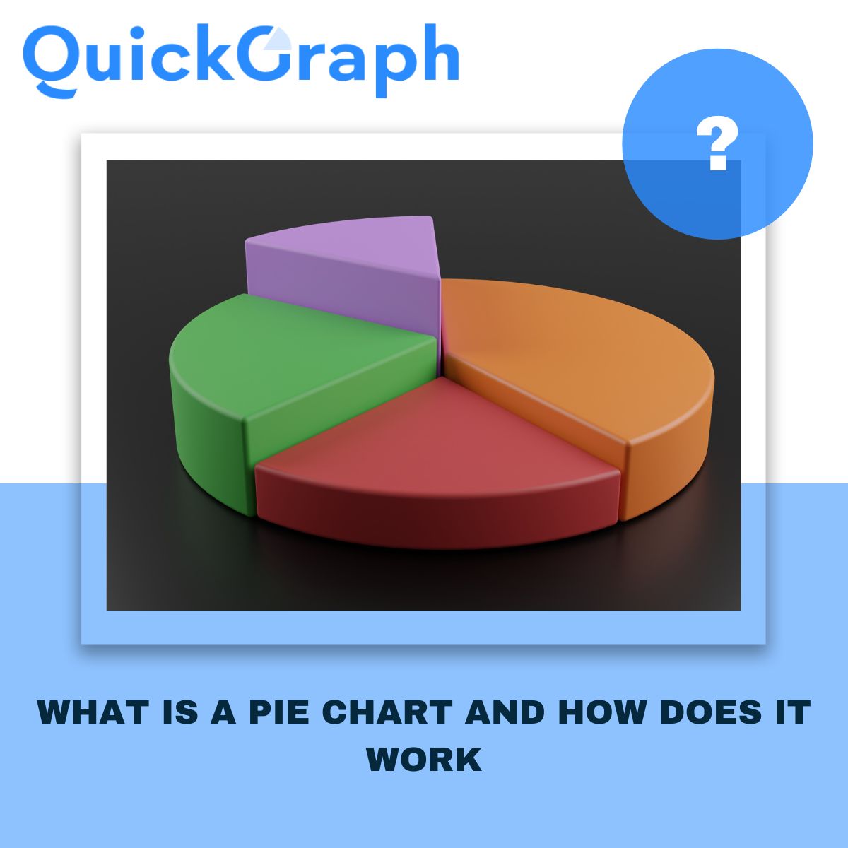
Whenever someone asks for a quick way to show data, a pie chart usually comes up first. It’s simple, familiar, and easy to understand. You’ve seen it a hundred times a circle divided into slices, each one showing a share of the whole. But how does it actually work, and when should you use it? Let’s go through it step by step for the Free Pie Chart Maker Online.
What Is a Pie Chart?
A pie chart is basically one circle split into pieces. Each piece shows how much one category takes up compared to the others. Picture a pizza. The whole pizza is your total data, and each slice is a category. Bigger slice = bigger share.
Say you’re looking at smartphone brands. A pie chart will instantly show which company has the biggest slice of the market and who’s trailing behind.
How Does a Pie Chart Work?
The setup is straightforward. You take each category, turn it into a percentage, and then cut the circle based on those numbers. Since a circle is 360 degrees:
- 50% of your data = half the circle, 180°.
- 25% = a quarter of the circle, 90°.
- All slices together = the full 100%.
That’s it. One glance and you see how the parts fit into the whole.
When a Pie Chart Works Best
Use a pie chart when you want to:
- Show how something is divided up (like a budget, survey answers, or customer groups).
- Point out one dominant category (when one slice is clearly bigger).
- Keep it clean and simple, with only a few slices.
When a Pie Chart Doesn’t Work
Skip the pie chart if:
- You have more than 5–6 categories. It gets messy.
- The slices are almost the same size. Hard to compare.
- You want to show changes over time. A line or bar chart is better.
Think of pie charts as a snapshot. They’re for big-picture breakdowns, not detailed analysis.
How People Use Pie Charts
- Marketing teams: to show where website traffic comes from (SEO, ads, social, referrals).
- Finance managers: to explain how budgets are split across departments.
- Teachers: to make percentages and fractions visual for students.
- Presenters: to simplify reports in a way that clicks with the audience.
Pros of Pie Charts
- Anyone can understand them no data skills required.
- They make the largest category stand out immediately.
- Perfect for presentations and simple reports.
- Great for showing market share, yes/no responses, or budget splits.
Cons of Pie Charts
- Not built for complex datasets.
- Tough to compare small differences.
- Can’t show trends or time-based changes.
- Easy to oversimplify if you force too much into it.
Pie Charts vs. Other Charts
- Pie vs. Bar Chart: Bars are better for exact comparisons. Pies are better for quick proportions.
- Pie vs. Donut Chart: Donuts are just pies with the middle cut out handy for labels.
- Pie vs. Line Chart: Lines show trends over time. Pies show a single snapshot.
Final Word
With Quickgraph AI, creating a clean, professional pie chart takes just seconds. You focus on the story you want to tell, and Quickgraph AI handles the design, colors, and balance making sure your chart is not only accurate but also easy on the eyes.


