The AI Chart Maker create faster and simpler data visualization functions than any previous method. The system creates professional charts within seconds from either a basic prompt or an uploaded dataset. The advanced tools still permit users to make errors in their work.
If you use an AI chart maker incorrectly, your charts may confuse people instead of helping them.
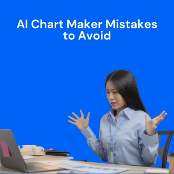
Here are the most common mistakes to avoid when using an AI chart maker like QuickGraph AI and how to fix them.
One of the biggest mistakes is choosing the wrong chart.
For example:
Why it’s a problem:
The wrong chart type makes your data hard to understand.
What to do instead:
Before generating the chart, ask yourself:
QuickGraph AI allows you to describe your goal clearly so it selects the right visualization.
AI tools work best when instructions are clear.
Bad prompt example:
“Make a chart of sales.”
Better prompt:
“Create a line chart showing monthly sales from January to December 2025.”
Why it matters:
If your prompt is unclear, the AI may:
Tip:
Be specific about:
Clear instructions = accurate results.
AI tools do not automatically fix messy data.
Common data issues:
If your data is incorrect, your chart will also be incorrect.
Before uploading data into QuickGraph AI:
Clean data ensures reliable charts.
Sometimes users try to add everything into one chart.
For example:
Result:
The chart becomes crowded and confusing.
Better approach:
A simple chart is more powerful than a complex one.
A chart without labels is incomplete.
Common mistakes:
Your audience should understand the chart without explanation.
Always include:
QuickGraph AI allows you to customize these details easily.
AI makes chart creation fast, but you should always review the final output.
Check for:
Never download and share a chart without reviewing it first.
Think of AI as an assistant not a replacement for human review.
Different audiences require different types of charts.
For example:
Before creating a chart, ask:
QuickGraph AI helps you generate charts for reports, presentations, and social media — but you must choose the right style for your audience.
A chart should support your message not replace it.
Mistake:
Always add:
For example:
“Sales increased by 25% in Q3 due to festive season promotions.”
Charts show data. Text explains meaning.
Many users generate a chart and stop there.
But tools like QuickGraph AI allow you to:
Small design improvements can make your chart look more professional.
If the chart is for a client or presentation, take extra time to refine it.
If you are working with sensitive business data:
QuickGraph AI is designed with user safety in mind, but it’s always good practice to protect important data.