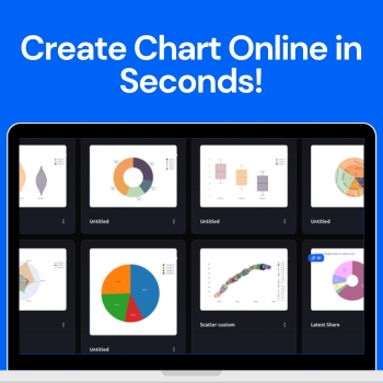
Visualizing data has never been easier with the AI Chart Maker. This innovative tool allows anyone — from students to professionals to turn raw numbers into polished, professional charts in just seconds. With a clean, intuitive dashboard, you can create custom charts or let the AI suggest the best visuals for your data, making the process fast, simple, and enjoyable.
People love to use QuickGraph AI because it eliminates the complexity of traditional charting tools. No design experience or coding skills are needed just input your data, customize if you want, and instantly get charts that look professional and easy to understand. In this blog, we’ll explore how the tool works, the different chart types available, and how you can use it to make your data stand out.
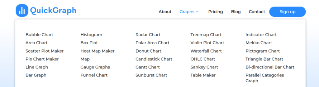
QuickGraph AI offers a wide variety of charts to suit any data visualization need. Some of the most popular types include:
Understanding how to visualize data correctly is just as important as choosing the right tool. Learning what is data visualization and why is it important such as selecting the right chart for your data, maintaining clarity, and avoiding visual clutter can greatly improve how your insights are perceived. Reputable educational resources and industry guidelines on data visualization can help users make informed decisions and present information more effectively in professional, academic, and business environments.
Start by creating your free account. Once signed up, you’ll gain access to the dashboard where all chart creation features are available.
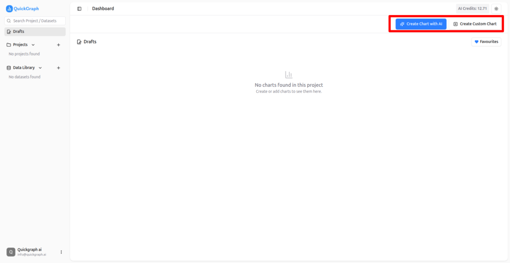
New users get free credits to start creating charts immediately. These credits allow you to test both custom charts and AI-powered charts without any upfront cost.
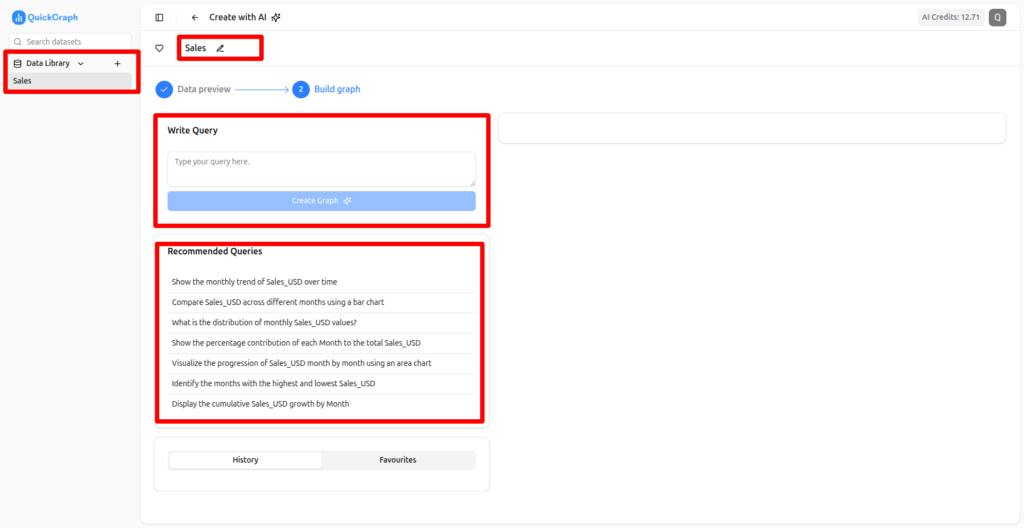
From the dashboard, you can select either a custom chart or an AI chart depending on your preference.
In custom mode, you have full control. Choose any type of chart you want, customize colors, labels, and layout, and preview your chart in real time.
For AI-powered charts, simply upload your data. You can create charts using a prompt or select a recommended prompt suggested by the AI. The tool analyzes your data and generates the most effective visualizations automatically.
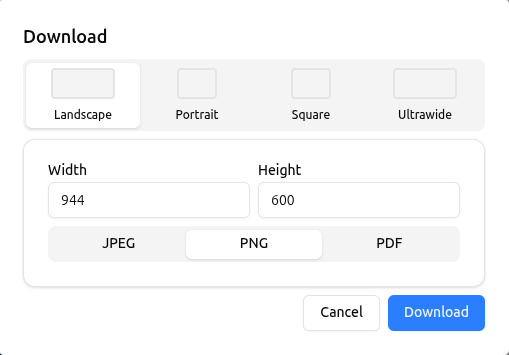
Once your chart is ready, you can:
Creating charts manually in Excel or Google Sheets can take a lot of time. With QuickGraph AI, charts are generated in seconds, freeing up time for analysis and decision-making.
Even users with no design experience can create professional charts. The interface is intuitive, and AI suggestions make it simple to select the right chart type for your data.
The AI feature ensures that your data is presented in the most effective way possible. It analyzes your dataset and recommends the chart that communicates your insights clearly.
From colors and labels to axes and legends, every element of your chart can be customized to match your brand or presentation style.
Whether you’re preparing a business report, marketing dashboard, academic project, or social media post, QuickGraph AI can handle it all. Its versatility makes it perfect for professionals, educators, and students alike.
QuickGraph AI is a revolutionary tool that allows anyone to create charts online in seconds. With over 30 chart types, AI-powered suggestions, and a fully customizable dashboard, it transforms raw data into professional visuals effortlessly. Whether you are a business professional, marketer, student, or educator, QuickGraph AI saves time, improves data clarity, and makes your charts look polished and easy to understand.