Creating maps online has never been easier. With a few clicks, you can turn data into colorful visuals that tell a story. But here’s the catch, even with great tools; many people end up making the same mistakes that make their maps confusing, cluttered, or flat-out wrong.
If you’re using a Custom Heat Map Generator or any free interactive map maker online, avoiding these common pitfalls can make the difference between a dull graphic and a map that truly speaks to your audience.
Let’s look at the five most common mistakes, and how to fix them.
It’s tempting to add every bit of data you have, thinking it’ll make your map more detailed. The truth? It usually does the opposite. Too many layers or markers overwhelm your viewers and hide the insights that actually matter.
A good map should have one purpose, maybe to show customer density, sales regions, or survey responses. Stick to that goal. Use filters to show only what’s relevant, and remove any extra noise that doesn’t support your story.
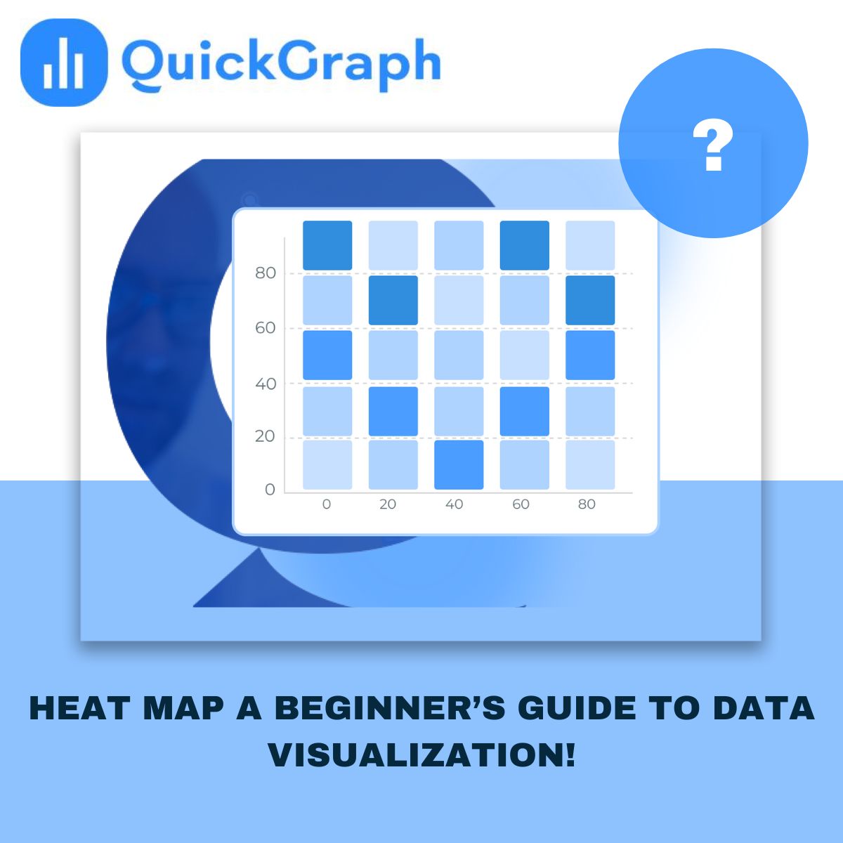
Color is powerful. It can guide attention, explain meaning, and make complex data easy to read. But the wrong color choices, especially random or clashing ones, can ruin the experience.
Avoid using too many bright or similar shades. Viewers shouldn’t have to guess what each color means. If your map is about population or performance, use clear gradients (light to dark) so it’s instantly understandable. And always test how your map looks on different screens, what looks great on your laptop might be unreadable on a phone.
A map isn’t just a visual, it’s a geographic story. Leaving out context, like missing labels or unclear boundaries, makes your audience work harder to understand what they’re seeing.
Always check your scale. If the area you’re mapping is too zoomed in or out, the data might look misleading. A map of “worldwide customers” that only shows North America won’t tell the full picture. Zoom to the level that matches your data’s story, whether it’s a neighborhood, city, or region.
One of the biggest trust killers is inaccurate data. A few wrong coordinates or outdated entries can lead to false conclusions, especially in research, logistics, or business planning.
Before uploading any dataset into a free interactive map maker online, double-check your sources. Make sure your columns are properly labeled, coordinates are correct, and there are no duplicates. A few minutes of cleanup can save hours of fixing later.
If you’re pulling data from multiple systems, align everything to one format, for instance, all coordinates in the same latitude-longitude style.
A good map is easy to explore. Many beginners focus so much on data that they forget about usability. If your map feels slow, overloaded, or hard to click through, users will give up.
Keep the interface clean. Use intuitive legends, short labels, and tooltips that explain what each point means. If your platform allows it, add light interactivity, things like hover effects or clickable regions, but don’t overdo it. Remember, simplicity is the new sophistication.
And if your map will be embedded on a website or dashboard, test it on different devices to make sure it loads fast and looks right.
Online mapping tools have made data visualization more accessible than ever. Anyone can create a professional-looking map today, but quality still depends on how carefully you plan it.
Avoiding these five mistakes helps your maps look cleaner, communicate better, and feel more credible. Whether you’re a teacher showing classroom data, a business tracking store performance, or a researcher presenting field results, clear design always wins.
If you’re ready to build your own, try Quickgraph AI Map Maker Online, a free interactive map maker online designed to turn raw data into meaningful visuals with just a few clicks.