In the world of data, the ability to tell a clear and compelling story is everything. Whether you’re a business analyst, student, marketer, or researcher, the visualizations you choose can either simplify your message or create confusion.
That’s why choosing the right type of graph matters it helps you translate raw data into actionable insights.
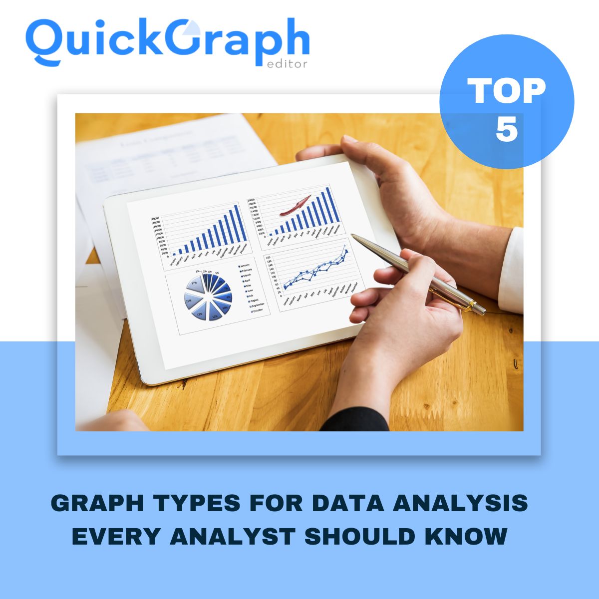
QuickGraph AI empowers users to transform data into dynamic, insightful visuals without the need for complex software or design experience. From structured spreadsheets to raw datasets, turning information into clarity has never been more accessible.
Let’s explore five of the most powerful chart types every analyst should be familiar with and how they can help you turn raw numbers into meaningful insights.
If you’re analyzing data over time, the Line Graph is one of the most effective tools available. It connects individual data points with lines, helping you identify trends, cycles, or shifts in performance.
This graph type is ideal when comparing multiple datasets on the same timeline, giving you a side-by-side view of progression or decline.
The Bar Graph is perfect when you want to compare quantities across multiple groups or categories. It presents data using rectangular bars of different lengths and is easily understood at a glance.
QuickGraph AI also supports advanced variations like the Bi-directional Bar Chart and Triangle Bar Chart, giving analysts more flexibility when presenting grouped data or dual-sided comparisons.
A classic visualization, the Pie Chart Maker is used to display how a whole is divided into parts. It’s perfect for percentage-based insights and quick overviews of distribution.
For more visual depth, you can use Donut Charts, Polar Area Charts, or Sunburst Charts, all available in QuickGraph AI offering style options without compromising clarity.
The Scatter Plot Maker allows you to study relationships between two variables by plotting data points on a Cartesian plane. It’s widely used in research, analytics, and predictive modeling.
To add another dimension, try the Bubble Chart, which incorporates a third variable using the size of the point perfect for multidimensional data stories.
When dealing with large sets of categorical or time-based data, the Heat Map Maker provides a clear overview using color gradients. It highlights high and low intensity values, making pattern recognition much easier.
Heat maps turn overwhelming spreadsheets into intuitive color-coded visuals that anyone can interpret quickly.
These five graph types are the backbone of effective data storytelling. Whether you’re trying to understand what happened, why it happened, or what might happen next, choosing the right chart makes your message stronger.
They simplify complexity, enhance presentations, and help decision-makers focus on what matters most.
With QuickGraph AI, you don’t need advanced design or coding skills. Just import your data whether from a CSV, Excel file, or Google Sheet and choose from 30+ smart chart types that designed for professionals.
The charts featured in this blog include:
Line Graph, Bar Graph, Pie Chart Maker, Scatter Plot Maker, Heat Map Maker
And that’s just the beginning. Explore other powerful options like the Gantt Chart, Funnel Chart, Candlestick Chart, Radar Chart, Treemap Chart, and more all crafted to make your data speak clearly.