
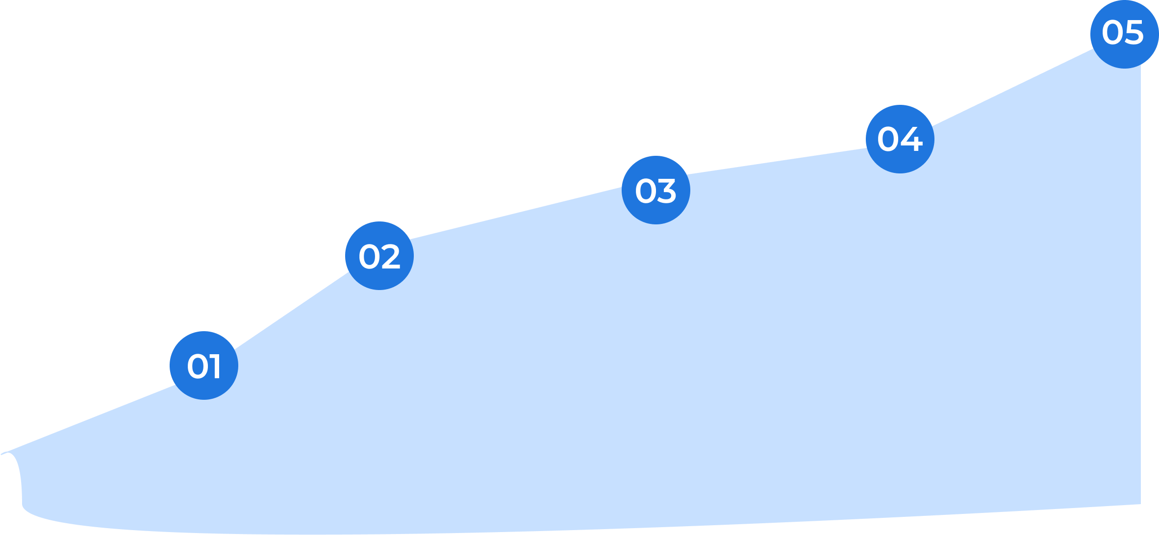
Area charts excel at showcasing how a quantity accumulates or diminishes and clearly illustrate the trend's direction and magnitude.
Stacked area charts effectively compare the contribution of different categories and is helpful in understanding the composition of a whole.
Proportional area charts emphasize the relative size of different categories within a dataset and enable easy comparison of visuals.
Area graphs are effective for visualizing data with cyclical patterns. It helps comparing variables or categories within a circular framework.
Area charts are ideal for visualizing cumulative data. They clearly demonstrate the total accumulated value at any given point of time.
By observing the slope of the area under the curve, you can identify turning points in the trend, like periods of rapid growth or decline.
Gather the data you want to visualize. Ensure it's organized in a tabular format, with categories and corresponding values.
Choose an area graph maker or creator like QuickGraphAI Editor. Create a free account on our free online area chart maker.
Enter your data into our tool. This usually involves copying and pasting your data into a spreadsheet or uploading a CSV file.
Standard Area Chart: Displays the cumulative value over time.
Stacked Area Chart: Shows the contribution of each part to the whole over time.
Proportional Area Chart: Similar to a stacked area chart but shows percentages.
Area Chart: Displays data in a circular format, useful for showing cyclical patterns.
Adjust the chart settings to fit your needs. This can include:
Colors: Differentiate between data series.
Labels: Add titles, axis labels, and data labels.
Legends: Include a legend to explain the data series.
Save & Share!

This is the most common form of area chart. All segments are layered on top of one another with clearly defined groups using lines and colors to differentiate.
Stacked area charts are effective when comparing parts of a whole across groups, and tracking the general trend or cumulative contribution of any group of bars.
The standard area chart plots the values for each data series on the y-axis. These charts are wonderful for comparing different data series-for example, you could use one to show how the total population of different countries has been compared through history.
In a stacked area chart, the data series are summed to show a cumulative total, so they appear 'stacked' on top of each other. This type of chart is good for showing part-to-whole relationships.
A percentage area chart is a form of stacked chart where the contribution of each group relative to the total is plotted. For instance, a percentage area chart could be used to show how the proportion of different demographics within a population have changed over time.

QuickGraph AI Editor transformed how we present data. The AI-powered insights and seamless interactive editor make complex visualizations effortless and dynamic. It was like having a data scientist and a designer in one tool!

Explore our insightful blog posts


All Rights Reserved. © 2026 by QuickGraph.