Box plots effectively display the spread and skewness of data. With our box plot maker, it gets easy to identify patterns and outliers.
Box plots allow quick comparison of the distribution of multiple datasets. This makes it possible to identify differences and similarities.
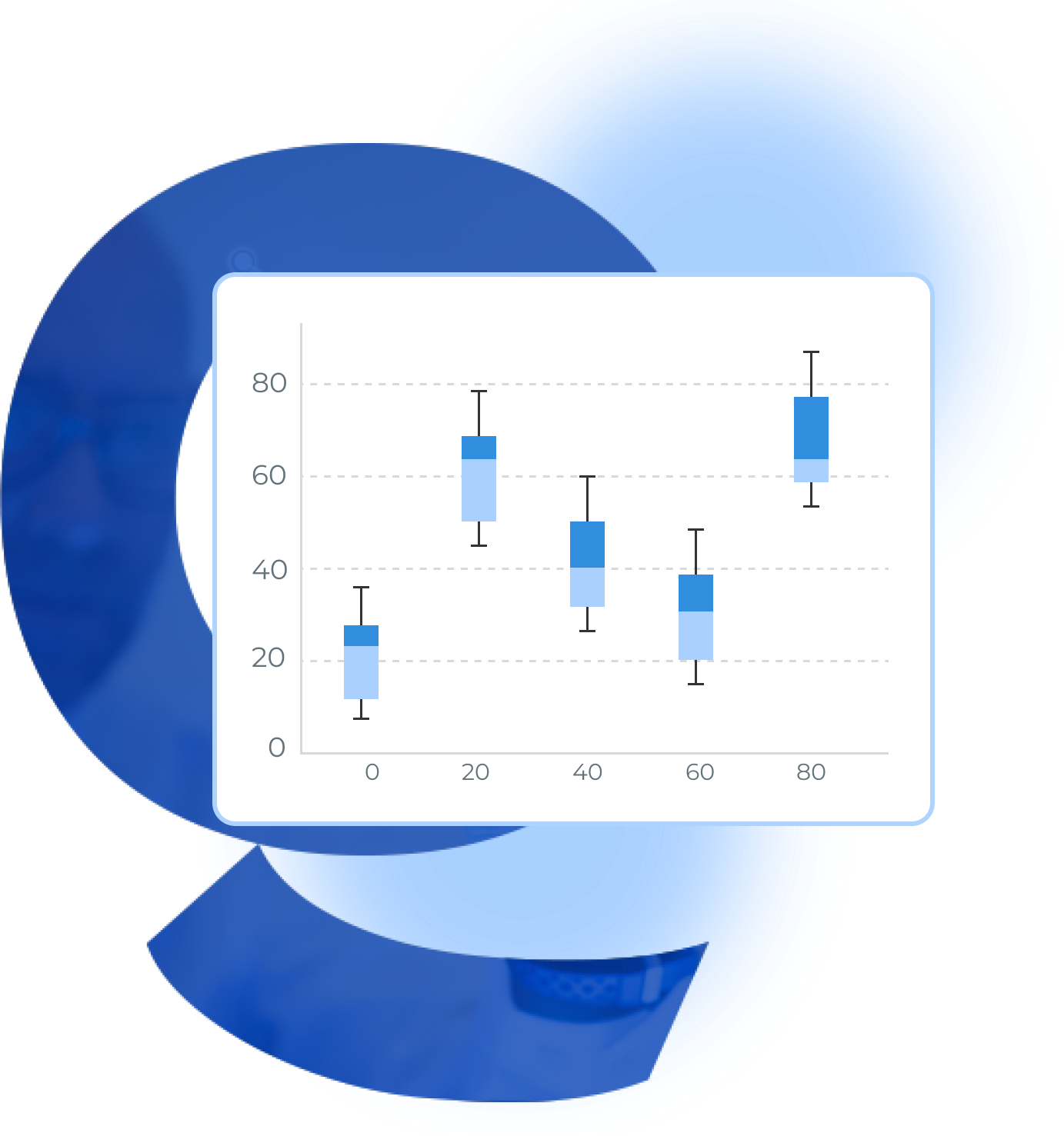
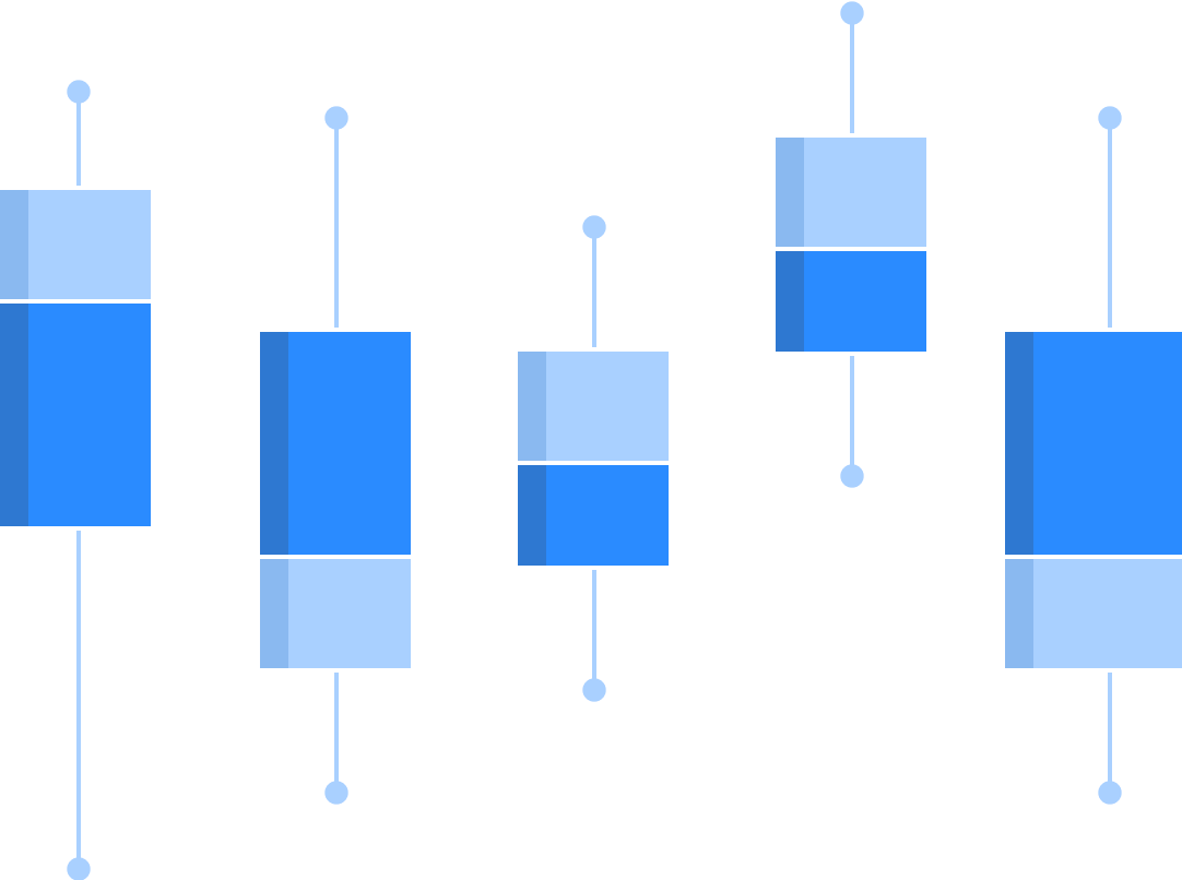
Box and whisker plots, commonly known as box plots, are a graphical tool to display the distribution of data.
They show several key measures of central tendency:
The median, or middle value of a set of data, and quartiles, or the values that divide the data into four nearly equal segments.
Outliers: Data points well away from other data points of the main data body.
Range: the spread of data from the smallest to the largest value.
Box plots can be valuable in knowing if a distribution of data is skewed and if there are any outliers in a set of data. Graphical comparisons of two different sets of data are often required.
Box and whisker plot is descriptive of its visual appearance. It consists of a "box" describing the interquartile range (IQR) and two "whiskers" expanding from the box to exhibit the minimum and maximum values within a certain range.
The initial phase in making a box plot involves determining the following:
Median: The mid value of the dataset.
Q1 - First Quartile - The value that is below 25% of the data falls.
Q3 - Third Quartile - The value that is below 75% of the data falls.
After identifying the values, you must calculate the interquartile range (IQR = Q3 - Q1) & proceed with creating the box and whiskers.
QuickGraph AI Editor transformed how we present data. The AI-powered insights and seamless interactive editor make complex visualizations effortless and dynamic. It was like having a data scientist and a designer in one tool!
Explore our insightful blog posts