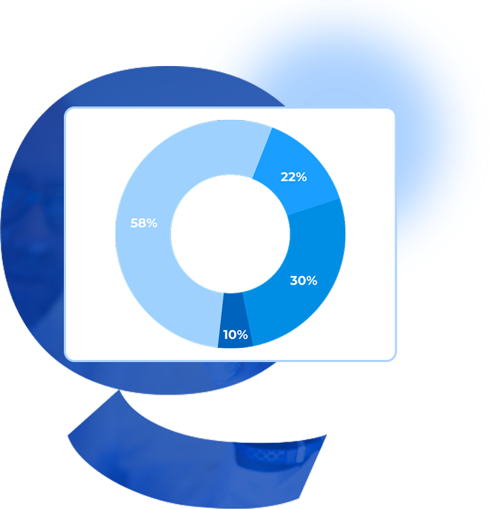
Create stunning donut charts, donut graphs, and donut diagrams that turn complex data into visually compelling stories.
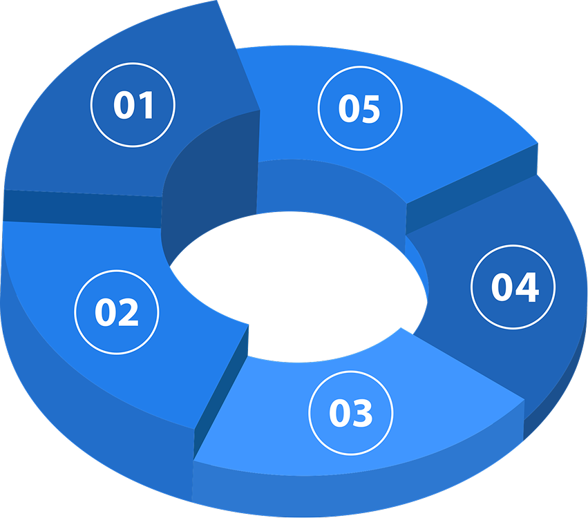
Our interactive platform empowers you to design dynamic custom donut charts tailored to your unique needs. From a simple yet dynamic Doughnut Chart to a Dynamic Doughnut Graph, you can craft dynamic data visualizations that truly stand out.
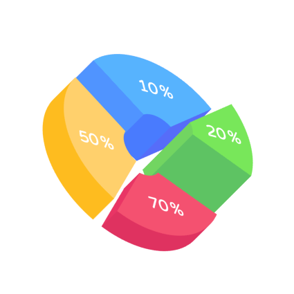
You can unleash your creativity and communicate insights effectively with our interactive features like the Circular Chart with a Hole, Interactive Donut Chart, and Donut Chart with Labels. Our platform supports a variety of styles, including the Segmented Ring Graph, Proportional Donut Graph, and Radial Percentage Chart.
Transform your data into impactful visual narratives with our Circular Progress Chart and Percentage-Based Donut Graph options.
Create your data storytelling through our Interactive Donut Chart Maker!