You can simply plot multiple lines on the same chart to quickly identify similarities, differences, and correlations between different variables.
Line Graph is incredibly versatile and can be used across various fields, including finance, marketing, science, business, education, and much more.
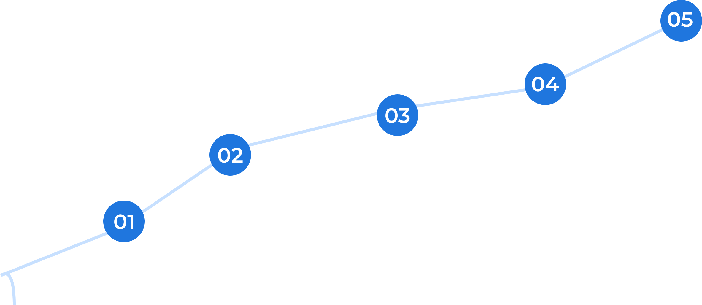
A step-by-step guide for creating a Line Graph through QuickGraphAI Editor:
Once logged in, go to your personalized home page and click on "Create New Project".
Customize your line graph using the editor. You can change the axis labels, colors of lines, markers, and other visual elements to your heart's content.

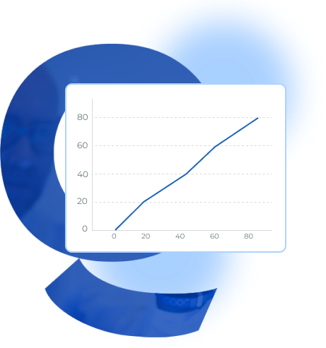
A line graph is sometimes called a line chart, and it presents points that are connected with segments of straight lines. Most of these line graphs show something moving forward on the horizontal, or x-axis, in quantifiable intervals such as minutes, hours, days, weeks, months, or perhaps years. The vertical axis, or y-axis, explains something that each point measures of concern.
There are several advantages of creating a line graph. First, the line graph is easy and simple, and they can convey a point effectively. For example, it is easier for people to see trends or patterns in a line graph than to find a meaning in a set of data in table form.
Absolutely! You can make single and stacked line graphs. And you can also choose from three different types of line styles: angled, smooth, or steps.
QuickGraph AI Editor transformed how we present data. The AI-powered insights and seamless interactive editor make complex visualizations effortless and dynamic. It was like having a data scientist and a designer in one tool!

Explore our insightful blog posts


All Rights Reserved. © 2026 by QuickGraph.