Polar Area Chart Maker

Generate Interactive Polar Area Charts Instantly.

Create a Dynamic Chart Now!

Step into the fascinating realm of data visualization with our Polar Area Chart!

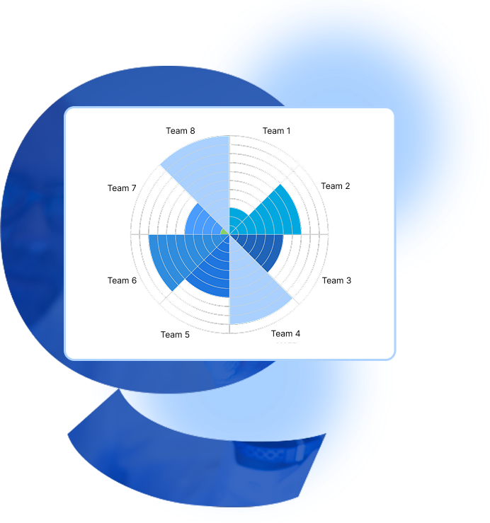
The polar area diagram presents information in a dynamic and interactive visual form. By using our interactive polar area chart generator and tool, you can effortlessly transform your data into dynamic visuals. The Polar Plot, Radial Area Chart, Coxcomb Chart, Rose Chart, Wind Rose Diagram, etc allow for accurate representation of cyclical data, multiple categories, trends, and patterns. Our interactive interface guides you through each step, enabling you to adjust colors, labels, and other settings to ensure your data is presented effectively.
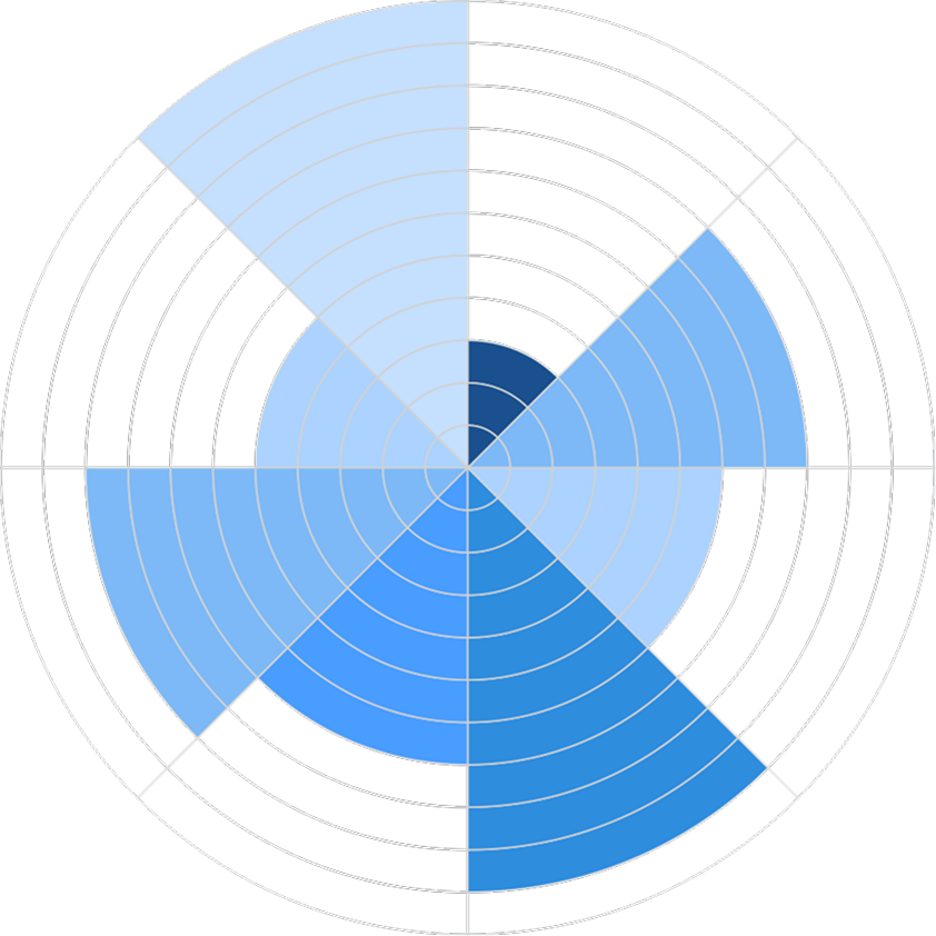
The Polar Distribution Chart and Proportional Radial Chart excel in showcasing proportional data in a visually appealing manner, while the Multivariate Circular Graph and Interactive Polar Area Chart provide interactive ways to analyze complex datasets. Additionally, the Circular Bar Chart and Spiral Area Chart offer dynamic solutions for displaying hierarchical or time-series data, ensuring clarity and audience engagement.
Create amazing graphics that capture your audience’s imagination with our Polar Area Chart.
Key Features Of Radar Chart

Key Features Of Polar Area Chart

The chart is organized in a circular manner, with the center representing the origin and the outer edge representing the maximum value.

The area of each segment is proportional to the value it represents. Whereas, the larger value results in larger segments.
Polar area charts are particularly effective for visualizing data that has a cyclical nature, such as time periods or stages in a process.
Polar area graph and chart allows users for easy comparison of the relative sizes of different categories and patterns.
It is typically best suited for datasets with a limited number of categories and trends to maintain the basic clarity.
To create polar area charts, one can use spreadsheet programs, data visualization libraries, and polar area chart generators.

Ever wondered how to make a dynamic polar area chart?

With our interactive polar area chart creator you can design beautiful and informative charts!

Process of Making a Polar Area Chart

A step-by-step guide for creating a Polar Area Chart through QuickGraphAI Editor:

polar area chart online

01

line

Sign up to QuickGraphAI Editor

Login or Sign up at QuickGraphAI Editor, the best Polar Area Chart Creator. Move ahead to create your very own customizable chart.

02

line

Collect Your Data

Ensure your data is suitable for a polar area chart. This type of chart is ideal for displaying cyclical data, such as monthly sales figures or seasonal trends.

03

line

Input Your Data

Enter your data manually or import it from a CSV or TSV file. We allow you to preview your chart as you input the data.

04

line

Customize Your Chart

You can adjust the settings to customize the appearance of your chart. You can change colors, labels, and other visual elements to make your chart more informative and visually appealing.

05

Generate and Download

Once you are satisfied with the chart, generate it and download it as an image file. This makes it easy to include in presentations or reports.

Significance of Polar Area Chart

polar area chart creator

Frequently Asked Questions

A Polar Area Chart is a data representation in an angular graph. Every point or radial line represents more than one variable across categories of different kinds.

Our polar area diagram tool will automatically generate the Polar Area Chart based on the input you give. Just input your data in the fields above. You can then input any number of slices you want and fill out the appropriate data for each slice. Our tool will then plot this based on the data to create an appropriately crafted, aesthetically pleasing, and interpretable Polar Area Graph.
To make a top notch Polar Area Chart you need to keep your data simple and easy to understand. Use concise and short labels. Pick unique colors to make your Polar Area Graph visually appealing. Choose the text and font accordingly. Check your Polar Area Diagram if the data is perfect before downloading it
You can customize the titles, labels of the X and Y axes, text and background colors, font family, and title font. This way, you can adjust the look of your Polar Area Graph and Chart to suit your idea and make it easy for others to understand your data.
Polar Area Charts are easily understandable concepts that display the points and radial lines to represent multiple variables. This enables users to understand it clearly and quickly without going deep into each detail of the data.
3d-shield-icon
bar-graph-icon

Dive into visually dynamic polar area graphs and diagrams that make complex data easy to understand.