Our interactive bar chart maker or online bar graph maker offers a wide range of customization options to tailor your visualizations to your specific needs. Choose from various chart types, including vertical and horizontal bar graph, stacked bar chart, and grouped bar chart.
With our free bar chart generator, you can create high-quality visualizations without any software downloads or installations.

Bar graph excel at visually comparing different categories of data. Each bar represents the quantity or magnitude of the data it represents.
Bar graph displays data, which involves discrete categories rather than continuous measurements. Like types of products, age groups, etc.
Bar graph is oriented either horizontally or vertically. The choice of orientation relies on personal preference or the specific data presentation.
Bar graph have two axes. The x-axis represents the categories compared and the y-axis represents the quantities associated with categories.
A step-by-step guide for creating a Bar Graph through QuickGraphAI Editor:
Gather the data you want to visualize. Ensure your data is organized into categories with corresponding values. Sign up or Login at QuickGraphAI Editor.
Enter your data and fill in your details. We have a data entry section where you can input your categories and their corresponding values.
Choose the type of bar graph you want to create. Options typically include vertical (column) or horizontal bars.
Make it more appealing. Color, use of labels and titles, and many more are options to make the bar graph clear.
After customization, generate your bar graph. Save or download it for use in reports, presentations, or other projects.
At QuickGraph AI, data visualization meets innovation!
Our dynamic and interactive tools convert your raw data into stunning visual representations, including Progress Bar Charts, Proportional Bar Graphs, or Percentage-Based Bar Charts. Whether you’re tracking project milestones with a Fractional Bar Graph, analyzing ratios using a Ratio-Based Bar Chart, or breaking down categories with a Category Percentage Bar Graph, QuickGraph AI ensures your data is both accurate and visually compelling.
From measuring market trends to monitoring project work or visualizing survey results, our dynamic platform transforms complex data into clear, impactful insights. Immerse yourself in a world where numbers come to life, making your findings more vivid and powerful than ever.
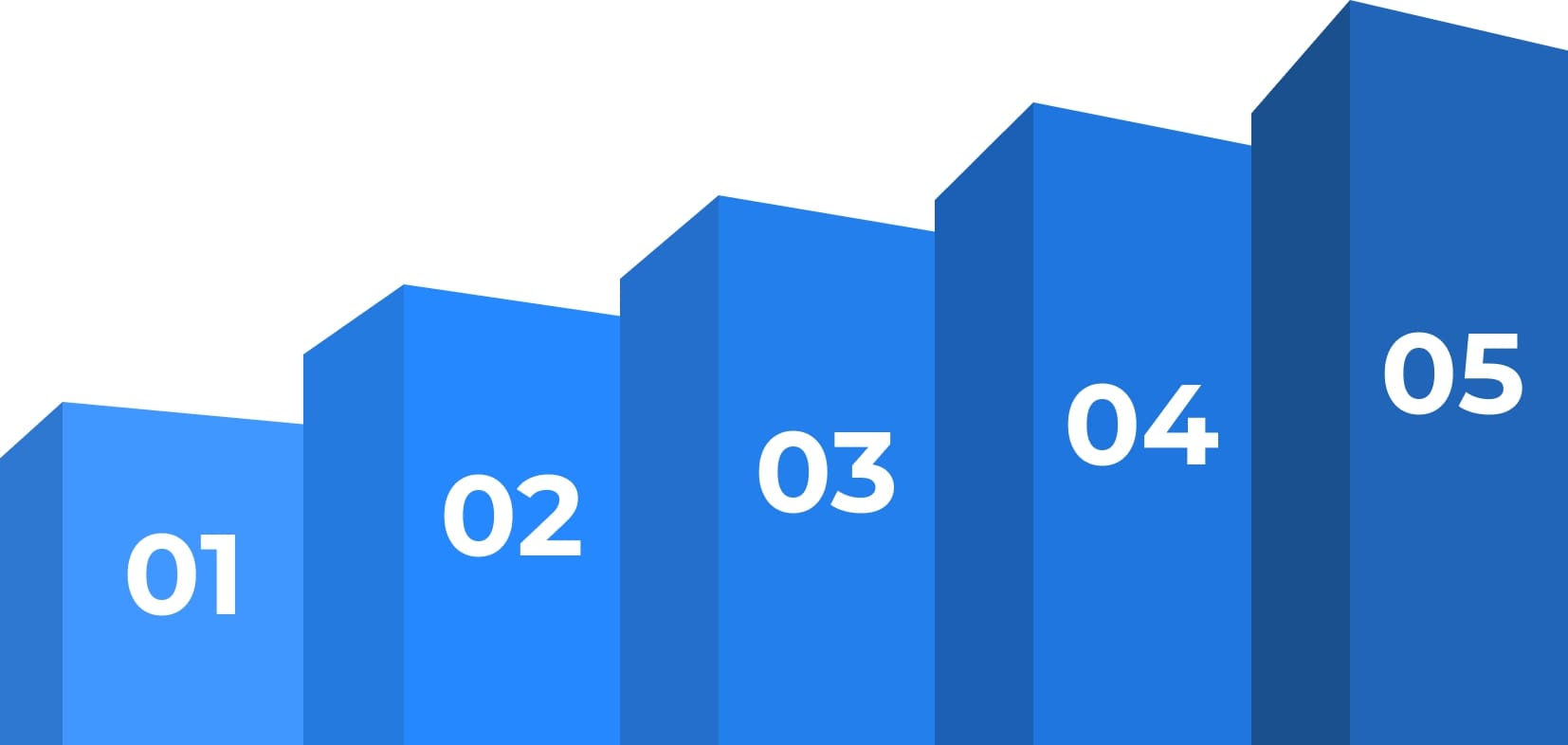
Ideally, each bar on your bar graph should be an equal width. The space between bars also must be the same. The height of the bar portrays the frequency or quantity of the corresponding observation. It's more common to display vertical bars but horizontal bars can also be used.
You can enter up to 40 units of data on the x axis and 50 on the y axis. You can also import live data from Google Sheets.
A bar chart is used to compare data across different categories. Each bar represents a category. Taller or longer bars represent larger values; shorter bars represent smaller values.
Yes! Signing up for QuickGraph AI is free, and free to use. However, some features of our portal require subscription at an extremely affordable price.

QuickGraph AI Editor transformed how we present data. The AI-powered insights and seamless interactive editor make complex visualizations effortless and dynamic. It was like having a data scientist and a designer in one tool!
Explore our insightful blog posts
All Rights Reserved. © 2026 by QuickGraph.
