The Power of Bi-directional Bar Chart is Here!

Join us today to transform your data visualization skills with a dynamic bi-directional bar graph.
Dive in and start creating impactful charts today!

Transform Basic Insights with Bi-directional Bar Charts

With QuickGraph AI, discover the secrets of crafting interactive bidirectional bar graphs and learn how to create a bidirectional bar chart that stands out.
A bidirectional bar graph—also known as a dual horizontal bar chart, butterfly chart, mirror bar chart, or split bar chart—displays two opposing datasets on either side of a central axis. This format is ideal for comparing data, such as positive vs. negative values or demographic distributions.
Popular types include the positive-negative bar chart, population pyramid chart, and side-by-side bar chart. Each format provides a unique way to visualize and interpret data, enabling clearer insights and better decision-making.
Let’s embark on this journey to create impactful bidirectional mirroring bar charts and more!

Key Features Of Bi-directional Bar Chart

Bidirectional bar charts provide an interactive and simple comparison of two sets side-by-side, making visualization easy.
It is appropriate for different dynamic applications, such as mirror bar charts, back-to-back bar charts, and population pyramid charts.
It ensures both datasets are equally represented, making it easier to spot differences and similarities.
It helps create mirroring bar charts to tell compelling data stories with visual impact.
It is ideal for demographic studies, financial comparisons, and more, including butterfly charts and graphs.
It empowers your decision-making process with clear, comparative visuals highlighting key insights.

Transform your Data Visualization today!

Explore our tools and features to unlock the full potential of bidirectional bar graphs right away!

Process of Making a Bi-directional Bar Chart

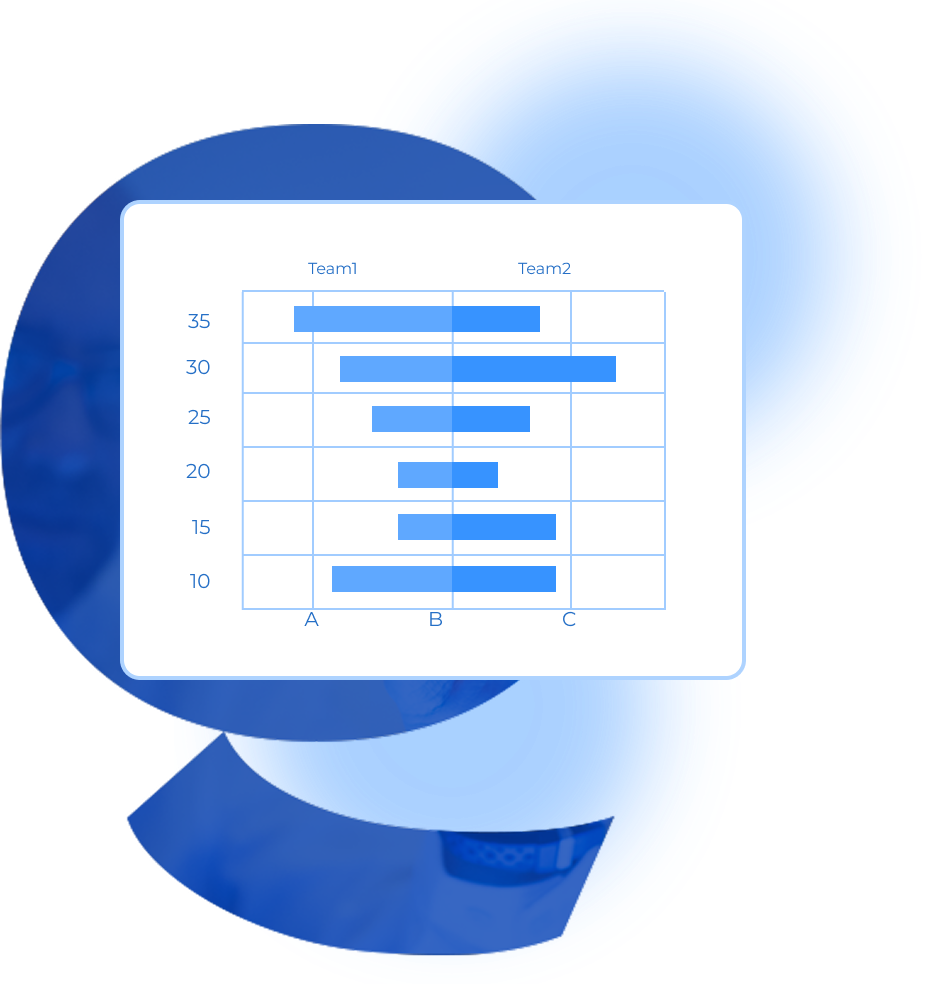
A step-by-step guide for creating a Donut Chart through QuickGraphAI Editor:

04

Input Data into QuickGraph AI

Upload or manually enter your datasets. QuickGraph AI automatically aligns and visualizes the information.

05

Customize the Chart

Adjust labels, colors, and axis scales for clarity. Ensure your chart highlights key comparisons effectively.

Significance of Bi-directional Bar Chart

custom donut maker

Create Gorgeous Divergent Chart and Graphs Online Free

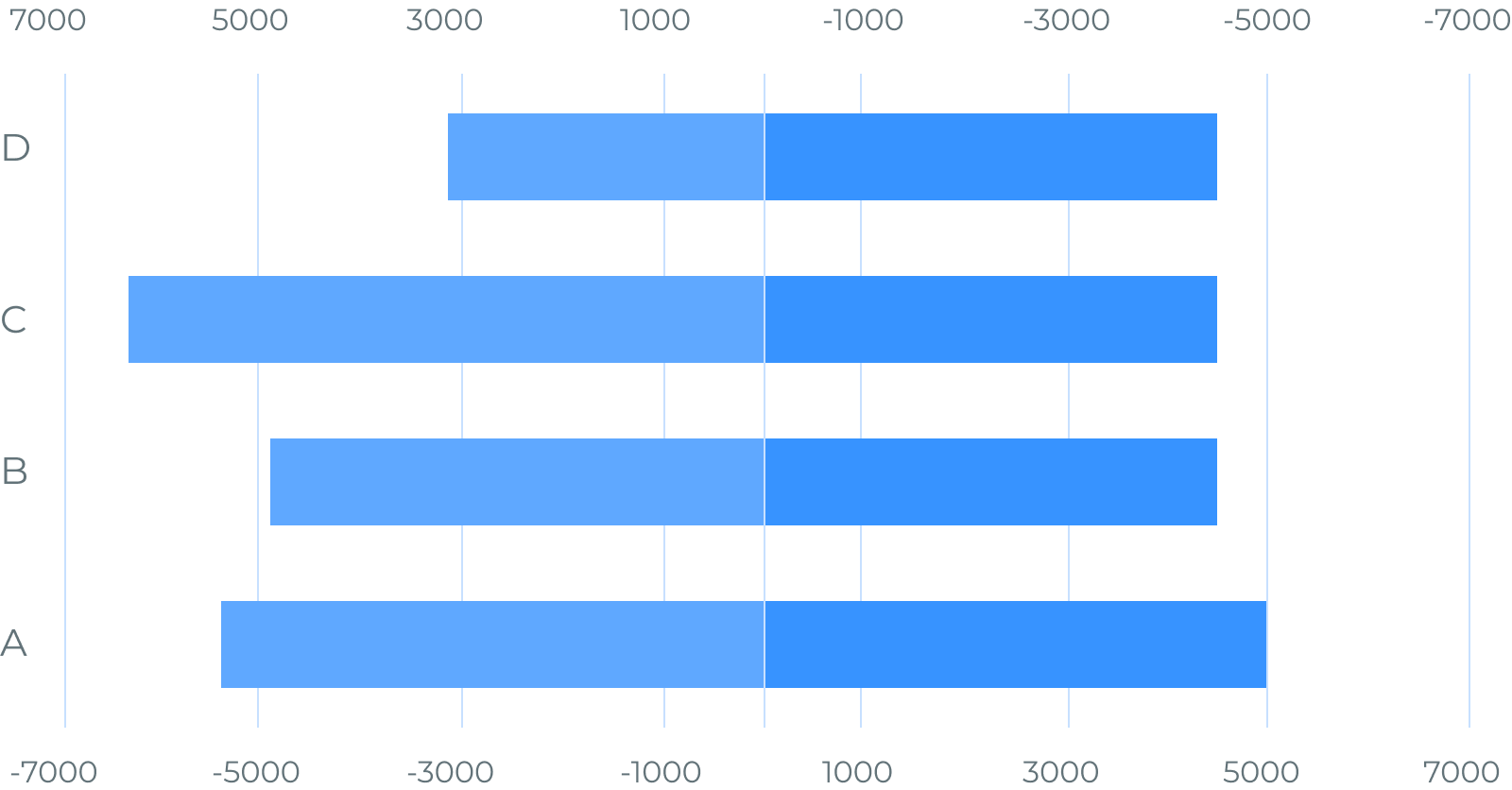
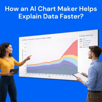
In the dynamic world of data visualization, QuickGraph AI stands out as a game-changer, offering unparalleled tools for creating divergent charts and graphs. If you’re looking to craft diverging bar charts, diverging bar graphs, or diverging bar chart horizontal, QuickGraph AI provides the precision and flexibility you need.

Whether you’re building a Sentiment Analysis Bar Chart, a Positive vs. Negative Value Bar Chart, or a Split Axis Bar Graph, QuickGraph AI offers intuitive features to simplify the process. From a Split Bar Chart to a Two-Sided Bar Graph, the platform allows users to create custom visualizations that reveal hidden insights with ease. QuickGraph AI also supports the creation of Deviation Bar Charts and Bipolar Bar Charts, enabling you to present balanced comparisons and highlight data deviations effectively.

Dive into a realm where data comes to life, making complex information not only accessible but also visually compelling. Transform your data storytelling with QuickGraph AI and see the difference that innovative visualization can make!
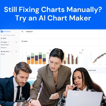
Frequently Asked Questions

A bidirectional bar chart is a form of bar graph used to compare two sets of data side by side. It's also referred to as a mirror bar chart or back-to-back bar chart.
These charts are versatile and can be used for demographic studies (e.g., population pyramid charts), financial comparisons, and more. They are also effective for creating butterfly charts and butterfly plots.
A butterfly chart is a particular form of bidirectional bar chart commonly employed to contrast two related data sets, for example, male and female populations in a population pyramid chart. The terms are occasionally used interchangeably.
QuickGraph AI makes it easy to produce diverging bar charts and graphs. Through its easy-to-use interface and advanced features, you can create diverging bar charts, diverging bar graphs, and horizontal diverging bar charts. These help to highlight comparisons and differences within your data and facilitate effective communication of insights.
Utilizing diverging bar charts with QuickGraph AI has several advantages. The charts are ideal for showing data that contains positive and negative values, enabling easy visual comparison. The diverging bar chart horizontal style is especially convenient for showing data in an easily readable and understandable format, particularly when working with large datasets. QuickGraph AI makes sure your charts are not just precise but also look good, and improves your data storytelling abilities.
Yes! Such charts are really great for use in presentations as they give you a balanced, clear visual figure of data to make it possible for your listeners to interpret and comprehend the info more easily.
Interpretation is based on comparing bar lengths on either side of the middle axis. This aids in detecting trends, patterns, and discrepancies between the two data sets.
Donut-Chart-icon
line-graph-icons

Convert raw data into interactive insights with QuickGraphAI!

You can build dynamic and aesthetic bidirectional bar charts that can guide you to make data-driven decisions and convey your findings understandably.