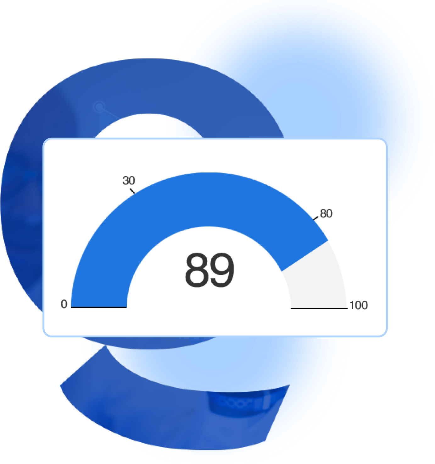
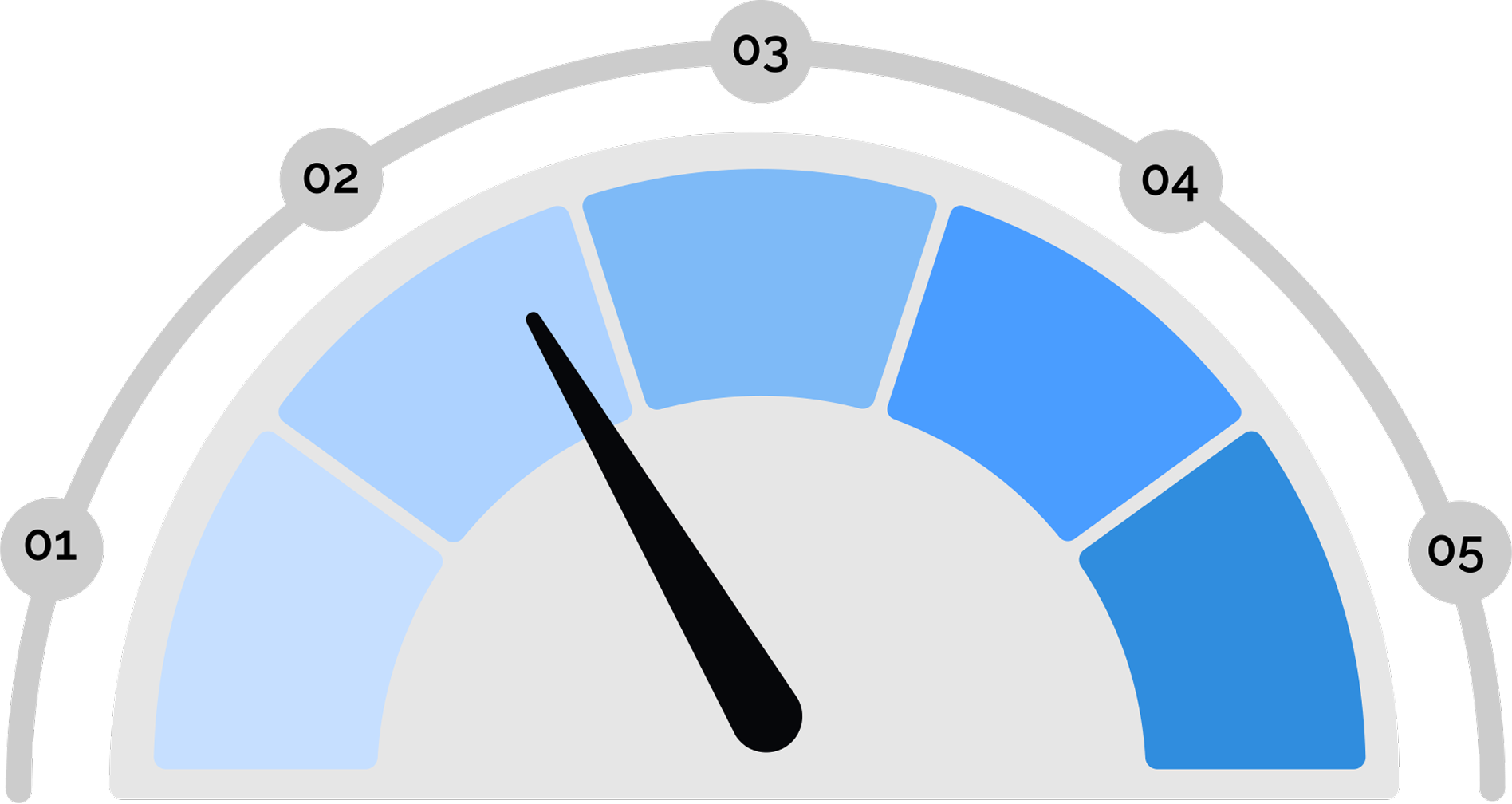
They provide a clear and concise way to communicate data, making it quick to understand the current status of a metric.
Gauge charts indicate the minimum, maximum, and target values for a metric, making it easy to see the desired range.
Gauge charts can be effortlessly updated in real-time. It helps the chart to provide the latest updates and information.
Gauge charts come in a variety of types, like circular, linear, and semi-circular, allowing you to choose the data.
A step-by-step guide for creating a Gauge Chart through QuickGraphAI Editor:
Click on "New Project" to start a fresh project. In the chart selection menu, look for "Gauge Chart" or "Gauge Graph". Select it to start creating your gauge chart.
Input your data that you want to dynamically visualize. This could be a single value or a range of values depending on what you want to show in your gauge chart.
Using the customization options, you can change the look of your gauge chart. You can change colors, labels, and other visual elements to suit your preferences.
Click on "Preview" to see how your gauge chart looks. Make any necessary adjustments.
After you're happy with your gauge chart, save your project. Use the "Export" option to download your chart in one of these file formats for use in presentations or for reports, for instance, PNG, JPEG, PDF format.
Absolutely! Our gauge charts are really attractive and professional, making them ideal for dashboards, reports, and any other kind of presentation.
QuickGraph AI Editor transformed how we present data. The AI-powered insights and seamless interactive editor make complex visualizations effortless and dynamic. It was like having a data scientist and a designer in one tool!
Explore our insightful blog posts