Best parallel coordinates chart and plots

Generate insightful alluvial diagram and chart to track changes and trends over time.

Create stunning parallel coordinates charts that make your data stand out.

At QuickGraphAI, data visualization effortlessly meets innovation! Our platform empowers you to transform intricate datasets into clear, insightful visuals. Even if you’re exploring the nuances of a parallel graph, understanding what a parallel plot is, or mastering the art of parallel plotting, QuickGraphAI has you covered.
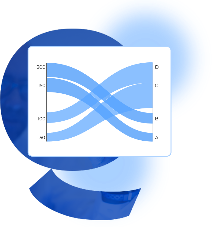
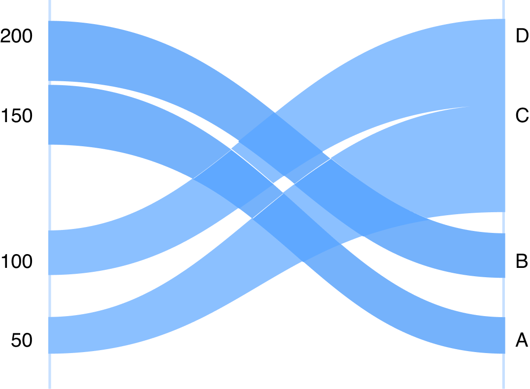
Dive into the world of parallel coordinates plots and parallel coordinates charts to effortlessly compare multiple variables. Go beyond basic charts with our interactive parallel categories graph—perfect for revealing trends in multi-level category visualizations and complex categorical data pathway charts.
Unlock the full potential of your data with QuickGraphAI today!

Key Features Of Parallel Categories Graph

You can seamlessly visualize complex data relationships with our user-friendly parallel graphs.
You can easily understand and learn what a parallel plot is and how it can simplify your data analysis.
You can compare multiple variables simultaneously with our detailed parallel coordinates plots.
You can design visually appealing parallel coordinate charts that highlight key data points.
You can seamlessly track data flow and changes over time with our interactive alluvial diagrams.
You can generate alluvial charts that provide a clear and concise overview of your data trends.

Explore QuickGraph Ai's Parallel Plots Now!

Understand what a parallel plot is and transform your data analysis. Dive into parallel plotting with QuickGraphAI!

Process of Making a Sunburst Chart

A step-by-step guide for creating a Donut Chart through QuickGraphAI Editor:

01

line

Collect and Prepare Categorical Data

Gather data with multiple categorical variables relevant to your analysis. Ensure the data is clean, consistent, and structured for easy parsing into categories.

02

line

Choose Relevant Categories

Select which variables (dimensions) to include based on their importance and relationships. Too many categories can clutter the graph, so prioritize clarity and relevance.

03

line

Assign Axes for Each Category

Place each selected category on parallel vertical axes from left to right. Each axis represents a different categorical variable in the dataset.

04

line

Map Unique Values on Each Axis

Display all distinct values (levels) for each category along its corresponding axis. This helps visualize all possible combinations between dimensions.

05

line

Connect Matching Data Points Across Axes

Draw lines (paths) from one category to another to show data flow across categories. Each path represents one observation or record in the dataset.

06

line

Encode Data Using Color or Thickness

Use line color or width to indicate group sizes or highlight specific paths. This adds an extra layer of insight into the distribution or importance of flows.

07

line

Add Interactive Features (Optional)

Include hover effects, filters, or tooltips for dynamic exploration, especially in web-based visualizations. Interactivity helps users better analyze patterns and outliers.

08

line

Label Axes and Add a Legend

Clearly label each axis and provide a legend for colors or line styles used. This ensures the graph is self-explanatory and easy to interpret.

09

line

Test and Refine Visualization

Check for readability and performance, especially with large datasets. Adjust spacing, simplify categories, or remove clutter to enhance clarity.

10

Export or Embed the Graph

Finalize the graph for presentation or publication in reports, dashboards, or web applications. Choose formats like PNG, SVG, or interactive HTML based on your needs.

Significance of Parallel Categories Graph

Frequently Asked Questions

A parallel graph is a type of data visualization that allows you to compare multiple variables simultaneously. It helps in identifying patterns and correlations across different dimensions, making complex data easier to understand and analyze.
A parallel plot is a visualization technique where each variable is represented by a separate axis. Data points are plotted as lines that intersect each axis, allowing you to see relationships and trends across multiple variables at once.
Creating parallel plots with QuickGraphAI is simple! Just upload your dataset, select the variables you want to compare, and customize the plot settings. Our intuitive interface makes parallel plotting a breeze.
Absolutely! QuickGraphAI offers a range of customization options for your parallel categories graphs. You can adjust axis scales, colors, labels, and more to create the perfect visualization for your data.
Getting started is easy! Simply sign up on our website, upload your dataset, and start exploring the powerful visualization tools QuickGraphAI has to offer. Transform your data into compelling visual stories today!
Donut-Chart-icon
line-graph-icons

Create Stunning Parallel Coordinates Chart

Visualize your data with Parallel Coordinates Plots. 
Compare multiple variables effortlessly and create a spectacular parallel coordinate chart with ease.