Scatter plot graphs can help you formulate hypotheses, make predictions about future outcomes, and identify potential trends in the data.
Scatter plots dynamically highlight outliers and deviate significantly from the general trend. Identifying outliers is crucial for data cleaning.
Scatter plots can be easily integrated with other data analysis tools. This seamless integration help further exploration & modeling of data.
Scatter plots provide a clear and concise visual representation of data, making them effective for communicating complex information.
Gather the data you want to visualize, ensuring you have pairs of values for the two variables you want to display in an XY plot.
Choose the scatter plot option from the chart types available in the QuickGraphAI Editor. This will plot your data on a Point Graph.

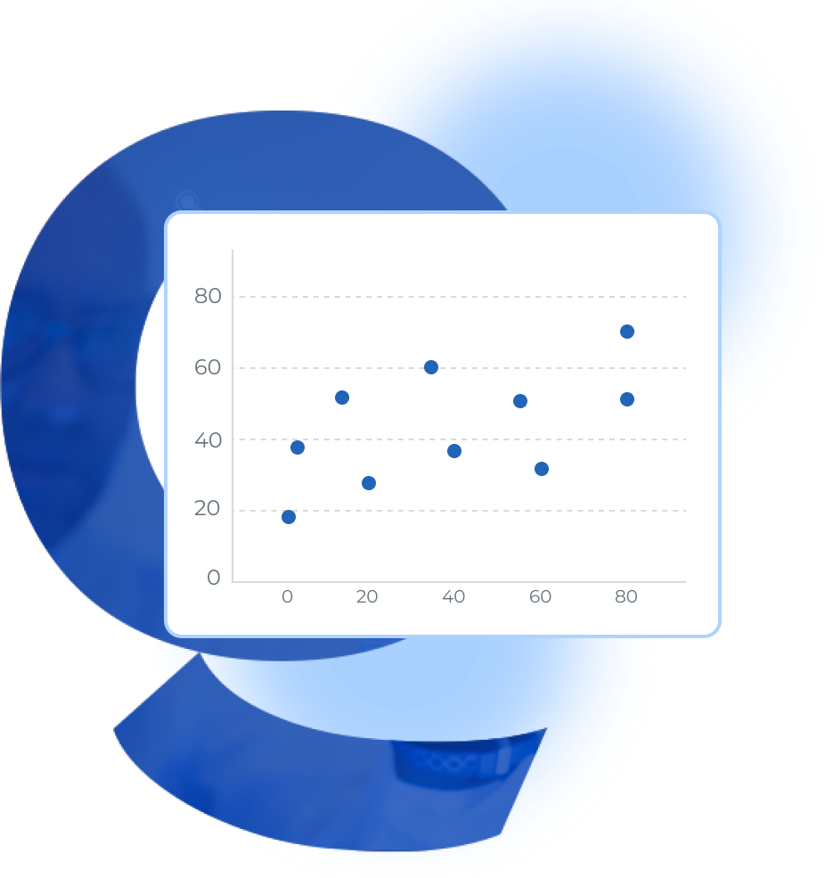
A scatter plot is a form of data visualization where two variables are plotted against each other on a x-y axis. It helps represent the relationship between the two variables. If the variables are correlated, the points will lie on a line or curve. The closer the points hug the line, the stronger the correlation.
Create a scatterplot design that's yours by uploading your logo, using your brand color palette and consistent fonts. To upload your logo, click on the Uploads tab, select the Uploads folder, and then click on the green Upload your own images button. Choose any PNG, JPEG or SVG file you would like to upload from your computer. Uploaded images are automatically saved inside your Uploads folder, ready to be used in other designs.
There are two ways to add your own information to generate a graph: You can link an open Google Sheet to the website or upload your Excel spreadsheet. If using the first option, when you enter information into a new cell, your new information is added to the graph instantly.
To make a scatter plot, first identify the two sets of numerical data you want to plot. Next, select a scale for the values on each axis and plot each Data Point Chart on the graph using the corresponding x-axis and y-axis values.
The horizontal axis of a scatter plot represents one variable, where x values are placed; the vertical axis line has the other variable represented through y values or y data. In general, the dependent variable is plotted on the y-axis line and the independent variable on the x-axis line.
Finally, add a chart title and labels for each value on each axis (y values and x values) to give context and interpretation of the plotted input data.
Scatter plots and Correlation Graph can visually depict the relationships and correlation between two variables, helping the presenter convey a message’s key elements more effectively. A scatter plot (or scatterplot) can also provide insights into patterns and trends in the data, helping the audience better understand the represented information being displayed.

QuickGraph AI Editor transformed how we present data. The AI-powered insights and seamless interactive editor make complex visualizations effortless and dynamic. It was like having a data scientist and a designer in one tool!

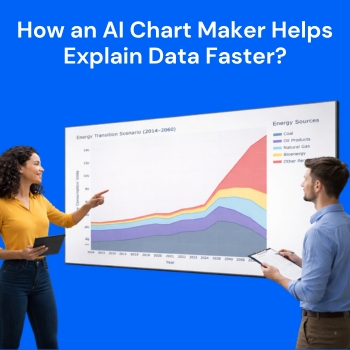
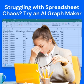
Explore our insightful blog posts

All Rights Reserved. © 2026 by QuickGraph.