If you’ve ever needed to show data changing over time sales, users, temperature, whatever—a line graph is one of your best friends. It’s simple, intuitive, and powerful. Whether you’re using a spreadsheet or a free line graph maker, the core principles remain the same. In this post, I’m going to walk you through what a line graph is, when to use it, how to make one like a pro, typical tools, common mistakes, and best practices. By the end, you’ll be confident drawing insights rather than just curves.
What is a Line Graph
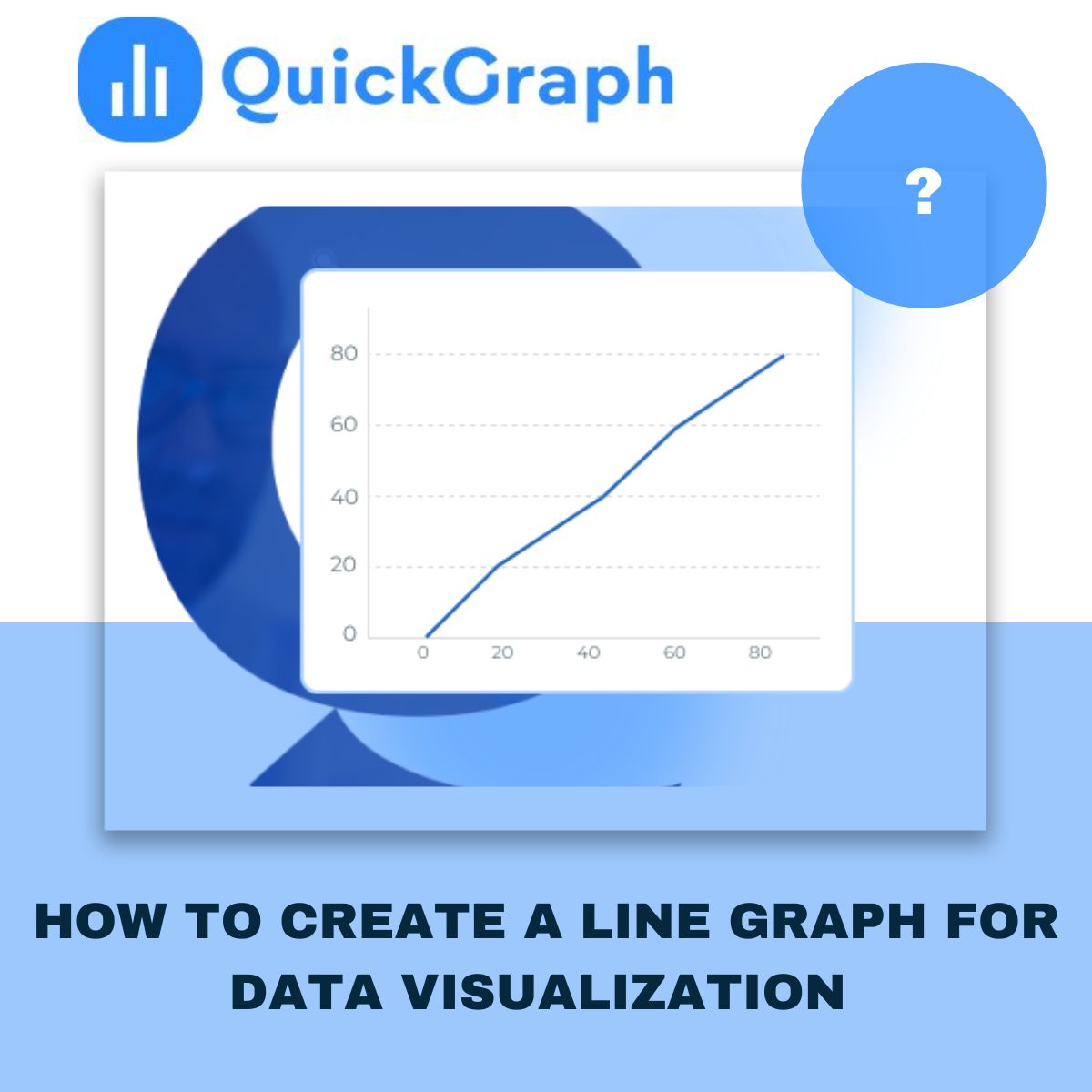
A line graph (also called line chart or line plot) connects data points via line segments, usually left to right. The x-axis represents a continuous variable (often time), and y-axis shows the measured values.
You can plot more than one line in a graph to compare different series (e.g. products, user types) side by side.
When to Use a Line Graph
- Show changes over regular intervals: days, months, years. If your data has a temporal aspect, line graphs help people see the trend.
- Compare multiple related series over same interval (For Ex: visitors vs sign-ups vs purchases) to see how they move relative to each other.
- Emphasize trends, slopes, direction (increasing, decreasing, seasonal patterns) rather than absolute numbers.
Data Structure & Preparation
- Your data usually needs two columns at minimum: one for x (e.g. date/time or ordered category) and one for y (numeric value). If you plot multiple lines, you’ll have additional y-series.
- Sometimes more complex formats: three columns where third column says which line a data row belongs to. Helps when your dataset is long rather than wide format.
- Make sure x-axis intervals are even and meaningful: missing dates or uneven spacing can mislead or obscure trends.
Step-by-Step: How to Create a Line Graph
Here’s how I’d make one in a tool like Excel / Google Sheets / QuickGraph.ai etc.
- Get your data ready: clean it, ensure no missing x values (or explicitly mark them), format the numeric columns.
- Choose your x & y axes: time or ordered category for x, numeric value(s) for y.
- Plot your line(s): Add points, connect them. If you have multiple series, use different colors or line styles.
- Label everything properly: axes titles, units, legend if needed, data point labels when necessary.
- Adjust visual style: line thickness, markers, colors, ensure readability. Use contrasting colors if more than one line.
- Refine scale & interval: Decide how to set the y-axis scale (does it need to start at zero?), decide time binning (daily, weekly, monthly) based on your data’s granularity and what you want to show.
- Review and interpret: Check for noise vs signal. Sometimes averaging or smoothing helps. Identify outliers or missing data.
Best Practices & Common Mistakes
Best Practices:
- Limit number of lines: too many lines = clutter. (Quickgraph suggests around 5 or fewer unless you separate them visually.)
- Use consistent intervals on the x-axis. Don’t mislead by skipping time periods or uneven spacing.
- Choose colors carefully: each line should be distinguishable. If lines are similar, legend + markers help.
- When useful, show uncertainty (error bars or shaded confidence intervals).
- For audiences, make sure labels, legends, titles are clear. Doesn’t matter how pretty graph is if people can’t understand.
Common Mistakes:
- Using a zero baseline when not needed: sometimes starting y-axis at zero makes trends invisible or misrepresents small changes. QuickGraph warns against always forcing the y-axis to start at zero, unless you’re working with frequency distributions or cases where zero is essential.
- Over-smoothing or fitting unnatural curves between points, giving impression of data you don’t have.
- Plotting too many lines together so viewer can’t distinguish them.
- Dual axis misuse: scales mismatched, causing misleading comparisons.
Advanced Tips & Variants
- Sparklines: tiny line graphs embedded inline (dashboards or tables) to show trend at glance.
- Ridgeline plots: multiple lines offset vertically to compare distributions (often for frequency). Useful when you have many lines but want compact view.
- Highlighting specific parts: perhaps annotate peaks/troughs, shade certain periods, or highlight one line among many by making others light/grey.
- When data is noisy, consider smoothing (moving averages, rolling windows), but clearly indicate if you do smoothing.
How QuickGraph.ai Can Help
Since this blog is for QuickGraph.ai, here’s how you (or your clients) can use our tool to make better line graphs:
- Upload raw data (CSV, Excel etc.) or connect data sources.
- Choose templates and customize: fonts, markers, colors to match brand.
- Built-in best practices: clear axes labels, legend, responsive design (for dashboards).
- Interactivity options: tooltips, hover for data points, annotations.
- Export formats for web, presentation, PDF etc.
Conclusion
A line graph is a straightforward but powerful way to present how things change over time (or over any continuous dimension). The secret is in data prep, choosing the right intervals, keeping it clean, labeling everything, avoiding misleading visual tricks, and using tools that help you rather than get in your way.
If you follow these steps, your audience will more likely see the story behind your numbers, not just lines. Need help choosing the right tool, or want custom templates? Just reach out, we at QuickGraph.ai are here to make your data speak clearly.