The creation of reports should ideally make data easier to understand, but in most cases, reports become complicated due to too many numbers, disorganized spreadsheets, and unclear graphs. An AI Chart Maker helps simplify this process by turning raw data into clear visuals that make reports easier to read and understand.
In making reports for business analysis, marketing dashboards, and customer reports, visuals come in very handy. One such graph generator AI software is QuickGraph AI, where you can easily visualize graphs using the data you have.
Many reports fail because they focus on showing all data instead of highlighting the most important insights.
Common reporting mistakes include:
For example, a marketing team presenting campaign results may include:
Without proper visuals, these numbers become overwhelming.
A clean report should answer questions like:
Clear charts make these answers obvious.
An AI chart maker automatically converts raw data into easy-to-understand visual reports.
Instead of manually creating graphs in spreadsheets, you can simply upload your data and let AI recommend the best visualization.
With QuickGraph AI, users can:
This helps teams focus on analyzing data instead of formatting charts.
One of the easiest ways to make reports clearer is by generating charts directly from prompts instead of manually creating them in spreadsheets.
For example, you can enter a prompt like:
“movies and TV shows’s share for top 10 countries.”
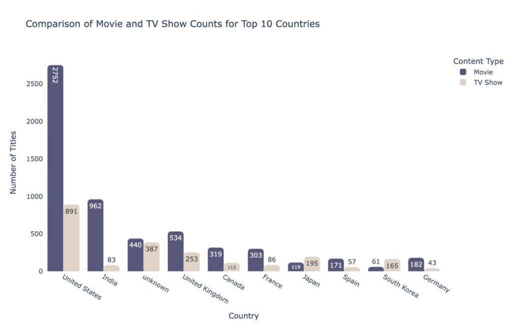
With QuickGraph AI, the AI instantly converts your prompt and data into clear visual charts that can be added directly to reports, presentations, or client dashboards.
This helps teams save time while making reports easier to understand.
One of the biggest reporting mistakes is selecting the wrong visualization.
For example:
Using pie charts for large datasets → hard to read
Using line graphs for non-time data → confusing
Using tables where charts would work better → less engaging
AI tools solve this problem by recommending appropriate visuals based on your data.
For example:
QuickGraph AI helps users generate the right chart instantly without needing design experience.
Business reports often include thousands of rows of raw information.
Manually finding patterns takes time.
An AI chart tool helps by quickly identifying:
For example:
A sales manager reviewing yearly sales performance can instantly visualize:
This makes reports more actionable.
Executives, clients, and stakeholders usually don’t want to read long explanations.
They want fast insights.
AI-generated charts make reports:
Instead of writing:
“Revenue increased from Q1 to Q3 before declining slightly in Q4.”
A simple line chart can communicate that insight in seconds.
That’s why businesses are replacing manual reporting methods with platforms like QuickGraph AI.
Creating charts manually often involves:
This process can take hours every week.
AI automation reduces this workload significantly.
With QuickGraph AI, teams can generate professional charts in minutes instead of spending valuable time on repetitive tasks.
This is especially useful for:
Agencies and consultants often need polished reports for clients.
Poor visuals can make even strong results look unprofessional.
AI chart tools help create:
This improves client trust and helps agencies present data more effectively.
If your team creates frequent client reports, switching to QuickGraph AI can reduce reporting time while improving presentation quality.
Companies want faster reporting systems.
Manual reporting creates:
AI reporting tools solve these issues by offering:
Faster report creation
Better visuals
Easier collaboration
Improved decision-making
Reduced manual effort
This is why AI-powered reporting platforms are becoming essential for modern businesses.
QuickGraph AI is built for teams that need fast, clear, and professional data visuals.
It helps users:
Whether you’re a marketer, analyst, startup founder, educator, or consultant, QuickGraph AI helps you create better reports without spending hours in spreadsheets.
Good reports result in good decision making.
The easier it is to understand your information, the sooner you can take action or make good decisions.
Rather than wasting hours trying to create charts on your own, artificial intelligence such as QuickGraph AI makes it simple.
With frequent reports generated by your team, now would be the perfect time to improve efficiency with AI-driven chart creation.
An AI chart maker automatically converts raw data into charts and graphs for easier reporting and analysis also you can know here what is an AI Chart Maker and how does it work?
QuickGraph AI helps users quickly turn spreadsheets into professional charts for reports, presentations, and dashboards.
Yes, AI-generated charts are commonly used in client reports, presentations, and business meetings.
Yes, startups and small businesses can use QuickGraph AI to save time and create professional reports without hiring data specialists.
Manual chart creation takes time and increases the risk of errors. AI tools make reporting faster, cleaner, and more efficient.