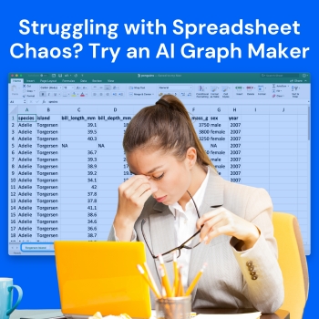
The ability to manage data through spreadsheets breaks down when users attempt to handle increasingly complex and larger datasets. Endless rows and columns create confusion, which prevents users from finding essential information while displaying data needs.
You struggle with messy spreadsheets because they create too much work for you to create charts throughout your day. Every day this issue confronts professionals, students, and businesses. Thank heavens, technology has some smarter help to offer.
An AI Graph Maker organizes raw table spreadsheets into spectacular charts within a matter of seconds parties.This blog shows how AI-powered tools make data visualization easier while decreasing manual work and allowing users to create better decisions.
The list of spreadsheet software provides strong capabilities which become difficult to use when handling extensive unstructured data. The existence of common challenges leads to the disorganized state of spreadsheet operations.
As data accumulates, the process of tracking trends and relationships becomes increasingly challenging. The management of large datasets requires various operations such as filtering and sorting and calculating, which results in a complicated spreadsheet that becomes hard to handle and comprehend.
Creating charts manually needs multiple steps which involve data range selection and chart type selection and label adjustment and format modification. The process becomes repetitive because it requires numerous updates which make it less efficient.
Manual work increases the risk of errors. The selection of incorrect data together with the use of inappropriate chart types and formatting errors will result in misleading insights which will lead to poor decision-making.
Numbers alone do not always tell a clear story. The data needs proper visualization because it makes pattern detection and trend identification and anomaly detection impossible.
An AI graph maker is a tool that uses artificial intelligence to automatically convert raw data into meaningful charts and graphs. The tool creates accurate and well-structured visuals when users input their data or give a prompt instead of building visualizations through manual work.
These tools create an easy user experience for data visualization because they automatically analyze datasets to choose suitable chart types and display the results in a professional and understandable way.
AI graph makers address the key challenges of traditional spreadsheets by automating and optimizing the visualization process.
AI tools can process large datasets in seconds and convert them into charts without requiring manual setup. This allows users to move quickly from raw data to actionable insights.
Choosing the right chart type is crucial for accurate data representation. AI graph makers analyze the structure of the data and automatically select the most suitable visualization, such as bar charts, line graphs, or pie charts.
By minimizing manual input, AI significantly reduces the chances of human error. The data is mapped correctly, and the resulting charts reflect accurate information.
AI-generated charts are clean, well-formatted, and consistent in design. This is especially useful for presentations, reports, and dashboards where visual clarity is important.
Visual representation makes it easier to identify trends, compare values, and draw conclusions. AI graph makers help users understand complex data more effectively.
Below is an example of how an AI graph maker simplifies data visualization. With just a dataset and a simple prompt, you can generate a clear and professional chart instantly.
Prompt:
Visualize annual Netflix Movies vs TV Shows (black/red theme)
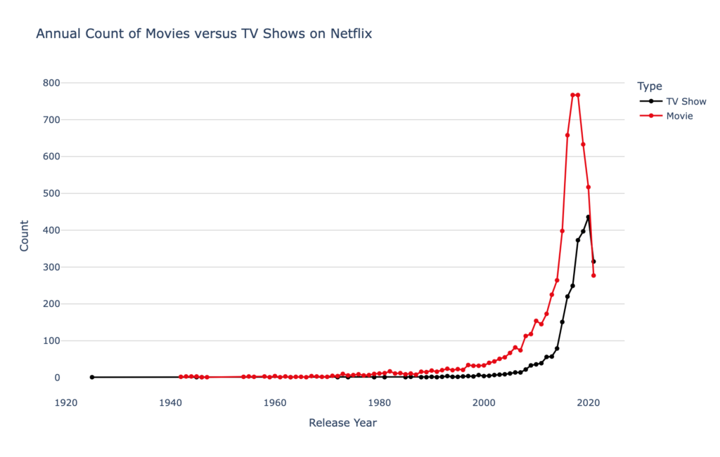
This example demonstrates how AI can not only generate accurate charts but also apply custom styling based on your prompt. Instead of manually designing the chart and adjusting colors, the AI creates a clean, themed visualization instantly.
Such visuals make it easier to compare content trends over time and present insights in a more engaging and professional way.
Adopting an AI-powered approach to data visualization offers several advantages.
Tasks that previously took hours can now be completed in seconds. Users no longer need to spend time formatting charts or adjusting layouts.
AI graph makers are designed to be user-friendly. Even individuals with no technical or design experience can create high-quality charts
Whether you are working with small datasets or large volumes of data, AI tools can handle both efficiently without compromising performance.
Clear and accurate visuals enable faster and more informed decisions. Users can quickly identify key insights and act on them.
The AI graph makers have the uber functionality to be applied in various industries and purposes.
AI helps companies to create charts that are good for perceiving patterns in business performance data and financial records.
So marketers depend on visual data when measuring performance of marketing campaigns, analyzing consumer behavior and tracking their return on investment.
Financial data presents itself as a complex and intricate system. AI graph makers create graphical representations of data which make the information more accessible to people who need to understand it.
Charts are utilized by students and researchers to present their findings, describe their data and back up their arguments.
QuickGraph AI provides an effective method for users to convert their spreadsheet information into professional-grade charts which they can easily generate with their basic spreadsheet skills.
The platform provides users with the ability to generate different graph types within a short time frame because it does not need any design or coding abilities. The platform provides users with a fast and precise experience which they can use to create their work because it meets the needs of both new users and expert users.
Users can create visual representations from their original data through QuickGraph AI which operates with three simple steps to create their visual content which replaces traditional chart creation methods.
Spreadsheet chaos is a common problem, but it does not have to slow you down. The ability to visualize data becomes essential as data gains more importance.
The AI graph maker tool creates a useful solution for users who need to create data visualizations because it automates the entire visualization process. The system produces professional outcomes within seconds because it decreases human work and error chances.
People and organizations can improve their work efficiency through AI-based tools because these tools allow them to concentrate more on discovering insights and making decisions instead of dealing with data presentation and formatting issues.