The process of data analysis appears easy until the charts fail to assist viewers. The professional work of many people results in the creation of graphs which ultimately fail to deliver their intended message. An AI Graph Maker which functions as QuickGraph AI provides valuable assistance in this situation.
You can eliminate common errors from your work by using instant correction tools instead of dealing with disorganized spreadsheets and confusing visual elements.
The Mistake:
The selection of a bar chart fails to present trends effectively which would have been better shown through a line chart. The use of a pie chart becomes inappropriate when there are excessive categories to display.
Why It’s a Problem:
They misread data or miss out on the key insight.
The Fix with an AI Graph Maker:
An AI Graph Maker analyzes your dataset and automatically suggests the best chart type. QuickGraph AI eliminates the need for users to make guesses because it automatically selects the best format to present their story.
The Mistake:
The extensive use of lines, bars, or labels in a single diagram may obscure the whole representation.
Why It’s a Problem:
One could claim that the graph is cluttered and difficult to comprehend.
The Fix:
AI tools simplify your data by focusing on what matters most. The QuickGraph AI tool eliminates all unnecessary elements while it extracts essential information, which results in clear and understandable visual representations.
The Mistake:
No titles, unclear axis labels, or missing units.
Why It’s a Problem:
People don’t understand what they’re looking at.
The Fix:
An AI Graph Maker automatically adds proper labels, titles, and formatting. It ensures every chart is self-explanatory even for someone seeing it for the first time.
The Mistake:
Displaying raw data without highlighting patterns or changes.
Why It’s a Problem:
Important insights stay hidden.
The Fix:
The QuickGraph AI system analyzes data to identify emerging trends while providing the capability to create hybrid visualizations that display bar and line chart data simultaneously. This feature enables users to identify patterns of growth and decline within data sets at an instant.
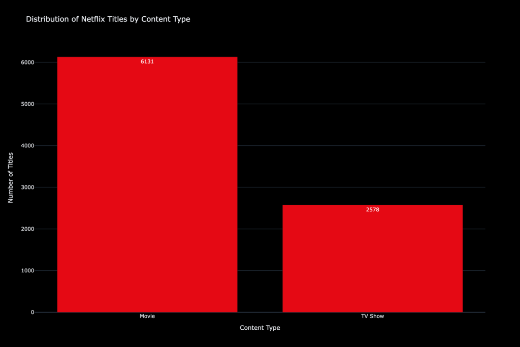
Prompt:
Distribution of Netflix titles by content type (Movie vs TV Show) using a black and red Netflix-inspired color theme.
Generated Output:
The Mistake:
Different colors, fonts, and styles across charts.
Why It’s a Problem:
Your report looks unprofessional and confusing.
The Fix:
An AI Graph Maker keeps everything consistent. QuickGraph AI automatically applies balanced layouts, matching colors, and clean formatting so your visuals look polished without extra effort.
The Mistake:
Incorrect values, wrong scaling, or calculation mistakes.
Why It’s a Problem:
Even small errors can lead to wrong decisions.
The Fix:
AI reduces human error by handling calculations and visualization automatically. With QuickGraph AI, your charts are accurate and reliable, saving you from costly mistakes.
The Mistake:
Manually building charts in spreadsheets for hours.
Why It’s a Problem:
It slows down your workflow and reduces productivity.
The Fix:
An AI Graph Maker generates charts in seconds from a simple prompt or dataset. QuickGraph AI lets you focus on insights instead of wasting time on design.
The AI Graph Maker tool generates graphs through automated processes which analyze your data. The system automatically selects optimal chart patterns while it creates visual designs and emphasizes important information without requiring user input.
QuickGraph AI makes the entire process easier to handle. The system produces professional-quality charts through data input which users provide either as their data or as their prompt.
The answer is yes for most use cases. The system provides benefits because it saves time and decreases mistakes while creating clearer results. The system allows users to implement manual changes whenever they choose to do so.
Yes certainly. No design or data skills are required. AI fulfills all the tasks, including choosing the appropriate chart for you and formatting.
Excel requires manual effort and design decisions. An AI Graph Maker automates everything, making the process faster and easier.
Yes, it supports bar charts, line charts, scatter plots, and more automatically choosing the best one for your data.
Yes, most AI tools, including QuickGraph AI, allow customization after generating the chart.
Reputable tools prioritize data security. Always check the platform’s privacy policy before uploading sensitive data.
Students, analysts, marketers, business owners anyone who works with data can benefit.
Data mistakes are common, but they’re also avoidable. The biggest problem isn’t the data it’s how it’s presented. An AI Graph Maker tool enables users to transform complex data sets into understandable visual displays. QuickGraph AI creates charts while improving your ability to deliver information. And in today’s data-driven world, that’s what really matters. Sign up for QuickGraph AI today and get started instantly.