Charts serve as the most effective method to showcase data in a straightforward manner. The system creates visual representations which allow users to comprehend numerical data with ease. AI Chart Maker enable better communication of information across all types of work, which includes school projects and business documents and research studies.
People continue to create charts through manual methods that involve Microsoft Excel as their primary tool. The process requires users to change labels, repair formatting errors, and choose appropriate chart types. The three steps required to complete the task might appear minor, yet they consume substantial time when executed together.
AI chart makers deliver an efficient and straightforward solution for creating charts through their automatic design process which eliminates the need for detailed formatting work.
Why Manual Chart Creation Is Frustrating?
Creating charts manually requires multiple steps and constant adjustments.
Common challenges include:
- Choosing the wrong chart type
- Fixing label placement
- Adjusting colors and formatting
- Correcting spacing and alignment
- Updating charts when data changes
Even after completing these steps, the chart may still need additional edits. This process can slow down productivity, especially when working with multiple datasets.
Why Charts Are Important for Data?
Charts are essential for turning numbers into insights.
They help users:
- Understand data quickly
- Compare different categories
- Identify patterns and trends
- Present information visually
- Simplify complex datasets
Without charts, large datasets can look overwhelming. A guide for well-designed chart allows readers to understand key insights within seconds.
Common Types of Charts
Different data requires different chart styles.
Some commonly used charts include:
- Bar charts – Compare values between categories
- Line graphs – Show trends over time
- Pie charts – Display proportions of a whole
- Scatter plots – Show relationships between variables
- Histograms – Display data distribution
Choosing the right chart type is important because it affects how clearly the data is presented.
How AI Chart Makers Help?
AI-powered chart tools simplify the entire visualization process.
They can:
- Generate charts automatically
- Recommend the best chart type
- Apply clean layouts and formatting
- Reduce manual editing
- Create visuals in seconds
Instead of spending time fixing formatting issues, users can focus on understanding their data.
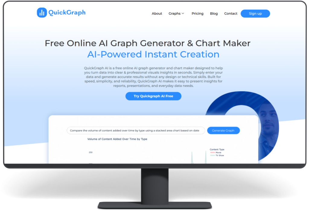
Tools like QuickGraph AI make this process even easier by allowing users to turn raw data into professional charts instantly.
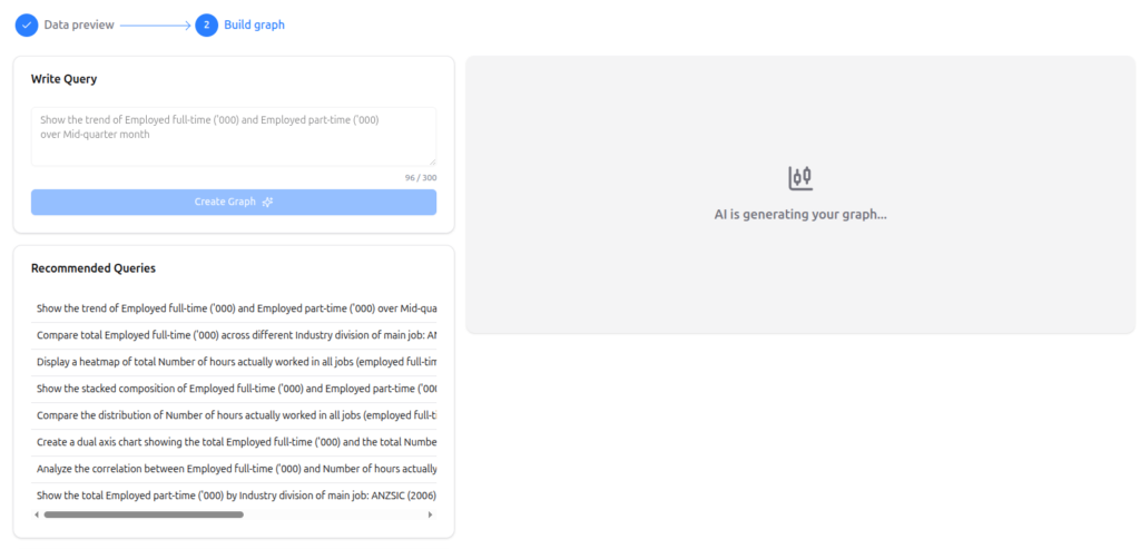
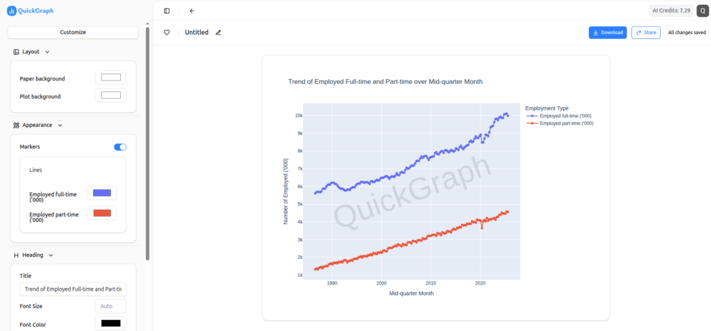
Example of an AI-Generated Chart
Below is an example of a chart created using an AI chart maker. By simply writing a prompt or entering a dataset, the tool automatically generates a clear and well-structured visualization.
Prompt: Create a chart showing risk level for geographic regions

This type of AI-powered chart generation allows users to quickly create professional visuals without spending time on manual formatting or design adjustments.
Advantages of Using AI Chart Makers
AI chart generators offer several benefits compared to traditional methods.
Key advantages include:
- Faster chart creation
- Beginner-friendly interface
- Professional-looking visuals
- Multiple chart types supported
- No installation required
Because these tools work online, users can create charts quickly without installing complicated software.
Who Can Use AI Chart Makers?
AI chart tools are useful for many different users.
They are commonly used by:
- Students creating assignments and projects
- Teachers preparing visual learning materials
- Business professionals making reports and presentations
- Researchers analyzing datasets
- Content creators presenting statistics visually
Anyone who works with data can benefit from faster chart creation.
AI Charts vs Traditional Charts
Traditional chart tools are powerful but often require manual adjustments.
With traditional tools like Google Sheets, users typically need to:
- Manually select chart types
- Adjust formatting settings
- Fix layout and spacing
- Re-edit charts when data updates
AI chart makers automate most of these tasks, making the process faster and easier.
Final Thoughts
The process of creating charts through manual methods requires extensive time and effort because users must complete both the formatting work and the necessary adjustments. The AI chart makers create professional visual representations through their automatic generation of clear graphics.
Users can dedicate their time to data comprehension and presentation instead of working on chart design corrections. QuickGraph AI enables anyone to create valuable charts from their basic numerical data within a few seconds.
The growing significance of data in education and business and research fields has made AI-powered visualization tools essential components of contemporary work processes.