
How to Make Reports Clear with an AI Chart Maker?

The creation of reports should ideally make data easier to understand, but in most cases, reports become complicated due to too many numbers, disorganized spreadsheets, and unclear graphs. An AI Chart Maker helps simplify this process by turning raw data into clear visuals that make reports easier to read and understand.

In making reports for business analysis, marketing dashboards, and customer reports, visuals come in very handy. One such graph generator AI software is QuickGraph AI, where you can easily visualize graphs using the data you have.

Why Most Reports Feel Confusing?

Many reports fail because they focus on showing all data instead of highlighting the most important insights.

Common reporting mistakes include:

  • Adding too many charts in one report
  • Using the wrong chart type
  • Overloading visuals with unnecessary labels
  • Presenting raw spreadsheets instead of summarized insights
  • Spending too much time manually designing charts

For example, a marketing team presenting campaign results may include:

  • Website traffic data
  • Conversion numbers
  • Social media engagement
  • Ad spend reports
  • Revenue tracking

Without proper visuals, these numbers become overwhelming.

A clean report should answer questions like:

  • Which campaign generated the highest ROI?
  • Which channel brought the most traffic?
  • Where did conversions drop?
  • What trends should the team focus on next month?

Clear charts make these answers obvious.

What an AI Chart Maker Does?

An AI chart maker automatically converts raw data into easy-to-understand visual reports.

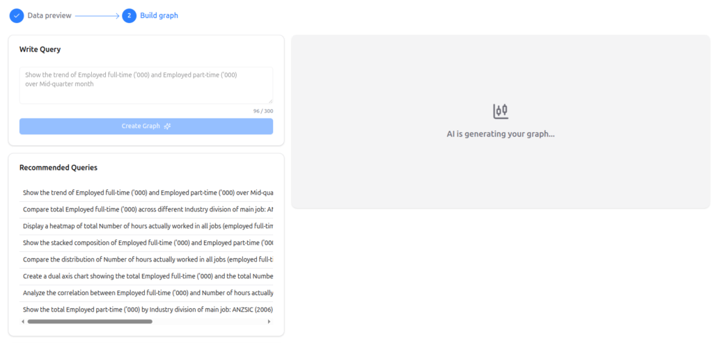
Instead of manually creating graphs in spreadsheets, you can simply upload your data and let AI recommend the best visualization.

With QuickGraph AI, users can:

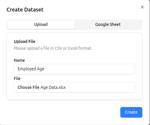
  • Upload spreadsheets instantly
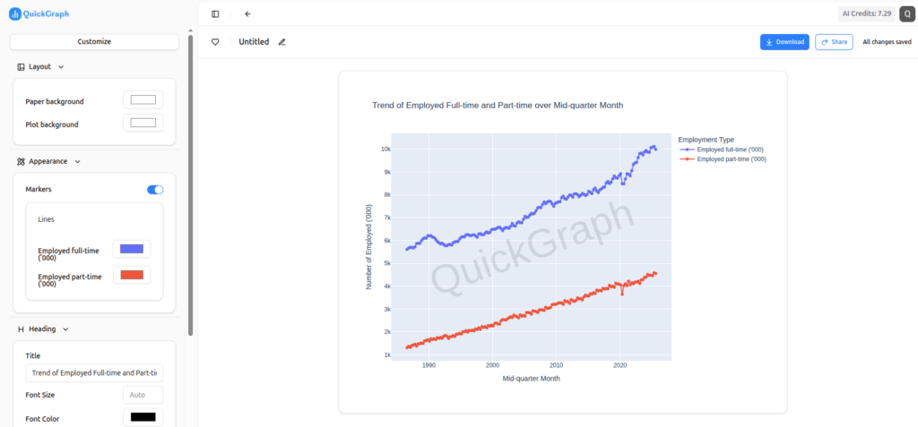
  • Generate charts automatically
  • Create bar graphs, pie charts, line charts, and more
  • Summarize large datasets faster
  • Export visuals for presentations and reports
  • Save hours of manual work

This helps teams focus on analyzing data instead of formatting charts.

Example: Generate a Report Chart with a Simple Prompt

One of the easiest ways to make reports clearer is by generating charts directly from prompts instead of manually creating them in spreadsheets.

For example, you can enter a prompt like:

“movies and TV shows’s share for top 10 countries.”
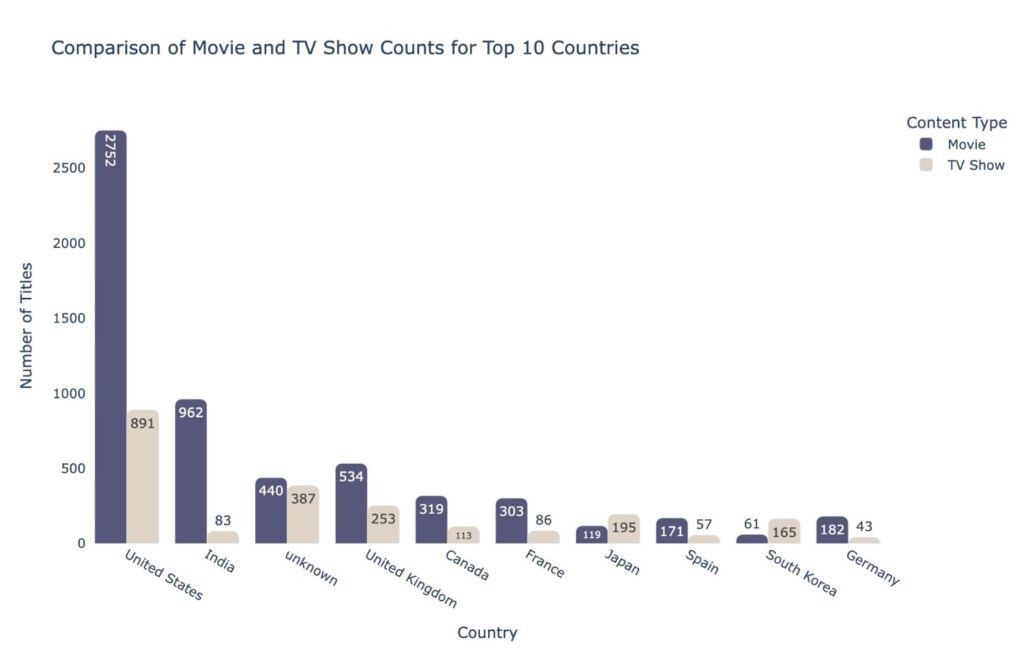
movies and TV shows's share for top 10 countries

With QuickGraph AI, the AI instantly converts your prompt and data into clear visual charts that can be added directly to reports, presentations, or client dashboards.

This helps teams save time while making reports easier to understand.

1. Choose the Right Chart Automatically

One of the biggest reporting mistakes is selecting the wrong visualization.

For example:

Using pie charts for large datasets → hard to read
Using line graphs for non-time data → confusing
Using tables where charts would work better → less engaging

AI tools solve this problem by recommending appropriate visuals based on your data.

For example:

  • Sales comparison → Bar chart
  • Monthly growth trends → Line chart
  • Market share → Pie chart
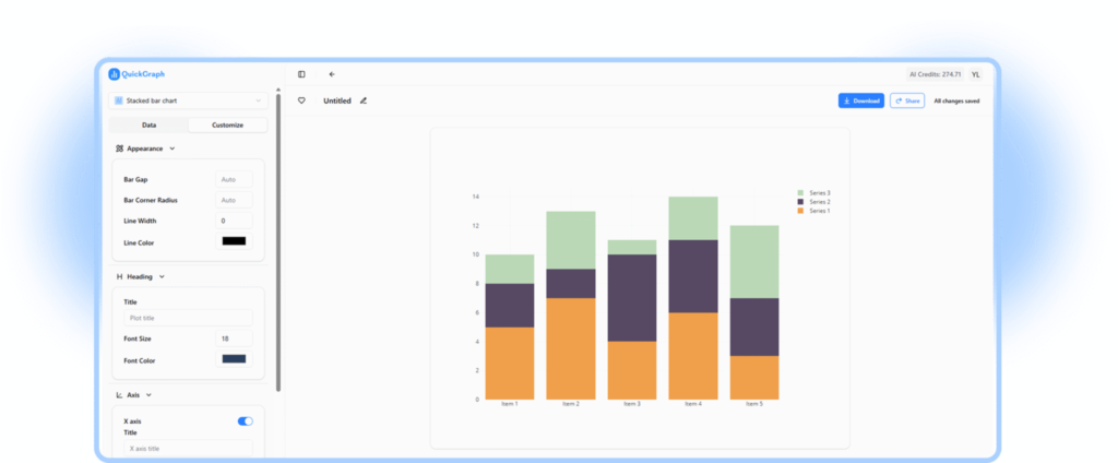
  • Category breakdown → Stacked chart

QuickGraph AI helps users generate the right chart instantly without needing design experience.

2. Summarize Large Datasets Faster

Business reports often include thousands of rows of raw information.

Manually finding patterns takes time.

An AI chart tool helps by quickly identifying:

  • Growth trends
  • Revenue spikes
  • Performance drops
  • Seasonal patterns
  • Outliers

For example:

A sales manager reviewing yearly sales performance can instantly visualize:

  • Best-performing months
  • Weak sales periods
  • Product category performance

This makes reports more actionable.

3. Improve Report Readability

Executives, clients, and stakeholders usually don’t want to read long explanations.

They want fast insights.

AI-generated charts make reports:

  • Cleaner
  • More visual
  • Easier to scan
  • Faster to understand

Instead of writing:

“Revenue increased from Q1 to Q3 before declining slightly in Q4.”

A simple line chart can communicate that insight in seconds.

That’s why businesses are replacing manual reporting methods with platforms like QuickGraph AI.

4. Save Hours on Manual Reporting

Creating charts manually often involves:

  • Cleaning spreadsheet data
  • Selecting chart styles
  • Fixing labels
  • Adjusting colors
  • Exporting visuals

This process can take hours every week.

AI automation reduces this workload significantly.

With QuickGraph AI, teams can generate professional charts in minutes instead of spending valuable time on repetitive tasks.

This is especially useful for:

  • Marketing teams
  • Business analysts
  • Students
  • Consultants
  • Startup founders
  • Financial teams

5. Create Professional Reports for Clients

Agencies and consultants often need polished reports for clients.

Poor visuals can make even strong results look unprofessional.

AI chart tools help create:

  • Clean dashboards
  • Client-ready visuals
  • Presentation charts
  • Monthly performance reports

This improves client trust and helps agencies present data more effectively.

If your team creates frequent client reports, switching to QuickGraph AI can reduce reporting time while improving presentation quality.

Why Businesses Are Switching to AI Chart Tools?

Companies want faster reporting systems.

Manual reporting creates:

  • Delays
  • Errors
  • Inconsistent visuals
  • Higher workload

AI reporting tools solve these issues by offering:

Faster report creation
Better visuals
Easier collaboration
Improved decision-making
Reduced manual effort

This is why AI-powered reporting platforms are becoming essential for modern businesses.

How QuickGraph AI Helps You Create Better Reports?

QuickGraph AI is built for teams that need fast, clear, and professional data visuals.

It helps users:

  • Convert spreadsheets into charts instantly
  • Generate multiple chart formats
  • Create clean visuals for presentations
  • Save time on repetitive reporting tasks
  • Present data clearly to stakeholders

Whether you’re a marketer, analyst, startup founder, educator, or consultant, QuickGraph AI helps you create better reports without spending hours in spreadsheets.

Final Thoughts

Good reports result in good decision making.

The easier it is to understand your information, the sooner you can take action or make good decisions.

Rather than wasting hours trying to create charts on your own, artificial intelligence such as QuickGraph AI makes it simple.

With frequent reports generated by your team, now would be the perfect time to improve efficiency with AI-driven chart creation.

FAQs

1. What is an AI chart maker?

An AI chart maker automatically converts raw data into charts and graphs for easier reporting and analysis also you can know here what is an AI Chart Maker and how does it work?

2. How does QuickGraph AI help with reporting?

QuickGraph AI helps users quickly turn spreadsheets into professional charts for reports, presentations, and dashboards.

3. Can I use AI-generated charts for client presentations?

Yes, AI-generated charts are commonly used in client reports, presentations, and business meetings.

4. Is QuickGraph AI suitable for small businesses?

Yes, startups and small businesses can use QuickGraph AI to save time and create professional reports without hiring data specialists.

5. Why should businesses switch from manual chart creation?

Manual chart creation takes time and increases the risk of errors. AI tools make reporting faster, cleaner, and more efficient.
7 Ways to Simplify Data with an AI Graph Maker  

The current data-driven environment requires organizations to develop efficient methods for processing complex information because rapid comprehension of such information has become essential. The ability to produce results requires you to have more than basic information because your work requires advanced skills. The situation demands better understanding of all aspects this is where an AI graph maker plays a role by transforming complex data into clear, actionable insights quickly.

We will show 7 effective methods which an AI graph maker uses to make data analysis easier while explaining why QuickGraph AI has become a necessary tool in today’s work environments.

1. Instantly Convert Raw Data into Visual Insights

The main difficulty of working with data arises because people need to convert numerical information into useful insights. The presence of numerous rows and columns in tables creates visual challenges that make comprehension difficult.

With QuickGraph AI you upload your dataset and the system creates the best matching visual representation which includes either bar graphs or line charts or pie charts.

Instead of asking:

  • “What does this data mean?”

You can immediately see:

  • Trends
  • Patterns
  • Comparisons

This instant visualization saves time and removes guesswork.

2. Eliminate Manual Chart Creation

Traditional tools like spreadsheets require multiple steps:

  • Selecting data
  • Choosing chart types
  • Formatting axes
  • Adjusting labels

In addition to being inaccurate, this method is slow.

The QuickGraph AI system handles all tasks through its complete automation capability. The system selects appropriate chart types through automatic selection while it applies professional design standards to the generated output. The following statement clarifies our previous explanation:

  • No formatting headaches
  • No design skills required
  • No wasted time

You focus on insights, not setup.

3. Reduce Human Errors in Data Visualization

Manual data handling often leads to mistakes:

  • Incorrect axis labels
  • Missing data points
  • Misleading chart formats

These errors can lead to wrong conclusions.

An AI graph maker like QuickGraph AI minimizes these risks by:

  • Validating your dataset
  • Choosing appropriate visualization types
  • Ensuring consistency in presentation

This results in more accurate and trustworthy insights.

4. Simplify Complex Data for Better Understanding

Large datasets can be intimidating. AI graph maker break down complexity into easy-to-understand visuals.

For example:

  • A 12-month revenue dataset becomes a simple trend line
  • Market share data becomes a clear pie chart
  • Growth comparisons turn into intuitive bar graphs

QuickGraph AI helps you communicate complex ideas in a way that anyone can understand—even without a technical background.

5. Improve Decision-Making Speed

In business and analytics, speed matters. The faster you understand your data, the faster you can act.

QuickGraph AI enables:

  • Real-time visualization
  • Quick comparisons across datasets
  • Immediate identification of trends

This allows teams to:

Instead of waiting hours for reports, you get insights in seconds.

6. Create Professional-Quality Charts Effortlessly

Presentation matters. Whether you’re sharing data in a report, presentation, or social media post, your visuals need to look clean and professional.

QuickGraph AI automatically generates:

  • Well-structured charts
  • Balanced layouts
  • Clear labels and formatting

This ensures your visuals are:

  • Easy to read
  • Visually appealing
  • Ready to share instantly

You don’t need a designer AI handles the aesthetics for you.

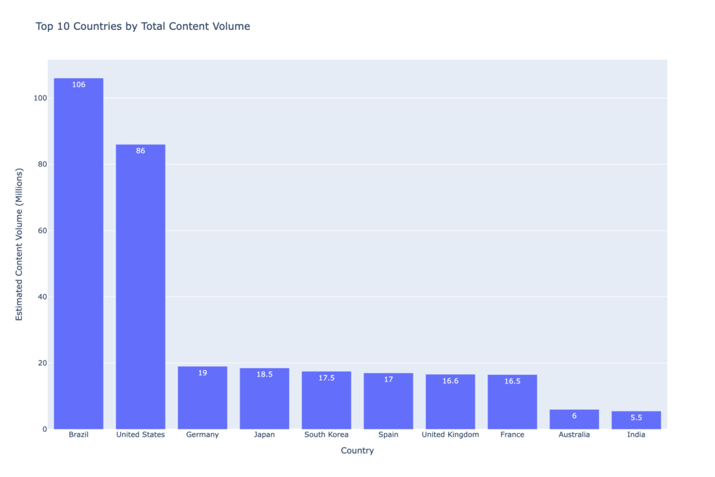
Example: Creating a Chart with a Simple Prompt

Instead of manually selecting chart types and formatting data, you can simply use a prompt like:

“Top 10 countries by total content volume.”

QuickGraph AI instantly generates a clean and professional graph based on this input.

7. Save Time and Boost Productivity

Time is one of the most valuable resources, especially when working with data regularly.

By using QuickGraph AI, you can:

  • Skip repetitive tasks
  • Automate visualization workflows
  • Focus on analysis instead of formatting

What used to take hours can now be done in minutes.

This efficiency is especially useful for:

  • Business analysts handling reports
  • Students working on assignments
  • Marketers tracking performance metrics

Why Choose QuickGraph AI?

While there are many tools available, QuickGraph AI stands out because it combines:

  • Speed
  • Accuracy
  • Simplicity

It’s designed for users who want powerful results without a steep learning curve. Whether you’re working with small datasets or complex analytics, it adapts to your needs and delivers clear, actionable visuals.

Final Thoughts

Data doesn’t have to be complicated. With the right tools, it becomes a powerful asset rather than a burden.

An AI graph maker like QuickGraph AI helps you:

  • Understand data faster
  • Communicate insights clearly
  • Make smarter decisions

You should improve your work routine because you continue to create charts by hand and face difficulties with spreadsheets. You should delegate your challenging tasks to AI while you concentrate on discovering essential information and implementing necessary steps.

FAQs

1. What is an AI graph maker?

The AI graph maker tool creates visual charts from raw data through its automated process which uses artificial intelligence technology to handle the task without human intervention while increasing precision of results.

2. How does QuickGraph AI simplify data?

QuickGraph AI analyses your data for you and produces a clear, professional-looking chart with well-integrated and instantly comprehensible graphs, making it easy for you to understand trends and patterns.

3. Do I need technical skills to use QuickGraph AI?

The design of QuickGraph AI enables all users to operate the software without any difficulties. Users who lack technical expertise or design experience can create charts.

4. Can AI graph makers handle large datasets?

QuickGraph AI and other graph maker tools are aimed towards handling and visualizing datasets from small to large.

5. Why should I use an AI graph maker instead of traditional tools?

The use of AI graph makers leads to time savings and decreased error rates while generating superior visualizations that surpass the capabilities of spreadsheet software.

How to Spot Data Trends Fast with an AI Graph Maker?

The current work environment of data analytics requires users to process information with the same speed as they need to achieve precise results. The ability to identify trends through quick assessments becomes a critical asset for business performance analysis, user behavior monitoring, and report creation. An AI Graph Maker helps streamline this process by automating visualization and reducing manual effort. Traditional tools require users to complete manual tasks, which results in formatting problems and extends the time needed to produce charts.

The AI Graph Maker QuickGraph AI creates a new way to visualize data.

Why Trend Detection Matters?

The data patterns require analysis because they reveal fundamental business information. The sales figures experience sudden increases which are followed by continuous customer engagement drops and seasonal sales patterns that control important business decisions. The speed of your signal detection process directly determines your response time.

However, spotting trends manually often involves:

  • Cleaning and organizing datasets
  • Choosing the right chart type
  • Adjusting formatting and labels
  • Interpreting visuals

These steps not only take time but also increase the risk of human error.

How an AI Graph Maker Speeds Things Up?

The AI Graph Maker enables complete process handling through its automated functions for creating charts and conducting analysis. You can create distinct visual content because the system generates professional graphs within a few seconds.

1. Instant Data Visualization

The system automatically selects the most suitable graph type when users input their dataset into QuickGraph AI. The AI system selects appropriate visualizations when it needs to choose between time-series data and comparison needs, which includes line charts and bar graphs.

This eliminates guesswork and allows you to focus directly on interpreting trends.

2. Automatic Pattern Recognition

AI doesn’t just create charts it helps highlight patterns. It can quickly identify:

  • Upward or downward trends
  • Sudden spikes or drops
  • Seasonal patterns
  • Outliers

Instead of scanning rows of numbers, you get a visual summary that makes trends obvious at a glance.

3. Reduced Human Error

Manual chart creation often leads to mistakes—wrong axis labels, incorrect data selection, or misleading visuals. An AI Graph Maker minimizes these risks by handling the technical details automatically.

This ensures your insights are based on accurate and reliable visuals.

4. Faster Decision-Making

When trends are easy to spot, decisions become faster and more confident. Businesses can:

  • Adjust strategies in real-time
  • Identify opportunities early
  • Respond to risks before they escalate

Speed is critical, and AI-driven tools provide that edge.

Practical Example

Imagine you’re analyzing monthly website traffic. Traditionally, you would:

  1. Import data into a spreadsheet
  2. Select a chart type
  3. Customize labels and formatting
  4. Review the graph for trends

With QuickGraph AI, you simply upload the dataset, and within seconds, you see a clean visualization showing growth patterns, dips, and peaks.

Instead of manually creating charts, you can simply enter a prompt like:

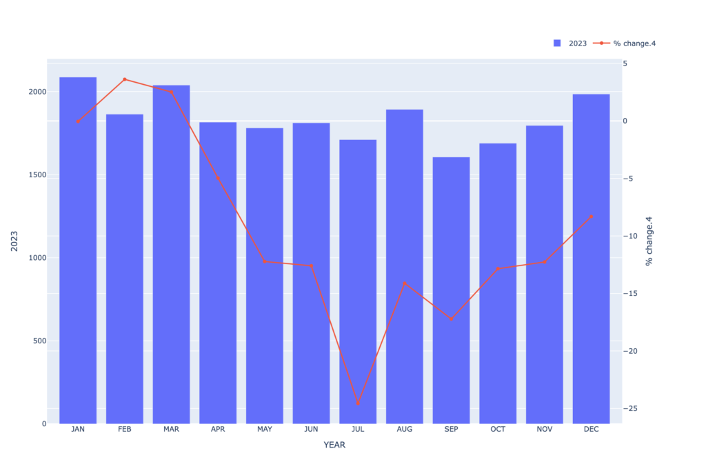
“Compare the 2023 values as bars and their corresponding percentage change from the baseline as a line across all months..”

the AI Graph Maker

Within seconds, the AI Graph Maker generates a clean, professional chart that highlights key trends, spikes, and patterns automatically.

What used to take 20–30 minutes now takes less than a minute.

Key Features to Look for in an AI Graph Maker

Not all tools are created equal. When choosing an AI Graph Maker, consider these features:

Smart Chart Selection

The tool should automatically choose the best visualization based on your data type.

Clean and Readable Design

Clarity is essential. Graphs should be easy to understand without extra adjustments.

Real-Time Processing

Fast generation ensures you can analyze data on the go.

Customization Options

While automation is important, having the ability to tweak charts adds flexibility.

QuickGraph AI combines all these features, making it a strong choice for anyone looking to streamline data analysis.

Who Can Benefit?

An AI Graph Maker is useful across multiple roles:

  • Marketers tracking campaign performance
  • Analysts working with large datasets
  • Students learning data visualization
  • Business owners making data-driven decisions

No matter your level of expertise, AI simplifies complex data into actionable insights.

The Future of Data Analysis

The rising volume of data will create operational challenges for manual methods which will reach their maximum capacity during upcoming months. The modern workplace needs AI-powered tools because they deliver essential benefits that extend beyond their use as basic tools.

Using the AI Graph Maker QuickGraph AI helps you save time while you enhance your ability to understand and use data.

Conclusion

QuickGraph AI achieves exceptional performance through its combination of rapid processing and precise results and user-friendly operations. You can concentrate on your essential work of trend analysis and decision-making when you use this tool because it eliminates the need to navigate through spreadsheets.

Businesses that operate in today’s data-driven environment must implement AI Graph Maker technology as their essential growth strategy.

Why Analysts Are Switching to AI Graph Maker Tools?

The current data-driven world presents analysts with excessive data which exceeds their ability to manage it. The real challenge of data analysis emerges when analysts attempt to convert their spreadsheets and complex datasets into understandable and practical insights. The process of making charts and graphs through traditional methods creates delays in this workflow.

The increasing number of analysts who adopt AI graph maker tools demonstrates their value to QuickGraph AI. The data visualization tools from these platforms enable users to enhance their productivity while creating new methods for displaying and understanding information.

The Problem with Traditional Chart Creation

Analysts have used manual tools since they began analyzing data which includes spreadsheets and advanced visualization programs. The tools provide strong capabilities but present multiple operational difficulties which include:

  • Time-consuming setup
  • Manual formatting and adjustments
  • Choosing the right chart type
  • Risk of human errors
  • Difficulty in explaining insights clearly

Analysts who possess expertise need to spend several hours on chart improvements which should require only a few minutes. This issue becomes critical when projects have approaching deadlines.

What’s Changing with AI Graph Maker Tools?

The design of AI graph makers enables users to create visual data representations without facing any obstacles. Users need to input their data or describe their requirements instead of selecting chart types and formatting axes and adjusting layouts.

Tools like QuickGraph AI allow analysts to:

  • Generate charts instantly using prompts
  • Automatically choose the best visualization type
  • Apply clean, professional styling
  • Reduce errors in interpretation
  • Focus more on insights rather than design

The name of the shift is one of convenience or comfort but of efficacy and intelligibility.

Scenario 1: Tight Deadlines in Business Reporting

Imagine an analyst working on a monthly performance report. The dataset is ready, but creating multiple charts for revenue, growth trends, and customer behavior takes hours.

With an AI graph maker, the same analyst can input prompts like:

Example Prompt:
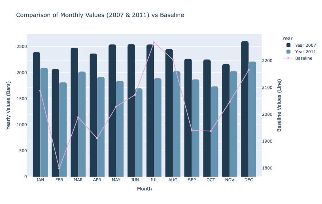
“Draw a dual chart comparing baseline, 2007 and 2011.”

Within seconds, QuickGraph AI generates a clear dual comparison chart, making it easy to analyze differences across time periods without manually building multiple visuals.

This saves valuable time and allows the analyst to focus on interpreting results rather than building visuals.

Scenario 2: Non-Designers Creating Professional Charts

Not every analyst has a design background. Many struggle with making charts look visually appealing and easy to understand.

AI tools solve this by automatically applying best practices in visualization:

  • Proper spacing and alignment
  • Clear labels and titles
  • Color consistency
  • Readable layouts

With QuickGraph AI, even beginners can create charts that look presentation-ready without needing design skills.

Scenario 3: Reducing Human Errors

Manual chart creation often leads to small but critical mistakes:

  • Incorrect data selection
  • Misaligned axes
  • Wrong chart types
  • Inconsistent formatting

These errors can mislead decision-making.

AI graph makers reduce these risks by automating the process. The system analyzes the data and suggests the most accurate visualization, ensuring consistency and correctness.

Scenario 4: Faster Decision-Making

In many industries, speed matters. Whether it’s finance, marketing, or operations, decisions often depend on how quickly insights are presented.

AI graph tools enable real-time visualization. Analysts can instantly generate charts during meetings or discussions, making it easier to:

  • Explain trends
  • Highlight key metrics
  • Support arguments with visuals

This leads to faster and more confident decision-making.

Scenario 5: Handling Complex Data Easily

Large datasets with multiple variables can be difficult to visualize manually. Choosing the right chart type becomes confusing.

AI tools simplify this by analyzing the structure of the data and automatically selecting the most suitable format whether it’s a scatter plot, bar chart, or line graph.

With QuickGraph AI, users don’t need to overthink technical decisions. The tool does the heavy lifting.

Why Analysts Prefer AI Over Traditional Tools

The shift toward AI graph makers is not just a trend it’s a practical choice driven by real benefits:

1. Time Efficiency

What once took hours can now be done in seconds.

2. Ease of Use

No steep learning curve or technical expertise required.

3. Accuracy

Reduced chances of manual errors.

4. Better Communication

Clear and visually appealing charts improve understanding.

5. Scalability

Handle large and complex datasets effortlessly.

The Role of QuickGraph AI in This Shift

Among the growing number of AI tools, QuickGraph AI stands out by focusing on simplicity and speed. It is designed specifically for users who want quick, reliable, and high-quality visualizations without complications.

Instead of navigating multiple settings, users can simply describe their needs. The tool transforms that input into a clean, meaningful chart almost instantly.

This makes it ideal for:

  • Business analysts
  • Students and researchers
  • Marketers
  • Startup teams

Anyone who works with data can benefit from this approach.

The Future of Data Visualization

As AI continues to evolve, the way we interact with data will become even more intuitive. Analysts will spend less time on technical tasks and more time on strategy and insights.

AI graph maker tools are just the beginning of this transformation.

The future is not about replacing analysts it’s about empowering them.

Conclusion

Analysts have started using AI graph creation tools because these tools resolve actual problems which include their need to work within time limits and handle complicated tasks and present their results in understandable ways. QuickGraph AI enables users to spend their time on essential tasks which involve understanding and presenting their research findings because it automates repetitive work associated with data visualization.

The current situation requires organizations to implement advanced technological solutions because data volumes continue to expand at unprecedented rates. The organization requires advanced tools because they have become critical to their operations.

AI graph creation software has emerged as the preferred solution for organizations.

Still Fixing Charts Manually? Try an AI Chart Maker! 

Charts serve as the most effective method to showcase data in a straightforward manner. The system creates visual representations which allow users to comprehend numerical data with ease. AI Chart Maker enable better communication of information across all types of work, which includes school projects and business documents and research studies. 

People continue to create charts through manual methods that involve Microsoft Excel as their primary tool. The process requires users to change labels, repair formatting errors, and choose appropriate chart types. The three steps required to complete the task might appear minor, yet they consume substantial time when executed together. 

AI chart makers deliver an efficient and straightforward solution for creating charts through their automatic design process which eliminates the need for detailed formatting work. 

Why Manual Chart Creation Is Frustrating?

Creating charts manually requires multiple steps and constant adjustments. 

Common challenges include: 

  • Choosing the wrong chart type
  • Fixing label placement 
  • Adjusting colors and formatting 
  • Correcting spacing and alignment 
  • Updating charts when data changes 

Even after completing these steps, the chart may still need additional edits. This process can slow down productivity, especially when working with multiple datasets. 

Why Charts Are Important for Data?

Charts are essential for turning numbers into insights. 

They help users: 

  • Understand data quickly 
  • Compare different categories 
  • Identify patterns and trends 
  • Present information visually 
  • Simplify complex datasets 

Without charts, large datasets can look overwhelming. A guide for well-designed chart allows readers to understand key insights within seconds. 

Common Types of Charts

Different data requires different chart styles. 

Some commonly used charts include: 

  • Bar charts – Compare values between categories 
  • Line graphs – Show trends over time 
  • Pie charts – Display proportions of a whole 
  • Scatter plots – Show relationships between variables 
  • Histograms – Display data distribution 

Choosing the right chart type is important because it affects how clearly the data is presented. 

How AI Chart Makers Help?

AI-powered chart tools simplify the entire visualization process. 

They can: 

  • Generate charts automatically 
  • Recommend the best chart type 
  • Apply clean layouts and formatting 
  • Reduce manual editing 
  • Create visuals in seconds 

Instead of spending time fixing formatting issues, users can focus on understanding their data. 

Tools like QuickGraph AI make this process even easier by allowing users to turn raw data into professional charts instantly. 

Example of an AI-Generated Chart

Below is an example of a chart created using an AI chart maker. By simply writing a prompt or entering a dataset, the tool automatically generates a clear and well-structured visualization.

Prompt: Create a chart showing risk level for geographic regions

This type of AI-powered chart generation allows users to quickly create professional visuals without spending time on manual formatting or design adjustments.

Advantages of Using AI Chart Makers 

AI chart generators offer several benefits compared to traditional methods. 

Key advantages include: 

  • Faster chart creation 
  • Beginner-friendly interface 
  • Professional-looking visuals 
  • Multiple chart types supported 
  • No installation required 

Because these tools work online, users can create charts quickly without installing complicated software. 

Who Can Use AI Chart Makers?

AI chart tools are useful for many different users. 

They are commonly used by: 

  • Students creating assignments and projects 
  • Teachers preparing visual learning materials 
  • Business professionals making reports and presentations 
  • Researchers analyzing datasets 
  • Content creators presenting statistics visually 

Anyone who works with data can benefit from faster chart creation. 

AI Charts vs Traditional Charts

Traditional chart tools are powerful but often require manual adjustments. 

With traditional tools like Google Sheets, users typically need to: 

  • Manually select chart types 
  • Adjust formatting settings 
  • Fix layout and spacing 
  • Re-edit charts when data updates 

AI chart makers automate most of these tasks, making the process faster and easier. 

Final Thoughts

The process of creating charts through manual methods requires extensive time and effort because users must complete both the formatting work and the necessary adjustments. The AI chart makers create professional visual representations through their automatic generation of clear graphics. 

Users can dedicate their time to data comprehension and presentation instead of working on chart design corrections. QuickGraph AI enables anyone to create valuable charts from their basic numerical data within a few seconds. 

The growing significance of data in education and business and research fields has made AI-powered visualization tools essential components of contemporary work processes. 

When Should You Use an AI Graph Maker Instead of Traditional Tools?  

Graph creation stands as an essential data analysis task. Graphs serve as effective tools for presenting numerical data in business reports and school projects and marketing analyses and sales presentations. 

People have used standard tools like spreadsheets and manual chart software to create graphs throughout history. The tools maintain their functionality. However, AI graph maker have introduced a new method for data visualization which has transformed our data presenting methods. 

1. When You Want to Save Time 

Traditional tools require multiple steps: 

  • Enter data manually 
  • Select chart type 
  • Adjust labels 
  • Fix formatting 
  • Check errors 

This process can take a lot of time. 

If you are working under deadlines, an AI graph maker like QuickGraph AI can create charts in seconds. You simply upload your data or type a prompt, and the tool generates the graph automatically. 

If speed matters → choose AI. 

2. When You’re Not Sure Which Graph to Use 

Many people struggle with choosing the correct chart type. 

Should it be: 

  • Bar graph? 
  • Line chart? 
  • Pie chart? 
  • Scatter plot? 

Using the wrong graph can confuse your audience. 

An AI graph maker studies your data pattern and suggests the best visualization automatically. This removes guesswork and improves clarity. 

If you feel confused about chart selection → choose AI. 

3. When You Want Fewer Errors 

Manual graph creation often leads to: 

  • Wrong scaling 
  • Missing labels 
  • Data entry mistakes 
  • Formatting problems 

Even small mistakes can change the meaning of your data. 

AI tools reduce these risks because they analyze and organize data automatically before generating the graph. 

If accuracy is important → choose AI. 

4. When You Need Professional-Looking Graphs 

Traditional tools sometimes create basic or outdated designs unless you manually customize everything. 

AI graph makers create clean, modern, and visually appealing charts instantly. 

This is useful for: 

  • Client presentations 
  • Investor meetings 
  • Business dashboards 

If you want your reports to look premium → choose AI. 

5. When You Want to Convert Text Into a Graph 

One powerful feature of AI tools is text-to-graph creation. 

For example, you can type: 
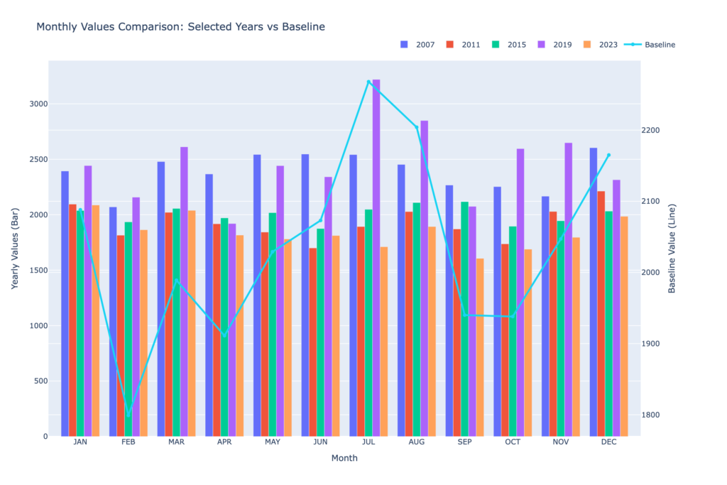
“Compare the monthly values for 2007, 2011, 2015, 2019, and 2023 using bars, while overlaying the Baseline as a line graph.” 

And the tool will generate the graph automatically. 

Traditional tools cannot understand text instructions. You must manually create everything. 

If you prefer simple text commands → choose AI. 

6. When You Work With Large or Complex Data 

Handling large datasets in traditional tools can feel overwhelming. 

Sorting, filtering, and analyzing data manually takes effort. 

AI graph makers help by: 

  • Detecting patterns 
  • Highlighting trends 
  • Identifying outliers 
  • Suggesting insights 

This makes data analysis smarter and easier. 

If your data is complex → choose AI. 

7. When You Want Better Productivity 

Business owners, marketers, and analysts need fast reporting. 

Using traditional tools repeatedly can slow down workflow. 

AI tools like QuickGraph AI help teams: 

  • Generate reports faster 
  • Share visualizations easily 
  • Improve collaboration 
  • Focus more on strategy instead of formatting 

If productivity matters → choose AI. 

8. When Should You Still Use Traditional Tools? 

AI graph makers are powerful, but traditional tools are still useful in some cases: 

  • When you need deep manual customization 
  • When working offline without internet 
  • When following strict company software policies 
  • When making very simple, basic charts 

If your needs are very basic and you enjoy manual control, traditional tools may still work. 

AI Graph Maker vs Traditional Tools: Quick Comparison 

Feature AI Graph Maker Traditional Tools 
Speed Very fast Slower 
Chart Suggestions Automatic Manual selection 
Error Reduction High Depends on user 
Design Quality Modern & clean Basic unless customized 
Ease of Use Beginner-friendly Requires knowledge 

AI focuses on automation and smart decisions. 
Traditional tools depend fully on user skills. 

Why More Businesses Are Switching to AI 

Companies today want: 

  • Faster insights 
  • Clear reports 
  • Strong presentations 
  • Better decision-making 

AI graph makers help businesses stay competitive. Instead of spending hours creating charts, teams can focus on analyzing results and planning growth. 

Tools like QuickGraph AI are designed to make data visualization simple for everyone not just experts. 

Final Thoughts 

You should use an AI graph maker instead of traditional tools when: 

  • You want to save time 
  • You are unsure about chart selection 
  • You want fewer mistakes 
  • You need professional visuals 
  • You work with large datasets 
  • You want better productivity 

Traditional tools are not outdated, but AI makes the process smarter and faster. 

In today’s fast-moving world, smart tools give you an advantage. 

If you want better graphs, better insights, and better results switching to an AI graph maker like QuickGraph AI is a smart move. 

What Is an AI Chart Maker and How Does It Work?  

An AI chart maker is a smart data visualization tool that uses artificial intelligence to convert raw data into clear, accurate charts automatically. QuickGraph AI provides tools that create professional charts within seconds because it analyzes your data without requiring you to select chart types or format axes or change design elements. 

What Problems Do Traditional Chart-Making Methods Have? 

The process of creating charts requires time and effort and technical skills when people use traditional spreadsheet software and design software to create their charts. Users must choose the appropriate chart type for their data needs while performing data cleaning and axis labeling and visual element modifications. The following challenges occur frequently in work situations: 

Common challenges include: 

  • Time-consuming setup 
  • Incorrect chart selection 
  • Poor readability 
  • Lack of design consistency 
  • Steep learning curve for beginners 

Work processes become delayed through these problems which result in visual outcomes that either confuse users or present false information. 

How an AI Chart Maker Solves These Problems

The AI chart maker simplifies chart creation because it handles all the necessary tasks for making charts. The system automatically detects data patterns which enables it to choose appropriate visual representations while maintaining design standards. 

QuickGraph AI provides users with three main advantages which help them discover insights without needing to work on their presentation. 

How Does an AI Chart Maker Work? Step-by-Step 

1. Data Input and Understanding 

The process starts when users provide data. This can be done by: 

  • Uploading files (CSV, Excel) 
  • Pasting raw data 
  • Entering text-based data descriptions 

The AI scans the dataset to understand values, categories, trends, and relationships. 

2. Data Cleaning and Structuring 

AI automatically detects inconsistencies such as: 

  • Missing values 
  • Duplicate entries 
  • Incorrect formatting 

It organizes the data into a structured format, ensuring charts are accurate and easy to read. 

3. Smart Chart Type Selection 

One of the biggest advantages of AI chart makers is automatic chart selection. Based on the data type, the AI decides whether a: 

  • Bar chart 
  • Line chart 
  • Pie chart 
  • Scatter plot 
  • Comparison chart 

will best represent the information. 

With QuickGraph AI, this decision happens instantly, removing guesswork. 

4. Visual Design and Styling 

After selecting the chart type, the AI applies: 

  • Balanced spacing 
  • Clear labels 
  • Readable scales 
  • Consistent colors 

The goal is clarity, not decoration. Charts are designed to be presentation-ready without manual styling. 

5. Real-Time Chart Generation 

Once everything is processed, the chart is generated instantly. If users update the data, the chart refreshes automatically saving time during revisions and updates. 

6. Export and Sharing Options 

AI chart makers allow users to download or embed charts easily. Charts can be used in: 

  • Reports 
  • Blogs 
  • Presentations 
  • Social media 
  • Websites 

QuickGraph AI ensures charts remain sharp and readable across platforms. 

Key Features of an AI Chart Maker 

An advanced AI chart maker typically offers: 

  • Automatic data analysis 
  • Smart chart recommendations 
  • Instant visualization 
  • Minimal manual input 
  • Consistent design quality 

QuickGraph AI is built specifically to deliver fast and accurate results without requiring design or technical skills. 

Who Should Use an AI Chart Maker? 

AI chart makers are useful across industries and roles, including: 

  • Students creating assignments 
  • Marketers analyzing campaign performance 
  • Business owners reviewing growth data 
  • Analysts presenting insights 
  • Content creators visualizing statistics 

Anyone working with data can benefit from faster, clearer chart creation. 

Benefits of Using QuickGraph AI 

Using QuickGraph AI offers several advantages: 

  • Saves time by automating chart creation 
  • Reduces errors caused by manual formatting 
  • Improves data clarity and understanding 
  • Requires no design or technical expertise 
  • Produces professional visuals instantly 

This makes it ideal for users who want results without complexity. 

Why AI Chart Makers Are the Future of Data Visualization?

As data volumes grow, manual chart creation becomes inefficient. The future of chart creation will use AI chart makers because they deliver fast results with precise outcomes and simple operation. The software enables users to concentrate on making decisions instead of spending time on design activities. 

Tools like QuickGraph AI demonstrate how artificial intelligence can simplify complex workflows and make data visualization accessible to everyone. 

How to Create AI Charts Faster and More Accurately?

The process of creating charts by hand requires both time and physical work which results in errors during data visualization. The current digital environment demands both accurate results and rapid performance more than any previous time period. The AI Chart Maker is really significant for a paradigm shift in data visualization. This will help you turn raw data into professionally made charts in seconds. 

Students, marketers, business owners, and analysts can enhance their work efficiency and data precision through the use of an AI Chart Maker. The following guide provides users with detailed instructions to create AI charts with increased speed and improved precision. The guide provides step-by-step instructions which help users to create AI charts at a faster pace and better accuracy. 

Step 1: Prepare Your Data Clearly 

Before using any AI Chart Maker, your data must be clean and organized. AI works best when it receives structured input. 

Make sure: 

  • Data is arranged in rows and columns 
  • Headers are clearly defined 
  • There are no unnecessary symbols or blank rows 
  • Numbers are formatted correctly 

Clean data allows the AI Chart Maker to understand patterns quickly and generate accurate visualizations without errors. 

Step 2: Choose the Right AI Chart Maker Tool 

Not all tools provide the same level of accuracy or automation. A good AI Chart Maker should: 

  • Support multiple chart types (bar, line, pie, scatter, etc.) 
  • Automatically suggest the best chart based on your data 
  • Allow quick edits and customization 
  • Export charts in high quality 

Choosing the right AI Chart Maker saves time and ensures your charts look professional and reliable. 

Step 3: Upload or Paste Your Data 

Once your data is ready, upload or paste it into the AI Chart Maker. Most AI-powered tools instantly analyze the dataset. 

At this stage, the AI: 

  • Reads data patterns 
  • Detects trends and relationships 
  • Understands numeric and categorical values 

This automation removes the need for manual calculations and chart selection. 

Step 4: Let AI Select the Best Chart Type 

One of the biggest advantages of using an AI Chart Maker is smart chart selection. Instead of guessing which chart works best, AI automatically recommends the most suitable option. 

For example: 

  • Comparisons → Bar charts 
  • Trends over time → Line charts 
  • Percentage distribution → Pie charts 

This step improves accuracy and ensures your data is presented in the most meaningful way. 

Step 5: Customize the Chart for Better Clarity 

Even though AI handles most of the work, small customizations improve readability and user engagement. 

You can: 

  • Edit chart titles and labels 
  • Adjust axis names 
  • Modify values or categories 
  • Reorder data points 

A good AI Chart Maker allows quick edits without breaking the data structure. 

Step 6: Review Data Accuracy Carefully 

AI reduces errors, but reviewing the final output is still important. Check: 

  • Values match your original data 
  • Labels are correct 
  • No missing or duplicated information 

This step ensures the AI Chart Maker has interpreted your data correctly and that your chart is fully accurate. 

Step 7: Export and Use Your AI Chart 

Once finalized, export your chart in the required format. Most AI Chart Makers support: 

  • PNG or JPG for blogs and websites 
  • PDF for reports 
  • SVG for high-quality designs 
  • Embedding options for presentations 

This flexibility makes AI charts perfect for content marketing, assignments, business reports, and social media. 

Why Use an AI Chart Maker Instead of Manual Tools? 

Using traditional tools often requires technical skills and extra time. An AI Chart Maker simplifies the entire process. 

Key benefits include: 

  • Faster chart creation 
  • Higher accuracy 
  • No design skills needed 
  • Smart automation 
  • Professional-quality visuals 

This makes AI chart makers ideal for anyone who works with data regularly. 

Final Thoughts 

An AI Chart Maker has become essential because it helps organizations create data visualizations more effectively. The step-by-step methods enable you to create AI charts in a faster and more accurate way while working with less effort.  
 
The best solution for saving time and preventing mistakes while creating professional data presentations involves using an AI Chart Maker. The combination of clean data with intelligent automation and fast customization options enables users to create AI charts with powerful and easy-to-use features. 

Why More People Are Choosing AI Graph Generators Over Excel?

For years, Microsoft Excel has been the go-to tool for creating charts and graphs. From students working on assignments to professionals preparing business reports, Excel has been everywhere. But things are changing fast. Today, more people are switching to AI graph generator like QuickGraph AI to visualize data faster, smarter, and with far less effort.

So why is this shift happening? Let’s break it down.

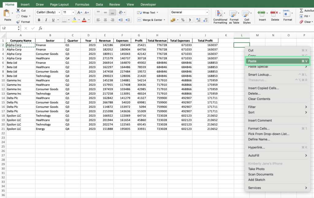
1. Excel Was Built for Spreadsheets, Not Speed

Excel is powerful, but it was designed primarily for data storage and calculations, not instant visualization. Creating a clean, meaningful chart often requires:

  • Formatting raw data
  • Choosing the right chart type manually
  • Adjusting labels, axes, and colors
  • Fixing layout and readability issues

For beginners, this process can be confusing. For professionals, it’s time-consuming.

AI graph generators like QuickGraph AI remove this complexity. Instead of spending minutes (or hours) formatting spreadsheets, users can simply input data or text and instantly get a well-structured graph.

2. AI Graph Generators Understand Your Data

One of the biggest advantages of AI tools is context awareness.

Excel does exactly what you tell it to do nothing more. If you choose the wrong chart type, Excel won’t stop you. The result? Misleading or ineffective visuals.

QuickGraph AI, on the other hand, analyzes your data and understands:

  • Whether a bar chart, line graph, or pie chart fits best
  • How to structure data for clarity
  • How to present insights visually, not just numbers

This makes AI tools especially useful for students, marketers, analysts, and decision-makers who want insights, not just charts.

3. Text-to-Graph Is a Game Changer

With Excel, everything starts with cells, rows, and formulas.

With QuickGraph AI, everything can start with plain text.

For example:

“Monthly sales from January to June: 20k, 25k, 30k, 28k, 35k, 40k”

Instead of manually entering this into a spreadsheet, AI can convert it directly into a visual graph. This text-to-graph capability is one of the main reasons people are moving away from Excel for everyday data visualization.

4. No Learning Curve, No Technical Skills

Excel has a learning curve. Advanced charts require:

  • Knowledge of chart tools
  • Data formatting rules
  • Functions and formulas

AI graph generators are built for simplicity.

QuickGraph AI allows users to:

  • Create graphs without formulas
  • Skip complex menus
  • Avoid design and formatting decisions

This makes it ideal for:

  • Students working on assignments
  • Teachers preparing learning materials
  • Marketers creating reports
  • Business owners who want quick insights

You focus on the data. AI handles the rest.

5. Faster Workflow = Better Productivity

Time matters.

Creating a single chart in Excel can take several steps. Multiply that by multiple datasets, revisions, or presentations, and productivity drops.

AI graph generators:

  • Reduce chart creation to seconds
  • Allow quick edits and regenerations
  • Help users test multiple visual formats instantly

With tools like QuickGraph AI, teams can move from raw data to decision-ready visuals in a fraction of the time.

6. Better for Modern Use Cases

Excel still works well for accounting, budgeting, and heavy calculations. But modern data needs are different.

Today’s users want:

  • Quick visuals for presentations
  • Charts for blogs, websites, and social media
  • Simple graphs for reports and dashboards

AI graph generators are designed for modern digital workflows, while Excel remains rooted in traditional spreadsheet use.

7. Accessibility Across Devices

Excel often requires:

  • Desktop software
  • Licensing
  • File sharing and version control

QuickGraph AI works online, making it:

  • Accessible from any device
  • Easy to share visuals instantly
  • Ideal for remote teams and students

This flexibility is another key reason users are choosing AI-powered tools.

8. The Future of Data Visualization Is AI

The shift from Excel to AI graph generators isn’t about replacing spreadsheets entirely. It’s about using the right tool for the right job.

Excel is still valuable for calculations and data management. But when it comes to:

  • Speed
  • Ease of use
  • Smart visualization
  • User-friendly design

AI tools like QuickGraph AI clearly have the advantage.

Conclusion

More people are choosing AI graph generators over Excel because they want simplicity, speed, and smarter visuals. Tools like QuickGraph AI eliminate the frustration of manual chart creation and make data visualization accessible to everyone not just Excel experts.

As data continues to grow and decisions need to be made faster, AI-powered visualization isn’t just a trend. It’s the future.

How Students Can Turn Assignment Data into Charts Using AI?

Data-driven assignments are now a core part of education. From business analytics and economics to science, psychology, and engineering, students are expected to analyze data and present it clearly. However, raw numbers in tables rarely make an impact. This is where an AI Chart Maker changes the game helping students convert assignment data into clean, professional charts in minutes instead of hours.

In this guide, you’ll learn how students can use AI-powered tools to transform spreadsheets and datasets into charts that improve clarity, grades, and presentation quality.

ai chart maker for student assignments

Why Charts Matter in Student Assignments?

Universities increasingly emphasize data interpretation and data literacy, not just data collection, as highlighted by research exploring university students’ perspectives on data skills and employability.

  • Clear trends and patterns
  • Logical comparisons
  • Visual evidence to support conclusions

Charts make assignments easier to understand and more persuasive. A well-designed graph can communicate insights faster than a full page of explanation.

But traditional chart creation tools often:

  • Require manual formatting
  • Take time to learn
  • Produce inconsistent visuals

That’s why students are shifting toward AI-powered visualization tools.

Common Problems Students Face with Data Visualization

Before AI, students typically struggled with:

  • Choosing the right chart type
  • Formatting axes, labels, and legends
  • Cleaning messy datasets
  • Spending hours adjusting visuals instead of analyzing results

Many still rely on traditional tools like Excel or Google Sheets, which are powerful but time-consuming for beginners. According to academic productivity comparisons published by tools like Microsoft Excel, manual chart creation often distracts students from actual analysis.

AI removes these barriers.

How AI Helps Students Create Charts Faster?

AI-powered chart tools analyze your data automatically and recommend the most suitable visual format. Instead of manually deciding between bar charts, line graphs, or scatter plots, the system does the thinking for you.

With QuickGraph AI, students can:

  • Upload CSV or spreadsheet files
  • Instantly generate accurate charts
  • Switch chart types with one click
  • Focus on insights instead of formatting

This makes AI tools especially valuable for students managing tight deadlines and multiple assignments.

how students create charts using ai

Step-by-Step: Turning Assignment Data into Charts Using AI

1. Prepare Your Data

Organize your data in a simple format:

  • Columns with headers
  • No merged cells
  • Clear numeric values

Most AI tools work best with structured data.

2. Upload Data to an AI Chart Tool

Instead of building charts manually, upload your file to QuickGraph AI. The system reads the dataset and identifies relationships automatically.

No advanced technical skills required.

3. Let AI Suggest the Best Chart

AI detects whether your data shows:

  • Trends over time → Line or Area chart
  • Comparisons → Bar or Column chart
  • Distribution → Histogram or Box plot

This step alone saves students a significant amount of time.

4. Customize for Academic Clarity

Students can:

  • Rename chart titles to match assignment questions
  • Adjust labels for clarity
  • Highlight key data points

The result looks professional and submission-ready.

5. Download or Insert into Assignments

Charts can be exported and directly added to:

  • Research papers
  • Reports
  • Presentations
  • Group projects

This is especially useful for students working on capstone projects or data-heavy coursework.

Best Chart Types for Student Assignments

Different subjects require different visualizations:

Assignment TypeRecommended Chart
Business or EconomicsBar, Line
Science ExperimentsLine, Scatter
Survey AnalysisPie, Bar
Statistics ProjectsHistogram, Box Plot

AI tools guide students toward these choices automatically, reducing guesswork.

Why Universities Are Encouraging Visual Data Skills?

Modern education focuses on:

  • Analytical thinking
  • Visual communication
  • Data literacy

Students who present insights visually stand out in:

  • Class presentations
  • Research submissions
  • Internships and academic projects

Learning how to use AI for data visualization gives students a practical skill that extends beyond college into professional life.

Why Students Choose QuickGraph AI?

QuickGraph AI is designed for learners, not just professionals. It helps students:

  • Save time on assignments
  • Improve presentation quality
  • Avoid technical complexity
  • Focus on analysis and learning

Whether you’re working on a simple class project or a detailed research paper, AI-powered charts make your work clearer and more impactful.

Final Thoughts

Turning assignment data into charts no longer has to be complicated. With an AI Chart Maker, students can visualize data faster, present insights better, and meet academic expectations with confidence.

As universities continue to emphasize data-driven learning, tools like QuickGraph AI help students stay ahead by transforming numbers into knowledge.