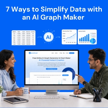
7 Ways to Simplify Data with an AI Graph Maker  

The current data-driven environment requires organizations to develop efficient methods for processing complex information because rapid comprehension of such information has become essential. The ability to produce results requires you to have more than basic information because your work requires advanced skills. The situation demands better understanding of all aspects this is where an AI graph maker plays a role by transforming complex data into clear, actionable insights quickly.

We will show 7 effective methods which an AI graph maker uses to make data analysis easier while explaining why QuickGraph AI has become a necessary tool in today’s work environments.

1. Instantly Convert Raw Data into Visual Insights

The main difficulty of working with data arises because people need to convert numerical information into useful insights. The presence of numerous rows and columns in tables creates visual challenges that make comprehension difficult.

With QuickGraph AI you upload your dataset and the system creates the best matching visual representation which includes either bar graphs or line charts or pie charts.

Instead of asking:

  • “What does this data mean?”

You can immediately see:

  • Trends
  • Patterns
  • Comparisons

This instant visualization saves time and removes guesswork.

2. Eliminate Manual Chart Creation

Traditional tools like spreadsheets require multiple steps:

  • Selecting data
  • Choosing chart types
  • Formatting axes
  • Adjusting labels

In addition to being inaccurate, this method is slow.

The QuickGraph AI system handles all tasks through its complete automation capability. The system selects appropriate chart types through automatic selection while it applies professional design standards to the generated output. The following statement clarifies our previous explanation:

  • No formatting headaches
  • No design skills required
  • No wasted time

You focus on insights, not setup.

3. Reduce Human Errors in Data Visualization

Manual data handling often leads to mistakes:

  • Incorrect axis labels
  • Missing data points
  • Misleading chart formats

These errors can lead to wrong conclusions.

An AI graph maker like QuickGraph AI minimizes these risks by:

  • Validating your dataset
  • Choosing appropriate visualization types
  • Ensuring consistency in presentation

This results in more accurate and trustworthy insights.

4. Simplify Complex Data for Better Understanding

Large datasets can be intimidating. AI graph maker break down complexity into easy-to-understand visuals.

For example:

  • A 12-month revenue dataset becomes a simple trend line
  • Market share data becomes a clear pie chart
  • Growth comparisons turn into intuitive bar graphs

QuickGraph AI helps you communicate complex ideas in a way that anyone can understand—even without a technical background.

5. Improve Decision-Making Speed

In business and analytics, speed matters. The faster you understand your data, the faster you can act.

QuickGraph AI enables:

  • Real-time visualization
  • Quick comparisons across datasets
  • Immediate identification of trends

This allows teams to:

Instead of waiting hours for reports, you get insights in seconds.

6. Create Professional-Quality Charts Effortlessly

Presentation matters. Whether you’re sharing data in a report, presentation, or social media post, your visuals need to look clean and professional.

QuickGraph AI automatically generates:

  • Well-structured charts
  • Balanced layouts
  • Clear labels and formatting

This ensures your visuals are:

  • Easy to read
  • Visually appealing
  • Ready to share instantly

You don’t need a designer AI handles the aesthetics for you.

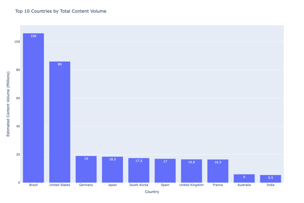
Example: Creating a Chart with a Simple Prompt

Instead of manually selecting chart types and formatting data, you can simply use a prompt like:

“Top 10 countries by total content volume.”

QuickGraph AI instantly generates a clean and professional graph based on this input.
7. Save Time and Boost Productivity

Time is one of the most valuable resources, especially when working with data regularly.

By using QuickGraph AI, you can:

  • Skip repetitive tasks
  • Automate visualization workflows
  • Focus on analysis instead of formatting

What used to take hours can now be done in minutes.

This efficiency is especially useful for:

  • Business analysts handling reports
  • Students working on assignments
  • Marketers tracking performance metrics

Why Choose QuickGraph AI?

While there are many tools available, QuickGraph AI stands out because it combines:

  • Speed
  • Accuracy
  • Simplicity

It’s designed for users who want powerful results without a steep learning curve. Whether you’re working with small datasets or complex analytics, it adapts to your needs and delivers clear, actionable visuals.

Final Thoughts

Data doesn’t have to be complicated. With the right tools, it becomes a powerful asset rather than a burden.

An AI graph maker like QuickGraph AI helps you:

  • Understand data faster
  • Communicate insights clearly
  • Make smarter decisions

You should improve your work routine because you continue to create charts by hand and face difficulties with spreadsheets. You should delegate your challenging tasks to AI while you concentrate on discovering essential information and implementing necessary steps.

FAQs

1. What is an AI graph maker?

The AI graph maker tool creates visual charts from raw data through its automated process which uses artificial intelligence technology to handle the task without human intervention while increasing precision of results.

2. How does QuickGraph AI simplify data?

QuickGraph AI analyses your data for you and produces a clear, professional-looking chart with well-integrated and instantly comprehensible graphs, making it easy for you to understand trends and patterns.

3. Do I need technical skills to use QuickGraph AI?

The design of QuickGraph AI enables all users to operate the software without any difficulties. Users who lack technical expertise or design experience can create charts.

4. Can AI graph makers handle large datasets?

QuickGraph AI and other graph maker tools are aimed towards handling and visualizing datasets from small to large.

5. Why should I use an AI graph maker instead of traditional tools?

The use of AI graph makers leads to time savings and decreased error rates while generating superior visualizations that surpass the capabilities of spreadsheet software.

Top Benefits of Using Box Plots in Data Analysis!

When working with data, the goal is to uncover insights quickly and present them in a way that makes sense to both technical and non-technical audiences. Among the many chart types available, box plots, also known as box-and-whisker plots, stand out as one of the most effective tools for summarizing and comparing data distributions. 

In this blog, we’ll walk through the top benefits of using Custom Box Plot Maker in data analysis and explain why they deserve a place in every analyst’s toolkit. 

What is a Box Plot? 

A box plot displays a dataset’s distribution using five key numbers: the minimum, first quartile (Q1), median, third quartile (Q3), and maximum. The “box” highlights the middle 50% of the data, while the “whiskers” extend to show variability outside the quartiles. Outliers, if present, appear as individual points. 

This compact visualization provides a clear snapshot of how data is spread and whether there are unusual values worth investigating. 

Top Benefits of Using Box Plots 

1. Clear Summary of Data Distribution 

Box plots condense complex data into a simple graphic that highlights central tendency, variability, and spread. Decision-makers can immediately understand the overall shape of the data without needing to sift through raw numbers. 

2. Easy Comparison Across Multiple Groups 

When multiple categories are plotted side by side, box plots make it straightforward to compare medians, spreads, and outliers. This is especially useful when analyzing sales performance across regions, product results across experiments, or customer feedback across segments. 

3. Quick Detection of Outliers and Skewness 

Box plots make it easy to see if data is skewed or contains outliers. The position of the median within the box and the length of the whiskers instantly reveal asymmetry, while any values outside the whiskers highlight unusual behavior or errors in the data. 

4. Efficient for Large Datasets 

With very large datasets, plotting every individual data point can be overwhelming. Box plots simplify the view by summarizing data into quartiles and highlighting outliers. This makes them ideal for high-volume data while still preserving critical insights. 

5. Space-Saving and Clean Visuals 

Box plots provide maximum information in minimal space. They are easy to place side by side for comparisons and work well in reports, presentations, or dashboards where clarity and simplicity are essential. 

6. Easy for Non-Technical Audiences to Understand 

Although they rely on statistical measures, box plots are surprisingly intuitive once explained. Terms like “median” or “middle 50%” resonate with most audiences, making this chart a practical choice for both technical teams and business stakeholders. 

7. Reveals Insights Beyond Averages 

Two datasets may share the same average, but their variability and outliers could be very different. Box plots expose these differences, preventing misleading conclusions that can arise from relying on averages alone. 

8. Reliable for Performance and Benchmarking 

Box plots are frequently used in performance testing, process analysis, and benchmarking because they show not just the typical outcome but also the spread and extreme cases. This gives a more complete picture than averages with error bars. 

Limitations to Keep in Mind 

While powerful, box plots are not always the perfect choice. They do not reveal detailed distribution patterns, such as multiple peaks in the data. For very small datasets, box plots may also be less informative. In such cases, histograms, scatter plots, or violin plots can be better complements. 

When to Use Box Plots 

Box plots are best used when: 

  • Comparing distributions across several groups 
  • Summarizing large datasets without clutter 
  • Highlighting outliers or skewness 
  • Creating clean, concise visuals for reports or dashboards 

They may not be the right choice when: 

  • Working with very small datasets 
  • Needing to show detailed distribution shapes 

Final Word 

Box plots strike the right balance between simplicity and insight. They highlight the story behind the data in a way that is both efficient and easy to understand. For analysts, researchers, and business leaders, box plots are more than just a visualization tool, they are a practical way to make smarter, data-driven decisions. 

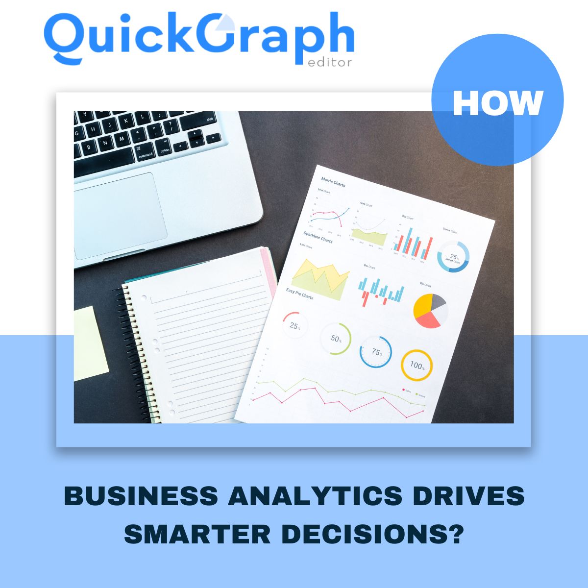
How Business Analytics Drives Smarter Decisions?

In a competitive business landscape where every decision counts, companies are turning to business analytics not as a luxury, but as a necessity. It’s no longer about intuition it’s about interpreting real data to discover what’s working, what’s not, and where to go next. Whether it’s refining a marketing campaign, forecasting sales, or streamlining operations, analytics equips every team with the clarity to move forward with purpose.

But analytics isn’t just about numbers it’s about interpreting data the right way. That’s where QuickGraph AI comes in. Our platform offers over 30+ powerful chart types that transform complex data into clear visuals, helping businesses uncover hidden insights.

Why Business Analytics Matters for Every Company

Data is everywhere sales figures, customer behavior, website traffic, marketing performance but without proper analysis, it means nothing.

With business analytics, companies can:

  • Track key performance indicators (KPIs)
  • Forecast future trends
  • Optimize processes and cut unnecessary costs
  • Improve customer satisfaction
  • Make data-driven decisions with confidence

However, many companies fail to unlock the full potential of analytics due to common data analysis mistakes.

Let’s talk about that.

Avoiding Mistakes in Data Analysis

Before you can make smarter business decisions, you must ensure your data analysis is accurate and unbiased. In our recent blog, 7 Common Data Analysis Mistakes and How to Fix Them,” we highlighted errors like:

  • Using the wrong chart type for the data
  • Ignoring outliers that skew results
  • Overcomplicating visuals that confuse instead of clarify
  • Failing to clean the data before analyzing
  • Misinterpreting correlation as causation

QuickGraph AI helps eliminate these mistakes by guiding users toward the right visualization tools. With AI-driven suggestions, it becomes easier to avoid errors and focus on clarity and impact.

Powerful Visual Tools for Smarter Insights

Choosing the right graph is just as important as the data itself. At QuickGraph AI, we provide over 30+ chart types, each designed to solve specific business problems:

These visualizations help avoid misinterpretations and reveal what truly matters in the data.

Real Business Use Cases

Let’s see how business analytics applies in real scenarios:

  • Marketing Teams track ad performance, conversion rates, and ROI using bar graphs, pie charts, and line graphs.
  • Sales Managers use funnel charts and indicator graphs to improve deal flow.
  • Operations Teams rely on Gantt and waterfall charts to ensure efficiency.
  • Finance Analysts use box plots and histograms to assess risks and profits.
  • Executives review dashboards powered by radar and heat maps for fast decision-making.

In each case, clean, mistake-free analysis + clear visual tools = smarter outcomes.

Why Choose QuickGraph AI?

We make business analytics simple, visual, and AI-powered. Here’s what sets us apart:

  • No coding required – Just paste your data and select a chart
  • Smart chart recommendations based on your dataset
  • Export-ready visuals for reports, presentations, or dashboards
  • Custom styling options for your brand or team

You don’t need to be a data scientist to make smart decisions you just need QuickGraph AI.

Conclusion

Don’t let messy spreadsheets and confusing charts hold you back.
Start using QuickGraph AI today and visualize your way to better business decisions.

7 Common Data Analysis Mistakes and How to Fix Them

In today’s data-driven world, analyzing data isn’t just about working with numbers it’s about making clear, accurate, and confident decisions. But even experienced analysts can make simple mistakes that lead to confusion or wrong conclusions.

At QuickGraph AI, we believe that avoiding these mistakes is just as important as doing the analysis itself. That’s why we’ve put together a list of 7 common data analysis mistakes along with practical tips to help you fix them and get better results.

1. Jumping into Analysis Without Understanding the Problem

One of the biggest mistakes is diving into data without clearly defining the goal. Without direction, your analysis may end up answering the wrong question.

Fix it:
Start with a specific business or research question. Ask yourself: “What do I need to know, and why?” Only then should you gather and analyze your data.

2. Using Unclean or Incomplete Data

Dirty data missing values, inconsistent formats, or duplicates can skew results and make your charts unreliable.

Fix it:
Clean your dataset thoroughly before you begin. Tools like our Table Maker or Indicator Chart can help surface inconsistencies when visualized properly.

3. Choosing the Wrong Chart Type

Using the wrong type of chart for your data is a fast way to confuse your audience or mislead decision-making. For example, a pie chart used for time-based data can distort trends.

Fix it:
Learn which visual fits your data. For a great starting point, check out our blog on the Top 5 Graph Types for Data Analysis inside it we explains when to use Line Graphs, Pie Charts, Bar Graphs, and more.

Outliers aren’t always bad sometimes they’re the most important part of your dataset. But many analysts either delete them or ignore them altogether.

Fix it:
Use charts like the Box Plot or Violin Plot to identify and evaluate outliers visually. Investigate them before deciding to exclude or include them in your analysis.

5. Overcomplicating the Analysis

Complex dashboards and heavy formulas can confuse stakeholders, even when your analysis is technically correct.

Fix it:
Keep it simple. Focus on the 2–3 key insights your audience needs. Our tools like Donut Chart or Funnel Chart are excellent for delivering clean, focused insights.

You’ll soon find that simplicity doesn’t reduce value it actually improves communication.

6. Misinterpreting Correlation as Causation

Just because two variables move together doesn’t mean one causes the other. Assuming so can lead to misleading conclusions.

Fix it:
Visualize relationships using tools like the Scatter Plot Maker or Sankey Chart to explore possible connections. But always back it up with domain knowledge or further testing.

7. Forgetting the Audience

An accurate analysis that’s hard to understand is a missed opportunity. Not everyone is fluent in charts and numbers.

Fix it:
Tailor your output to your audience. A dashboard for a marketing manager should look different than one for a data scientist. Use simple visuals, clear labels, and avoid unnecessary jargon. Charts like the Donut Chart, Indicator Chart, or Funnel Chart in QuickGraph AI are especially useful for summarizing complex insights in a more approachable way.

Final Thought

Every analyst makes mistakes but the best ones learn to spot and fix them early.

By using the right tools and avoiding these common traps, you’ll deliver cleaner, smarter, more actionable insights every time.

At QuickGraph AI, we provide over 30 visualization tools to support your analysis.

Top 5 Graph Types for Data Analysis Every Analyst Should Know

In the world of data, the ability to tell a clear and compelling story is everything. Whether you’re a business analyst, student, marketer, or researcher, the visualizations you choose can either simplify your message or create confusion.

That’s why choosing the right type of graph matters it helps you translate raw data into actionable insights.

QuickGraph AI empowers users to transform data into dynamic, insightful visuals without the need for complex software or design experience. From structured spreadsheets to raw datasets, turning information into clarity has never been more accessible.

Let’s explore five of the most powerful chart types every analyst should be familiar with and how they can help you turn raw numbers into meaningful insights.

1. Line Graph – Track Trends Over Time

If you’re analyzing data over time, the Line Graph is one of the most effective tools available. It connects individual data points with lines, helping you identify trends, cycles, or shifts in performance.

When to Use a Line Graph:

  • Monthly revenue or profit tracking
  • Website traffic analysis
  • Sales performance over time

This graph type is ideal when comparing multiple datasets on the same timeline, giving you a side-by-side view of progression or decline.

2. Bar Graph – Compare Categorical Data

The Bar Graph is perfect when you want to compare quantities across multiple groups or categories. It presents data using rectangular bars of different lengths and is easily understood at a glance.

When to Use a Bar Graph:

  • Comparing sales across product categories
  • Measuring customer feedback by location
  • Showing department-wise budget allocation

QuickGraph AI also supports advanced variations like the Bi-directional Bar Chart and Triangle Bar Chart, giving analysts more flexibility when presenting grouped data or dual-sided comparisons.

3. Pie Chart Maker – Visualize Proportions

A classic visualization, the Pie Chart Maker is used to display how a whole is divided into parts. It’s perfect for percentage-based insights and quick overviews of distribution.

When to Use a Pie Chart:

  • Market share representation
  • Budget or expense distribution
  • Customer segment breakdown

For more visual depth, you can use Donut Charts, Polar Area Charts, or Sunburst Charts, all available in QuickGraph AI offering style options without compromising clarity.

4. Scatter Plot Maker – Reveal Correlations

The Scatter Plot Maker allows you to study relationships between two variables by plotting data points on a Cartesian plane. It’s widely used in research, analytics, and predictive modeling.

When to Use a Scatter Plot:

  • Analyzing pricing vs. demand
  • Plotting ad spend vs. conversions
  • Exploring income vs. education level

To add another dimension, try the Bubble Chart, which incorporates a third variable using the size of the point perfect for multidimensional data stories.

5. Heat Map Maker – Highlight Patterns and Density

When dealing with large sets of categorical or time-based data, the Heat Map Maker provides a clear overview using color gradients. It highlights high and low intensity values, making pattern recognition much easier.

When to Use a Heat Map:

  • Monitoring weekly sales by region
  • Analyzing website click behavior
  • Identifying peak usage periods

Heat maps turn overwhelming spreadsheets into intuitive color-coded visuals that anyone can interpret quickly.

Why These 5 Graphs Matter?

These five graph types are the backbone of effective data storytelling. Whether you’re trying to understand what happened, why it happened, or what might happen next, choosing the right chart makes your message stronger.

They simplify complexity, enhance presentations, and help decision-makers focus on what matters most.

Create All These Charts with QuickGraph AI

With QuickGraph AI, you don’t need advanced design or coding skills. Just import your data whether from a CSV, Excel file, or Google Sheet and choose from 30+ smart chart types that designed for professionals.

The charts featured in this blog include:
Line Graph, Bar Graph, Pie Chart Maker, Scatter Plot Maker, Heat Map Maker

And that’s just the beginning. Explore other powerful options like the Gantt Chart, Funnel Chart, Candlestick Chart, Radar Chart, Treemap Chart, and more all crafted to make your data speak clearly.