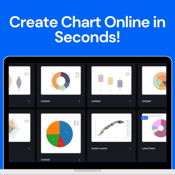
Create Any Type of Chart Online in Seconds

Visualizing data has never been easier with the AI Chart Maker. This innovative tool allows anyone — from students to professionals to turn raw numbers into polished, professional charts in just seconds. With a clean, intuitive dashboard, you can create custom charts or let the AI suggest the best visuals for your data, making the process fast, simple, and enjoyable.

People love to use QuickGraph AI because it eliminates the complexity of traditional charting tools. No design experience or coding skills are needed just input your data, customize if you want, and instantly get charts that look professional and easy to understand. In this blog, we’ll explore how the tool works, the different chart types available, and how you can use it to make your data stand out.

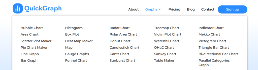
30 Chart Types Available

QuickGraph AI offers a wide variety of charts to suit any data visualization need. Some of the most popular types include:

  • Bar Chart – Compare categories side by side.
  • Line Chart – Show trends over time.
  • Pie & Donut Chart – Visualize percentages of a whole.
  • Area Chart – Highlight cumulative data.
  • Radar Chart – Compare multiple variables at a glance.
  • Funnel Chart – Track stages in a process.
  • Scatter & Bubble Charts – Represent relationships between variables.
  • Waterfall Chart – Display how values contribute to a total.
  • And many more — the tool has over 30 chart types to cover every need.
Data Visualization Best Practices

Understanding how to visualize data correctly is just as important as choosing the right tool. Learning what is data visualization and why is it important such as selecting the right chart for your data, maintaining clarity, and avoiding visual clutter can greatly improve how your insights are perceived. Reputable educational resources and industry guidelines on data visualization can help users make informed decisions and present information more effectively in professional, academic, and business environments.

How QuickGraph AI Works?

Step 1: Sign Up

Start by creating your free account. Once signed up, you’ll gain access to the dashboard where all chart creation features are available.

Step 2: Receive Free Credits

New users get free credits to start creating charts immediately. These credits allow you to test both custom charts and AI-powered charts without any upfront cost.

Step 3: Choose Your Chart Type

From the dashboard, you can select either a custom chart or an AI chart depending on your preference.
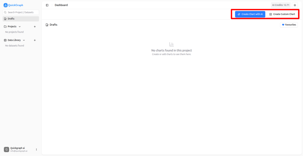
Step 4: Create Custom Charts

In custom mode, you have full control. Choose any type of chart you want, customize colors, labels, and layout, and preview your chart in real time.

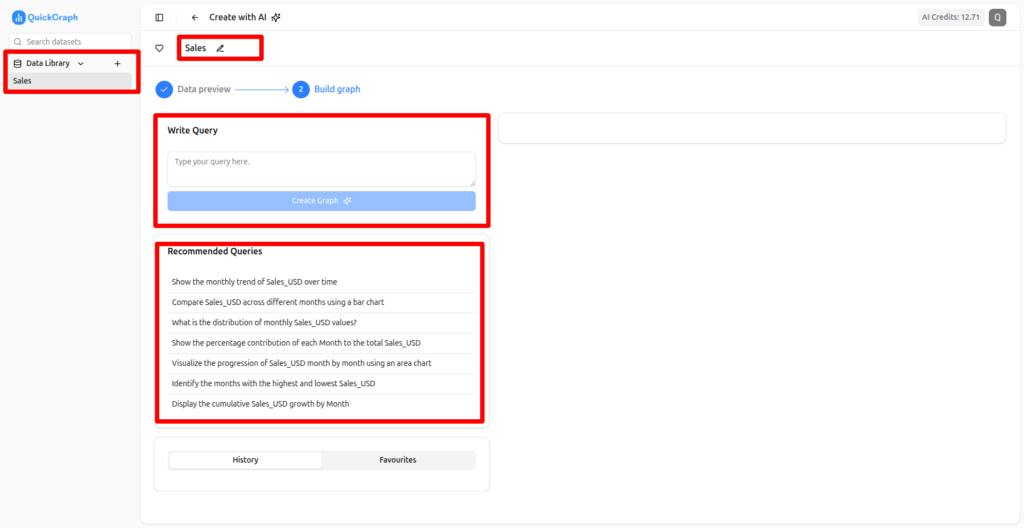
Step: 5 – Create Chart using AI Chart Maker:

For AI-powered charts, simply upload your data. You can create charts using a prompt or select a recommended prompt suggested by the AI. The tool analyzes your data and generates the most effective visualizations automatically.
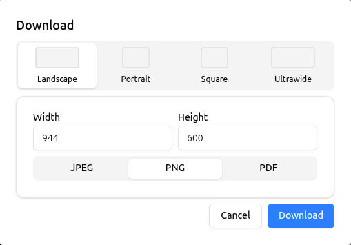
Step 6 – You can Download & also Publish Your Chart:

Once your chart is ready, you can:

  • Download in PNG, JPG, or PDF format
  • Publish online with a shareable link for easy collaboration
Why Users Love QuickGraph AI?

Saves Time

Creating charts manually in Excel or Google Sheets can take a lot of time. With QuickGraph AI, charts are generated in seconds, freeing up time for analysis and decision-making.

Beginner-Friendly

Even users with no design experience can create professional charts. The interface is intuitive, and AI suggestions make it simple to select the right chart type for your data.

AI-Powered Suggestions

The AI feature ensures that your data is presented in the most effective way possible. It analyzes your dataset and recommends the chart that communicates your insights clearly.

Highly Customizable

From colors and labels to axes and legends, every element of your chart can be customized to match your brand or presentation style.

Versatile Use Cases

Whether you’re preparing a business report, marketing dashboard, academic project, or social media post, QuickGraph AI can handle it all. Its versatility makes it perfect for professionals, educators, and students alike.

Tips for Creating Charts Quickly!

  1. Prepare Your Data First – Clean, organized data ensures accurate charts.
  2. Use AI Suggestions – For faster results, let the AI recommend chart types.
  3. Keep It Simple – Avoid cluttered charts; simplicity improves readability.
  4. Consistent Design – Use consistent colors and styles across charts for reports or presentations.
  5. Test Export Options – Check downloads for quality and resolution before final use.

Conclusion

QuickGraph AI is a revolutionary tool that allows anyone to create charts online in seconds. With over 30 chart types, AI-powered suggestions, and a fully customizable dashboard, it transforms raw data into professional visuals effortlessly. Whether you are a business professional, marketer, student, or educator, QuickGraph AI saves time, improves data clarity, and makes your charts look polished and easy to understand.

AI Data Visualization Trends in 2026! 

The process of data visualization has transcended graphical representation of numerals it is now uncovering valuable information and facilitating the consumption of data. In the year 2026, the artificial intelligence (AI) is not only changing the traditional way of visualizing data, but also fast, intelligent, and more user-friendly than ever before. 

Companies, educational institutions, analysts, and marketers are getting rid of their traditional ways of making graphs and charts and welcoming AI-powered tools to do it for them in a proper way without any effort. QuickGraph AI is one of the leaders of this change in process by providing users with a clearer, more attractive, and faster way of visualizing their data. 

This blog post looks at the main AI data visualization trends in 2026 that will come, and it will also show the capabilities of QuickGraph AI for making its users lead. 

1. AI-Powered Chart Generation 

One of the most thrilling trends in 2026 is AI-driven chart creation

The conventional method of making charts involved a series of manual steps like determining the type of chart, doing the formatting, and making the adjustments which was a time-consuming process and also had the chances of making mistakes. But by using AI: 

  • Your data can be analyzed automatically 
  • The most appropriate chart type can be suggested 
  • Aesthetically nice graphs can be produced in a matter of seconds. 

QuickGraph AI allows its users to generate line charts, bar charts, pie charts, heatmaps, Gantt charts, and more just by clicking a few times. The AI takes care of making sure that your charts are correct, visually clear, and comprehensible. 

Why it is important: It saves time, cuts down errors, and enhances the presentation of reports and lectures. 

2. Interactive Dashboards Become Standard 

Static charts have given way to interactive dashboards that show data in a dynamic manner. 

Interactive dashboards provide the possibility of users to: 

  • Make a dynamic exploration of data 
  • Make use of filtering and segmentation of the data 
  • Get real-time access to the insights through drilling down 

QuickGraph AI simplifies the creation of interactive dashboards. You can merge various graphs, join filters, and permit the audience to examine the parameters by themselves. 

The significance: It facilitates the process of making faster, data-driven decisions by the decision makers and business analysts through the access of real-time insights. 

3. Natural Language Data Visualization 

AI has now come to a stage where it can create charts from natural language commands, therefore, you can simply give instructions in normal language and get charts made immediately. 

To make it clearer: “Show the trends of monthly sales for the last year” → QuickGraph AI automatically generates a professional graph. 

Here are some of the advantages: 

  • There is no need for any technical or coding skills 
  • A fast drawing suitable for business reports or presentations 
  • Opens up to students, marketers, and non-technical users 

The reason it is important is that it frees up data visualization for everyone and users can easily turn data into insights as much as they want. 

4. Real-Time Data & Predictive Analytics 

In the year 2026, to remain competitive, companies are asking for immediate insights. The capabilities of AI have expanded to: 

  • Live data processing and streaming 
  • Charts and dashboards updates on the go 
  • Trends and metrics of performance predictions 

QuickGraph AI provides real-time dashboards and predictive analytics which allow businesses to keep an eye on their KPIs, sales, and even make decisions right away. 

The significance of this is that companies will have the ability to intervene quicker with their strategies, market changes, and hence the whole market will be very competitive. 

5. Data Storytelling with AI 

The process of visualizing data is developing into a data story. Artificial intelligence is one of the major factors aiding this development by generating narrative visuals from raw data that accentuate the trends, comparisons, and insights. 

QuickGraph AI gives you the ability to: 

  • Generate clean and easy-to-grasp charts showing insights 
  • Mix different visuals for a more persuasive presentation 
  • Break down and clarify intricate data 

The reason for its importance: It increases the involvement of the audience, and it enables the teams to pass on the insights efficiently and, consequently, makes the decision-making process dependent on data. 

What makes QuickGraph AI different from the rest is: 

QuickGraph AI stands out because it offers: 

  • 30 different graph and chart types 
  • Dashboards that are interactive 
  • Prompts in natural language 
  • Updates and analytics that are both real-time and predictive 

QuickGraph AI makes it possible for everyone from business experts to marketers, teachers, and students to see data quicker, more intelligently, and in a more captivating way than before. 

Check out QuickGraph AI now and see for yourself how AI is changing the way we visualize data in the year 2026. 

Top 10 AI Chart Maker Tools for Students & Professionals in 2026

Raw data alone doesn’t impress clarity does. Students struggle to turn spreadsheets into meaningful charts, and professionals waste hours tweaking graphs that still fail to tell a story. In 2026, AI chart maker tools completely change the game: they analyze your data, pick the right chart type, and generate professional visuals in seconds no design skills, no manual formatting, no guesswork. Here’s a curated list of the top 10 AI chart maker tools for students and professionals, starting with QuickGraph AI, the fastest and smartest way to turn numbers into insights.

Why AI Chart Maker Tools Are Essential in 2026

Spreadsheets are great for storing data, but they rarely communicate meaning. Long rows and columns hide patterns, trends, and insights. AI chart maker tools solve this by:

  • Automatically analyzing data
  • Suggesting the most suitable chart types
  • Generating professional, presentation-ready visuals

Whether you’re preparing a research report, a marketing presentation, or a business dashboard, AI-powered chart makers save time, reduce errors, and make your data instantly understandable.

1. QuickGraph AI — Best Overall AI Chart Maker

QuickGraph AI is an intuitive tool that converts raw data into professional visuals instantly. Upload your spreadsheet or paste data, and the AI selects the best chart type — bar, line, pie, area, and more — without any design skills.

Best for: Students, business reports, marketing insights
Key features: AI-powered chart selection, multiple chart types, fast export

2. ChartGen AI — Natural Language Chart Creation

ChartGen AI allows you to create charts simply by describing what you want. Upload your data and tell the AI what type of chart you need — it handles the rest.

Best for: Analysts, marketers
Strength: Text-to-chart automation

3. Sourcetable — AI Charts from Spreadsheets

Sourcetable is ideal for spreadsheet-heavy workflows. It analyzes your Excel or CSV files and automatically generates charts, reducing manual effort.

Best for: Students, data professionals

4. VizGPT — Free Online AI Chart Maker

VizGPT is browser-based and free, perfect for quick charts without sign-ups. It supports bar, line, pie, scatter, and other chart types.

Best for: Students and casual users

5. Powerdrill Bloom — Charts + PowerPoint Automation

Powerdrill Bloom generates charts and automatically prepares presentation-ready slides. Upload your spreadsheet, and the AI delivers charts integrated into decks.

Best for: Consultants, executives

6. Google Looker Studio + AI Connectors — Cloud Collaboration

Looker Studio integrates AI for chart suggestions and real-time collaborative dashboards. Ideal for teams using Google Workspace.

Best for: Teams, collaborative reporting

7. Canva (Magic Charts) — Design-Focused AI Charts

Canva’s Magic Charts feature automatically creates charts from uploaded data and integrates them into visually rich presentations, infographics, or reports.

Best for: Marketing visuals, creatives

8. Tableau Public — Free Interactive Dashboards

Tableau Public lets you create highly interactive charts for free. Ideal for research projects, student assignments, and sharing data online.

Best for: Interactive dashboards, student projects

9. RAWGraphs & Open-Source Tools — Customizable Charts

RAWGraphs and other open-source tools now include AI-assisted suggestions for chart types and customization, perfect for designers and researchers.

Best for: Advanced customization, research, creative charts

10. Native AI in Excel & Google Sheets — Everyday Smart Charts

Native AI in Excel’s Copilot and Google Sheets’ AI features automatically generate charts and insights within spreadsheets, making visualization quick and accessible for everyday users.

Best for: Office users, students, professionals

How to Choose the Right AI Chart Maker Tool

  • Ease of Use: Beginner-friendly vs advanced features
  • Chart Types: Bar, line, pie, area, dashboards
  • Export Options: PNG, PDF, SVG, or presentation-ready
  • Free vs Paid: Students may prefer free versions; professionals may need premium features

Final Thoughts

AI chart maker tools in 2026 aren’t just about prettier charts they’re about speed, insight, and impact. From free online generators to enterprise-grade platforms, these tools help students and professionals communicate data clearly, professionally, and effectively. Start exploring these top 10 tools today and transform the way you visualize data.

From Spreadsheet to Smart Chart in One Click

Spreadsheets are efficient at storing information but ineffective at communicating meaning. Large datasets hide patterns inside rows and columns, forcing users to manually interpret trends, relationships, and performance indicators. As data volume increases, clarity decreases this is where an AI Chart Generator becomes essential. The result is slower decisions, misinterpretation, and unnecessary dependence on manual chart creation without intelligent data visualization tools.

Modern teams no longer struggle with data availability they struggle with data understanding.

What Makes a AI Chart Generator “Smart”?

A smart AI chart generator is not defined by appearance but by intelligence. It is a visualization generated using artificial intelligence that understands the structure and purpose of the data before presenting it visually.

Smart charts automatically:

  • Identify data relationships
  • Select the most effective chart type
  • Emphasize important trends
  • Reduce visual noise
  • Maintain consistency across reports

Instead of asking users how to visualize data, AI makes that decision based on logic and context.

How AI Transforms a Spreadsheet into a Chart Instantly

AI chart generators follow a systematic process that replaces manual work with automation:

Data Interpretation

The AI scans headers, values, and data ranges to understand how information is organized. It recognizes numerical patterns, categories, and time-based sequences without manual selection.

Context Awareness

Based on the dataset, AI determines whether the goal is comparison, trend analysis, performance tracking, or distribution analysis.

Chart Type Optimization

Rather than defaulting to common charts, AI selects the most suitable visualization—line charts for trends, bar charts for comparisons, heatmaps for density, or advanced hybrids for complex datasets.

Visual Enhancement

Design elements such as color contrast, labels, spacing, and emphasis are applied automatically to improve readability and focus attention on key insights.

Quality Control

Outliers, missing values, and formatting inconsistencies are detected, reducing the risk of misleading visuals.

Key Benefits of Using an AI Chart Generator

Speed Without Compromise

Charts that once took hours can now be created in seconds without sacrificing accuracy or clarity.

Improved Accuracy

AI removes subjective choices that often lead to misleading or poorly scaled visuals.

Consistent Visual Standards

Every chart follows a clean, professional layout, making reports easier to understand and compare.

Focus on Insights

Teams spend less time formatting charts and more time analyzing results and planning actions.

AI Chart Generator vs Traditional Chart Tools

AspectTraditional Chart ToolsAI Chart Generator
Data handlingManualAutomated
Chart selectionUser-drivenAI-driven
Time investmentHighMinimal
Error riskModerate to highLow
Insight clarityInconsistentHigh

This shift is not an improvement—it is a transformation in how data is visualized

Where One-Click Smart Charts Deliver Maximum Value

Business & Operations

Track KPIs, operational efficiency, and growth metrics without manual reporting.

Marketing & Sales

Visualize campaign performance, conversion funnels, and pipeline data in real time.

Finance & Forecasting

Create accurate financial summaries, revenue projections, and budget analysis visuals.

Education & Research

Turn complex datasets into clear, understandable charts for presentations and studies.

Why One-Click Chart Creation Matters

Speed alone is not the advantage. The real benefit is removing friction between raw data and insight. One-click smart charts eliminate delays, reduce errors, and enable faster alignment across teams.

When visuals are created instantly and correctly, discussions shift from interpretation to decision-making.

The Future of Data Visualization

As artificial intelligence continues to evolve, data visualization will become increasingly automated and insight-driven. Manual chart building will be replaced by systems that adapt to data changes in real time and continuously optimize visuals for clarity.

Smart charts will become a standard tool for organizations that rely on data to compete and grow.

Conclusion

AI chart generators bridge the gap between spreadsheets and understanding. By transforming raw data into smart, meaningful visuals in one click, they redefine how businesses interact with information. The result is faster insights, better decisions, and more confident actions—without the complexity of traditional charting tools.

How to Create Professional Charts Online in Seconds Using AI?

Data plays a major role in decision-making across businesses, education, and marketing. However, raw numbers alone can be confusing and hard to interpret. This is why charts and graphs are essential—they turn complex data into clear, visual insights. With the rise of AI-powered chart tool, creating professional chart online no longer takes hours. Today, you can do it in seconds.

In this article, you’ll learn how to create professional charts online using AI, why AI-driven chart tools are more effective than traditional methods, and how QuickGraph AI makes data visualization simple and fast.

Why Professional Charts Matter?

Professional charts help communicate information clearly and efficiently. A well-designed chart allows viewers to understand trends, comparisons, and patterns at a glance. Whether you’re preparing a business report, marketing performance analysis, or academic presentation, professional charts:

  • Improve clarity and understanding
  • Save time during explanations
  • Increase credibility and trust
  • Make data more engaging

Poorly designed charts can mislead or confuse the audience. That’s why using the right tool matters.

The Problem with Traditional Chart Creation!

Traditional tools like spreadsheets and desktop software require manual work. You need to select chart types, adjust layouts, format colors, and fix alignment issues. This process can be time-consuming, especially if you’re not experienced in data visualization.

Common challenges include:

  • Steep learning curves
  • Repetitive formatting tasks
  • Limited design flexibility
  • Higher chances of human error

These limitations often slow down productivity and affect the quality of the final output.

What Is an AI Chart Maker?

An AI chart maker is an online tool that uses artificial intelligence to automatically analyze your data and convert it into the most suitable chart. Instead of manually designing visuals, AI handles chart selection, layout, and design elements for you.

QuickGraph AI is designed to simplify this process. It understands your data and instantly transforms it into clean, professional charts no technical or design skills required

How AI Makes Chart Creation Faster?

AI-powered tools speed up chart creation in several ways:

Automatic Data Understanding

AI quickly analyzes your data to identify relationships, trends, and comparisons.

Smart Chart Selection

The system automatically chooses the best chart type bar, line, pie, or others—based on your data structure.

Professional Design

AI applies balanced layouts, readable labels, and modern visual styles automatically.

Fewer Errors

By automating the process, AI reduces mistakes caused by manual formatting.

How to Create Professional Charts Online Using AI?

Creating charts with QuickGraph AI is simple and efficient. Follow these steps:

Step 1: Add Your Data

Upload your dataset or paste your data directly into the platform. QuickGraph AI supports common data formats.

Step 2: Let AI Do the Work

Once your data is uploaded, the AI instantly analyzes it and generates the most suitable chart.

Step 3: Customize If Needed

You can quickly adjust colors, labels, and styles to match your brand or presentation requirements.

Step 4: Export or Share

Download your chart in high quality or share it online with your team or audience.

Types of Charts You Can Create Using AI!

With AI chart tools like QuickGraph AI, you can create:

  • Bar charts for comparisons
  • Line charts for trends
  • Pie charts for proportions
  • Area charts for growth analysis
  • Column and combination charts

Each chart is optimized for clarity and professional presentation.

Who Should Use AI Chart Tools?

AI-powered chart makers are useful for many professionals:

  • Business owners tracking sales and performance
  • Marketers analyzing campaigns and engagement
  • Students creating charts for assignments and projects
  • Analysts visualizing large datasets quickly
  • Content creators designing visuals for blogs and social media

Why Choose QuickGraph AI?

QuickGraph AI focuses on speed, simplicity, and accuracy. It eliminates the frustration of manual chart creation and helps users focus on insights instead of formatting.

Key benefits include:

  • Create charts in seconds
  • No software installation required
  • Clean, professional designs
  • Easy to use for beginners and experts
  • AI-powered accuracy

Final Thoughts

Creating professional charts doesn’t have to be complicated or time-consuming. With AI-powered tools, anyone can visualize data quickly and effectively. QuickGraph AI makes it easy to turn raw numbers into clear, impact charts in just seconds.

If you want a faster, smarter way to visualize your data, QuickGraph AI is the solution.