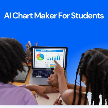
Data-driven assignments are now a core part of education. From business analytics and economics to science, psychology, and engineering, students are expected to analyze data and present it clearly. However, raw numbers in tables rarely make an impact. This is where an AI Chart Maker changes the game helping students convert assignment data into clean, professional charts in minutes instead of hours.
In this guide, you’ll learn how students can use AI-powered tools to transform spreadsheets and datasets into charts that improve clarity, grades, and presentation quality.

Why Charts Matter in Student Assignments?
Universities increasingly emphasize data interpretation and data literacy, not just data collection, as highlighted by research exploring university students’ perspectives on data skills and employability.
- Clear trends and patterns
- Logical comparisons
- Visual evidence to support conclusions
Charts make assignments easier to understand and more persuasive. A well-designed graph can communicate insights faster than a full page of explanation.
But traditional chart creation tools often:
- Require manual formatting
- Take time to learn
- Produce inconsistent visuals
That’s why students are shifting toward AI-powered visualization tools.
Common Problems Students Face with Data Visualization
Before AI, students typically struggled with:
- Choosing the right chart type
- Formatting axes, labels, and legends
- Cleaning messy datasets
- Spending hours adjusting visuals instead of analyzing results
Many still rely on traditional tools like Excel or Google Sheets, which are powerful but time-consuming for beginners. According to academic productivity comparisons published by tools like Microsoft Excel, manual chart creation often distracts students from actual analysis.
AI removes these barriers.
How AI Helps Students Create Charts Faster?
AI-powered chart tools analyze your data automatically and recommend the most suitable visual format. Instead of manually deciding between bar charts, line graphs, or scatter plots, the system does the thinking for you.
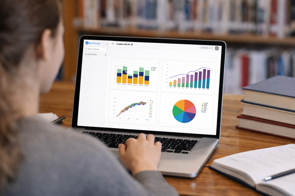
With QuickGraph AI, students can:
- Upload CSV or spreadsheet files
- Instantly generate accurate charts
- Switch chart types with one click
- Focus on insights instead of formatting
This makes AI tools especially valuable for students managing tight deadlines and multiple assignments.
Step-by-Step: Turning Assignment Data into Charts Using AI
1. Prepare Your Data
Organize your data in a simple format:
- Columns with headers
- No merged cells
- Clear numeric values
Most AI tools work best with structured data.
2. Upload Data to an AI Chart Tool
Instead of building charts manually, upload your file to QuickGraph AI. The system reads the dataset and identifies relationships automatically.
No advanced technical skills required.
3. Let AI Suggest the Best Chart
AI detects whether your data shows:
- Trends over time → Line or Area chart
- Comparisons → Bar or Column chart
- Distribution → Histogram or Box plot
This step alone saves students a significant amount of time.
4. Customize for Academic Clarity
Students can:
- Rename chart titles to match assignment questions
- Adjust labels for clarity
- Highlight key data points
The result looks professional and submission-ready.
5. Download or Insert into Assignments
Charts can be exported and directly added to:
- Research papers
- Reports
- Presentations
- Group projects
This is especially useful for students working on capstone projects or data-heavy coursework.
Best Chart Types for Student Assignments
Different subjects require different visualizations:
| Assignment Type | Recommended Chart |
|---|---|
| Business or Economics | Bar, Line |
| Science Experiments | Line, Scatter |
| Survey Analysis | Pie, Bar |
| Statistics Projects | Histogram, Box Plot |
AI tools guide students toward these choices automatically, reducing guesswork.
Why Universities Are Encouraging Visual Data Skills?
Modern education focuses on:
- Analytical thinking
- Visual communication
- Data literacy
Students who present insights visually stand out in:
- Class presentations
- Research submissions
- Internships and academic projects
Learning how to use AI for data visualization gives students a practical skill that extends beyond college into professional life.
Why Students Choose QuickGraph AI?
QuickGraph AI is designed for learners, not just professionals. It helps students:
- Save time on assignments
- Improve presentation quality
- Avoid technical complexity
- Focus on analysis and learning
Whether you’re working on a simple class project or a detailed research paper, AI-powered charts make your work clearer and more impactful.
Final Thoughts
Turning assignment data into charts no longer has to be complicated. With an AI Chart Maker, students can visualize data faster, present insights better, and meet academic expectations with confidence.
As universities continue to emphasize data-driven learning, tools like QuickGraph AI help students stay ahead by transforming numbers into knowledge.