Top 5 Mistakes to Avoid When Designing a Funnel Chart!

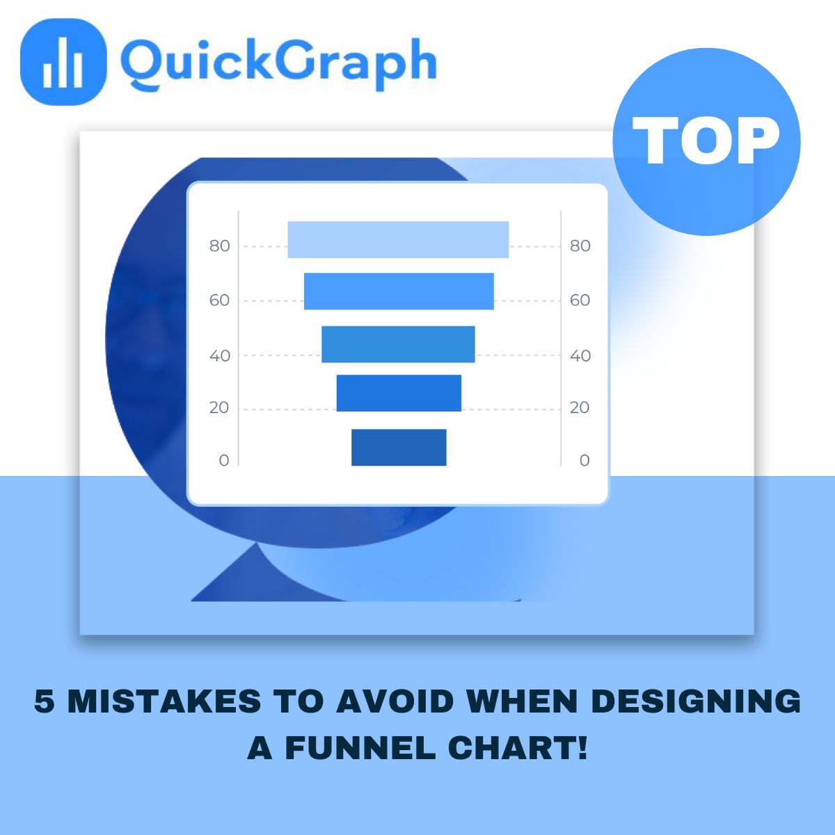
When you’re trying to understand how people move through a process, like signing up for a service or buying a product, a funnel chart is one of the clearest ways to see what’s working and what’s not. 

It quickly shows you where users drop off, how many reach the next step, and whether your conversion flow makes sense. 

But here’s the catch, a poorly designed funnel chart can tell the wrong story. Small design mistakes can twist the numbers, confuse your audience, or hide the real problem in your funnel. 

Let’s go through the top five Custom Funnel Chart Maker design mistakes most people make, and how to avoid them the smart way. 

1. Ignoring the Logical Stage Order 

A funnel chart is supposed to represent a journey. If the stages aren’t in the right order, the whole picture falls apart. 

Sometimes teams add random steps because the data comes from different sources. But if you mix the order, say, putting checkout before add to cart, your chart stops making sense. 

Fix: Always structure stages from top to bottom in the same order your users experience them. 

For example: Website Visit → Add to Cart → Checkout → Purchase. 

If you skip this, your audience will spend more time decoding your chart than understanding your funnel. 

2. Over complicating the Design 

It’s tempting to make your chart “look cool.” 3D shapes, gradient overload, shadows, they all sound nice until you realize nobody can read the numbers. 

A funnel chart isn’t an art project. Its job is to communicate data clearly, not decorate a dashboard. 

Fix: Keep it clean. Use one consistent color gradient or a few shades of the same palette. The audience should immediately spot drop-offs, not get lost in color chaos. 

If you’re using QuickGraph’s Funnel Chart Maker, you can pick predefined color themes that keep things sharp and consistent automatically. 

3. Forgetting Scale Consistency 

This is one of the biggest silent killers of data accuracy. 

If the width of each stage doesn’t match the actual value behind it, your funnel will misrepresent what’s really happening. For example, if 1,000 users look visually the same width as 300 users, that’s misleading — even if your numbers are labeled correctly. 

Fix: Make sure each segment’s size or width corresponds exactly to the data. 

The chart should make it obvious where users are dropping off without even reading the text. 

QuickGraph automatically scales each stage proportionally, so the visuals always match reality. 

4. Ignoring Drop-Off Highlights 

A funnel chart’s real power lies in showing where people leave the process. Yet many designers skip emphasizing those key gaps. 

When all stages look equally calm, the biggest problem goes unnoticed. 

Fix: Draw attention to those “trouble zones”. 

Use color contrast or percentage labels to show exactly how much of your audience you’re losing at each step. 

For instance, highlighting “–42% between Cart and Checkout” instantly tells you where to focus your marketing fix. 

5. Forgetting Mobile Readability 

We live in a mobile-first world. Yet many funnel charts still break the moment you open them on a phone or tablet. 

Narrow screens distort labels, clip percentages, and ruin alignment. That’s enough to make any dashboard unreadable. 

Fix: Always check how your chart looks on smaller screens. 

Use responsive layouts or horizontal funnel options if your audience views reports on mobile. 

QuickGraph automatically optimizes funnel charts for different devices, so your visuals stay clean and legible everywhere. 

Bonus Tip: Give Context, Not Just Numbers 

Even when your funnel is perfectly designed, people still need context. 

If your “conversion rate” suddenly dips, add a note or small annotation, maybe a campaign ended, or a price test was running. 

These small human explanations turn your funnel chart from a graphic into a real story about performance. 

Designing Smarter with QuickGraph.ai 

Creating a funnel chart shouldn’t feel like guesswork. 

With QuickGraph’s Funnel Chart Maker, you can turn your data into professional-looking funnels in minutes — no coding, no design stress. 

  • Drag-and-drop builder 
  • Custom colors and labels 
  • Automatic scaling 
  • Ready-to-share visuals for reports or dashboards 

Whether you’re analyzing sales leads, app downloads, or website conversions, QuickGraph helps you design a funnel that looks clean, accurate, and presentation-ready. 

Final Takeaway 

A good funnel chart doesn’t just show numbers, it tells a story about your audience’s behavior. 

Avoid these common mistakes, keep your visuals simple, and always design for clarity. 

The cleaner the funnel, the faster your team will spot what’s working, and what’s not. 

Try building your next funnel chart with QuickGraph.ai and see the difference yourself. 

Top 5 Mistakes to Avoid When Creating Maps Online!

Creating maps online has never been easier. With a few clicks, you can turn data into colorful visuals that tell a story. But here’s the catch, even with great tools, many people end up making the same mistakes that make their maps confusing, cluttered, or flat-out wrong. 

If you’re using a Free Interactive Map Maker Online or any free interactive map maker online, avoiding these common pitfalls can make the difference between a dull graphic and a map that truly speaks to your audience. 

Let’s look at the five most common mistakes, and how to fix them. 

1. Using Too Much Data Without a Clear Focus 

It’s tempting to add every bit of data you have, thinking it’ll make your map more detailed. The truth? It usually does the opposite. Too many layers or markers overwhelm your viewers and hide the insights that actually matter. 

A good map should have one purpose, maybe to show customer density, sales regions, or survey responses. Stick to that goal. Use filters to show only what’s relevant, and remove any extra noise that doesn’t support your story. 

2. Choosing the Wrong Color Scheme 

Color is powerful. It can guide attention, explain meaning, and make complex data easy to read. But the wrong color choices, especially random or clashing ones, can ruin the experience. 

Avoid using too many bright or similar shades. Viewers shouldn’t have to guess what each color means. If your map is about population or performance, use clear gradients (light to dark) so it’s instantly understandable. And always test how your map looks on different screens, what looks great on your laptop might be unreadable on a phone. 

3. Ignoring Context and Scale 

A map isn’t just a visual, it’s a geographic story. Leaving out context, like missing labels or unclear boundaries, makes your audience work harder to understand what they’re seeing. 

Always check your scale. If the area you’re mapping is too zoomed in or out, the data might look misleading. A map of “worldwide customers” that only shows North America won’t tell the full picture. Zoom to the level that matches your data’s story, whether it’s a neighborhood, city, or region. 

4. Overlooking Data Accuracy 

One of the biggest trust killers is inaccurate data. A few wrong coordinates or outdated entries can lead to false conclusions, especially in research, logistics, or business planning. 

Before uploading any dataset into a free interactive map maker online, double-check your sources. Make sure your columns are properly labeled, coordinates are correct, and there are no duplicates. A few minutes of cleanup can save hours of fixing later. 

If you’re pulling data from multiple systems, align everything to one format, for instance, all coordinates in the same latitude-longitude style. 

5. Forgetting the User Experience 

A good map is easy to explore. Many beginners focus so much on data that they forget about usability. If your map feels slow, overloaded, or hard to click through, users will give up. 

Keep the interface clean. Use intuitive legends, short labels, and tool tips that explain what each point means. If your platform allows it, add light interactivity, things like hover effects or clickable regions, but don’t overdo it. Remember, simplicity is the new sophistication. 

And if your map will be embedded on a website or dashboard, test it on different devices to make sure it loads fast and looks right. 

Final Thoughts 

Online mapping tools have made data visualization more accessible than ever. Anyone can create a professional-looking map today, but quality still depends on how carefully you plan it. 

Avoiding these five mistakes helps your maps look cleaner, communicate better, and feel more credible. Whether you’re a teacher showing classroom data, a business tracking store performance, or a researcher presenting field results, clear design always wins. 

If you’re ready to build your own, try QuickGraph’s AI Map Maker Online, a free interactive map maker online designed to turn raw data into meaningful visuals with just a few clicks. 

Beginner’s Guide to Histograms: What They Are and Why They Matter?

When you’re dealing with numbers, spreadsheets alone don’t tell the full story. To really understand your data, you need to see how it spreads out. That’s where histograms come in. A Custom AI Histogram Maker gives you a quick visual snapshot of how often values fall into certain ranges, making patterns and insights easier to spot.  

What Is a Histogram? 

A histogram is a chart that organizes continuous data into ranges, called bins, and then displays how many values land in each bin. Instead of comparing categories like a bar chart, a histogram reveals the shape of your data distribution. It’s one of the fastest ways to uncover trends, clusters, and unusual values. 

Why Histograms Matter 

Averages don’t always tell the full story. Two datasets can share the same mean, yet behave in completely different ways. A histogram makes that difference crystal clear. In seconds, you can see if your data is clustered, stretched out, or leaning heavily to one side, insights that numbers alone often hide. 

Central Tendency and Spread 

Histograms make it easy to see where most of your values fall, the central tendency, and how much variation exists around that center. You’ll know right away if your dataset is stable and consistent or stretched across a wide range of values. 

Spotting Fewness 

Data doesn’t always fall into a neat, balanced shape. Sometimes most values cluster on one side, leaving a long tail on the other. That uneven spread—known as skewness—can influence which analysis methods you should trust. A histogram makes it easy to spot this right away, so you can adjust your approach with confidence. 

Finding Outliers 

Outliers are the data points that break away from the pack. On a histogram, they show up as bars sitting apart from the main cluster. Spotting them is crucial—sometimes they’re mistakes that need cleaning, other times they uncover powerful insights you don’t want to miss. 

Types of Histograms: Unimodal, Bimodal, and More 

Some histograms rise with a single peak, these are unimodal. Others reveal two clear peaks, known as bimodal, and some show multiple peaks. These shapes often uncover subgroups within your data, like survey results split by age or income. Without a histogram, those hidden patterns would likely stay buried in the numbers. 

How Histograms Are Used in the Real World: 

Business: Use histograms to track sales performance and spot buying patterns that drive revenue. 

Quality Control: Monitor product consistency and quickly detect variations in manufacturing. 

Healthcare: Analyze patient test results to uncover health trends and guide treatment decisions. 

Research: Visualize data distribution to lay the groundwork for deeper analysis and insights. 

Process of Making a Histogram with QuickGraph 

Learning about histograms is one thing. Building them quickly and accurately is another. That’s where QuickGraph’s Histogram Maker makes life easier. In just a few steps, you can turn raw numbers into clear, professional charts: 

1. Create a New Project 

Open our Histogram Maker and start with a clean workspace designed to keep you focused. 

2. Select Graph Type 

Choose Histogram from the graph options to ensure your data is displayed the right way. 

3. Upload Your Data 

Bring in your dataset directly—Excel, CSV, or manual input. QuickGraph handles it seamlessly. 

4. Customize Your Histogram 

Fine-tune bin sizes, adjust colors, and add labels to make your chart tell the exact story you want. 

5. Save and Share 

Once your chart is ready, download it or share it instantly for reports, presentations, or collaboration. 

Final Word 

A histogram isn’t just another chart, it’s a tool that reveals the story behind your numbers. From spotting trends to catching outliers, it helps you see what’s really happening in your data. And with QuickGraph’s Histogram Maker, creating one takes minutes, not hours. 

What Is an Area Chart? A Beginner’s Guide with Examples 

If you’ve ever looked at business reports or dashboards, you’ve probably seen colorful charts that show trends over time. One of the most popular formats for this is the area chart maker. It’s a simple but powerful way to show not just the trend, but also the magnitude of change. Whether you’re tracking sales, website traffic, or market share, an area chart can help you see the story behind the numbers. 

In this guide, we’ll break down everything you need to know: what area charts are, when to use them, the different types, real-world examples, and how you can create one quickly with an online area chart maker. 

What Is an Area Chart? 

An area chart is basically a line chart with shading under the line. That shaded area makes the data feel more “filled in,” so you can easily see how values grow, shrink, or compare across time. 

Instead of just a thin line, the shaded region communicates volume. For example: 

  • A line chart might show that your website traffic is trending up. 
  • An area chart shows not just the trend but also how much traffic is stacking up month by month. 

In short: line charts show the trend, area charts emphasize the magnitude of that trend. 

Why Use an Area Chart? 

Not every dataset needs an area chart. But when you want to highlight both direction and scale, it’s the right choice. Here are some common use cases: 

  • Business growth: Show how revenue is increasing each quarter. 
  • Website traffic: Compare organic vs paid visitors over time. 
  • Market share: Visualize how competitors stack up in your industry. 
  • Financial data: Highlight profits, expenses, or cumulative changes. 
  • Forecasting: Display projections with shaded areas for confidence intervals. 

Tip: If the exact numbers are the focus, a bar or line chart might be better. But if you want to communicate growth and “volume,” go with an area chart. 

Types of Area Charts 

Area charts aren’t one-size-fits-all. There are variations depending on what you’re trying to show. 

1. Simple Area Chart 

The most basic version: a single line with shading underneath. Perfect for showing how one variable changes over time. 

2. Stacked Area Chart 

This version layers multiple data series on top of each other. It helps compare how different categories contribute to the total. 

3. 100% Stacked Area Chart 

This shows proportions as a percentage of the whole, always summing to 100%. It’s best for highlighting changes in relative contribution. 

4. Overlapping Area Chart 

Two or more area charts with transparency overlap, letting you compare multiple data sets without stacking. 

Real-World Examples of Area Charts 

Let’s make this concrete. Here are some simple scenarios where area charts shine: 

  • E-commerce: Tracking how total sales add up, with different product categories stacked by volume. 
  • Marketing analytics: Seeing how campaigns drive overall traffic while comparing paid ads vs SEO. 
  • Finance: Showing profits vs expenses, with areas revealing when one overtakes the other. 
  • SaaS growth: Visualizing how monthly recurring revenue grows alongside churn. 

Area Chart vs Line Chart: When to Use Which? 

This is a common question. Since both start with a line, how do you know which to pick? 

  • Use a line chart when precision matters. If you need to highlight exact values or multiple intersecting trends, lines are clearer. 
  • Use an area chart when you want to emphasize the magnitude. The shaded area makes growth look more substantial and visually impactful. 

Quick rule of thumb: Line charts are about direction. Area charts are about volume. 

How to Create an Area Chart 

The good news is you don’t need to be a designer to create one. Here’s how you can build an area chart step by step: 

  1. Collect your data – Time-series or categorical data works best. 
  1. Choose your tool – You can use Excel, Google Sheets, or an online area chart maker. 
  1. Select “Area Chart” from the visualization menu. 
  1. Customize the look – Add colors, adjust transparency, and label axes. 
  1. Highlight trends – Use stacked or 100% stacked if you’re comparing categories. 
  1. Publish or export – Share it online, embed in a dashboard, or add to reports. 

Common Mistakes to Avoid with Area Charts 

Even though they’re simple, area charts can be misused. Here are pitfalls to avoid: 

  • Too many layers: A stacked chart with 6+ categories becomes impossible to read. Stick to 3–4 at most. 
  • Poor color choices: Overlapping areas need transparency, or it looks messy. 
  • No labels: Without axis labels and context, the shaded area can be misleading. 
  • Comparing unrelated data: Only use area charts for datasets that actually add up or make sense together. 

Best Practices for Effective Area Charts 

If you want your charts to not just look good but also be useful, follow these quick tips: 

  • Keep it simple — don’t clutter with too many categories. 
  • Use contrasting colors that don’t overwhelm. 
  • Make sure the baseline (X-axis) starts at zero, otherwise the area exaggerates changes. 
  • Add clear titles, labels, and legends. 
  • Always ask: Does the shaded area help tell the story? 

Final Thoughts 

Area charts are one of those visualization tools that combine clarity with impact. They’re easy to read, they highlight growth, and they help stakeholders quickly see the big picture.

Whether you’re a business owner tracking sales, a marketer analyzing campaigns, or a data analyst building dashboards, an area chart is a smart way to communicate both trends and volume.

And the best part? You don’t need advanced software. With a free area chart maker like Quickgraph AI, you can create professional charts in minutes, ready to share in presentations, reports, or websites.

What Is a Scatter Plot? A Beginner’s Guide with Examples!

When you’re looking at raw numbers, it’s not always clear what they mean. You can scroll through spreadsheets all day and still miss the connection between two things. A scatter plot makes that connection visible. It’s one of the simplest charts out there just dots on a graph but the insights you can get from it are powerful. With a Scatter Plot Maker, you can quickly turn data into visuals without complicated tools.

If you’ve ever seen a chart filled with dots and wondered how to make sense of it, this guide will clear it up. I’ll explain what a scatter plot is, why people use it, some terms worth knowing, and a few examples that make the whole idea click.

What Is a Scatter Plot? 

A scatter plot is a chart that compares two variables. One variable sits on the bottom axis, the other on the side. Each dot shows how those two values come together for one data point. 

Picture it with students. Hours studied go on the bottom, test scores go on the side. Each student is one dot. The more dots you add, the easier it is to see the overall pattern. 

Why Do We Use Scatter Plots? 

Scatter plots are useful because they give you answers fast. You can see if two things rise together, if one goes up while the other goes down, or if there’s no relationship at all. They help you find outliers those unusual dots that don’t follow the pattern. And most importantly, they make decisions easier. Businesses, teachers, doctors, and marketers all use scatter plots to figure out what’s really driving results. 

Key Terms to Know 

A few words come up often when you’re reading scatter plots: 

  • Correlation: The relationship between the two variables. Positive means they rise together, negative means one goes up while the other goes down, and no correlation means the dots look random. 
  • Trend line: A line that cuts through the dots to show the overall direction. 
  • Outliers: The dots that sit far away from the main group. They don’t follow the trend and often need a closer look. 

Scatter Plot Examples 

Marketing teams use scatter plots all the time. Imagine plotting ad spend against website leads. Each campaign is a dot. If the dots climb as spend increases, that shows your budget is working. If not, you know it’s time to adjust. 

In healthcare, a doctor might compare patient age with recovery time. A scatter plot can make it clear that older patients generally take longer to heal. 

Teachers often use them too. Hours studied versus test scores is a classic example. If the dots slope upward, it’s proof that more study time usually means better results. 

And in business, you could look at customer income compared to purchase value. A scatter plot may reveal that higher-income buyers are leaning toward premium products, which is gold for shaping marketing strategy. 

When to Use a Scatter Plot?

Scatter plots work best when you want to see if two variables are related. They’re especially useful when you have a lot of data points and want to spot trends quickly. They also make outliers obvious, which can help you avoid mistakes or uncover opportunities. 

They’re not perfect for every case though. If you only have one variable, or if you want to track changes over time, a different chart like a line graph makes more sense. 

Common Mistakes to Avoid 

The most common issue with scatter plots is overcrowding. Too many dots and the chart becomes messy. Another mistake is forcing a trend where none exists. Sometimes the data doesn’t show a relationship, and that’s fine. And don’t ignore outliers—they might be errors, but they might also tell you something important. 

Final Thoughts 

A scatter plot may look simple, but it’s one of the clearest ways to spot patterns in data. It helps you see whether two things are connected, where the outliers are, and what trends matter most.

You don’t need advanced software to create one either. With an online Scatter Plot Maker like Quickgraph AI, you can plug in your data and build a chart in minutes. Start with something small like sales versus ad spend and you’ll see how quickly the dots start telling a story.

Once you get used to reading scatter plots, you’ll realize how valuable they are for making better decisions, whether you’re running campaigns, teaching students, or growing a business.

How Business Analytics Drives Smarter Decisions?

In a competitive business landscape where every decision counts, companies are turning to business analytics not as a luxury, but as a necessity. It’s no longer about intuition it’s about interpreting real data to discover what’s working, what’s not, and where to go next. Whether it’s refining a marketing campaign, forecasting sales, or streamlining operations, analytics equips every team with the clarity to move forward with purpose.

But analytics isn’t just about numbers it’s about interpreting data the right way. That’s where QuickGraph AI comes in. Our platform offers over 30+ powerful chart types that transform complex data into clear visuals, helping businesses uncover hidden insights.

Why Business Analytics Matters for Every Company

Data is everywhere sales figures, customer behavior, website traffic, marketing performance but without proper analysis, it means nothing.

With business analytics, companies can:

  • Track key performance indicators (KPIs)
  • Forecast future trends
  • Optimize processes and cut unnecessary costs
  • Improve customer satisfaction
  • Make data-driven decisions with confidence

However, many companies fail to unlock the full potential of analytics due to common data analysis mistakes.

Let’s talk about that.

Avoiding Mistakes in Data Analysis

Before you can make smarter business decisions, you must ensure your data analysis is accurate and unbiased. In our recent blog, 7 Common Data Analysis Mistakes and How to Fix Them,” we highlighted errors like:

  • Using the wrong chart type for the data
  • Ignoring outliers that skew results
  • Overcomplicating visuals that confuse instead of clarify
  • Failing to clean the data before analyzing
  • Misinterpreting correlation as causation

QuickGraph AI helps eliminate these mistakes by guiding users toward the right visualization tools. With AI-driven suggestions, it becomes easier to avoid errors and focus on clarity and impact.

Powerful Visual Tools for Smarter Insights

Choosing the right graph is just as important as the data itself. At QuickGraph AI, we provide over 30+ chart types, each designed to solve specific business problems:

These visualizations help avoid misinterpretations and reveal what truly matters in the data.

Real Business Use Cases

Let’s see how business analytics applies in real scenarios:

  • Marketing Teams track ad performance, conversion rates, and ROI using bar graphs, pie charts, and line graphs.
  • Sales Managers use funnel charts and indicator graphs to improve deal flow.
  • Operations Teams rely on Gantt and waterfall charts to ensure efficiency.
  • Finance Analysts use box plots and histograms to assess risks and profits.
  • Executives review dashboards powered by radar and heat maps for fast decision-making.

In each case, clean, mistake-free analysis + clear visual tools = smarter outcomes.

Why Choose QuickGraph AI?

We make business analytics simple, visual, and AI-powered. Here’s what sets us apart:

  • No coding required – Just paste your data and select a chart
  • Smart chart recommendations based on your dataset
  • Export-ready visuals for reports, presentations, or dashboards
  • Custom styling options for your brand or team

You don’t need to be a data scientist to make smart decisions you just need QuickGraph AI.

Conclusion

Don’t let messy spreadsheets and confusing charts hold you back.
Start using QuickGraph AI today and visualize your way to better business decisions.