Top Benefits of Using Box Plots in Data Analysis!

When working with data, the goal is to uncover insights quickly and present them in a way that makes sense to both technical and non-technical audiences. Among the many chart types available, box plots, also known as box-and-whisker plots, stand out as one of the most effective tools for summarizing and comparing data distributions. 

In this blog, we’ll walk through the top benefits of using Custom Box Plot Maker in data analysis and explain why they deserve a place in every analyst’s toolkit. 

What is a Box Plot? 

A box plot displays a dataset’s distribution using five key numbers: the minimum, first quartile (Q1), median, third quartile (Q3), and maximum. The “box” highlights the middle 50% of the data, while the “whiskers” extend to show variability outside the quartiles. Outliers, if present, appear as individual points. 

This compact visualization provides a clear snapshot of how data is spread and whether there are unusual values worth investigating. 

Top Benefits of Using Box Plots 

1. Clear Summary of Data Distribution 

Box plots condense complex data into a simple graphic that highlights central tendency, variability, and spread. Decision-makers can immediately understand the overall shape of the data without needing to sift through raw numbers. 

2. Easy Comparison Across Multiple Groups 

When multiple categories are plotted side by side, box plots make it straightforward to compare medians, spreads, and outliers. This is especially useful when analyzing sales performance across regions, product results across experiments, or customer feedback across segments. 

3. Quick Detection of Outliers and Skewness 

Box plots make it easy to see if data is skewed or contains outliers. The position of the median within the box and the length of the whiskers instantly reveal asymmetry, while any values outside the whiskers highlight unusual behavior or errors in the data. 

4. Efficient for Large Datasets 

With very large datasets, plotting every individual data point can be overwhelming. Box plots simplify the view by summarizing data into quartiles and highlighting outliers. This makes them ideal for high-volume data while still preserving critical insights. 

5. Space-Saving and Clean Visuals 

Box plots provide maximum information in minimal space. They are easy to place side by side for comparisons and work well in reports, presentations, or dashboards where clarity and simplicity are essential. 

6. Easy for Non-Technical Audiences to Understand 

Although they rely on statistical measures, box plots are surprisingly intuitive once explained. Terms like “median” or “middle 50%” resonate with most audiences, making this chart a practical choice for both technical teams and business stakeholders. 

7. Reveals Insights Beyond Averages 

Two datasets may share the same average, but their variability and outliers could be very different. Box plots expose these differences, preventing misleading conclusions that can arise from relying on averages alone. 

8. Reliable for Performance and Benchmarking 

Box plots are frequently used in performance testing, process analysis, and benchmarking because they show not just the typical outcome but also the spread and extreme cases. This gives a more complete picture than averages with error bars. 

Limitations to Keep in Mind 

While powerful, box plots are not always the perfect choice. They do not reveal detailed distribution patterns, such as multiple peaks in the data. For very small datasets, box plots may also be less informative. In such cases, histograms, scatter plots, or violin plots can be better complements. 

When to Use Box Plots 

Box plots are best used when: 

  • Comparing distributions across several groups 
  • Summarizing large datasets without clutter 
  • Highlighting outliers or skewness 
  • Creating clean, concise visuals for reports or dashboards 

They may not be the right choice when: 

  • Working with very small datasets 
  • Needing to show detailed distribution shapes 

Final Word 

Box plots strike the right balance between simplicity and insight. They highlight the story behind the data in a way that is both efficient and easy to understand. For analysts, researchers, and business leaders, box plots are more than just a visualization tool, they are a practical way to make smarter, data-driven decisions. 

How to Create a Line Graph for Data Visualization?

If you’ve ever needed to show data changing over time sales, users, temperature, whatever—a line graph is one of your best friends. It’s simple, intuitive, and powerful. Whether you’re using a spreadsheet or a free line graph maker, the core principles remain the same. In this post, I’m going to walk you through what a line graph is, when to use it, how to make one like a pro, typical tools, common mistakes, and best practices. By the end, you’ll be confident drawing insights rather than just curves.

What is a Line Graph

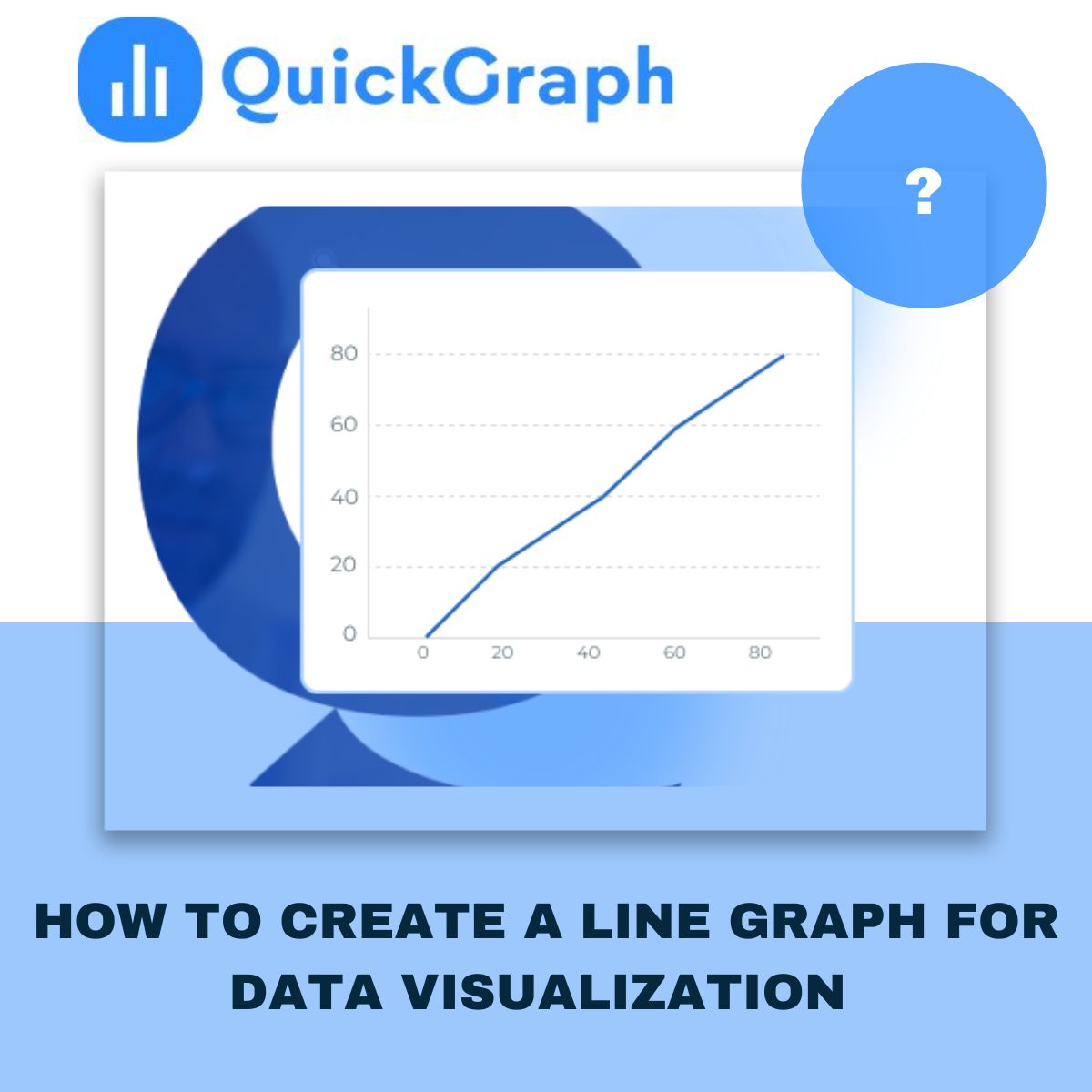
A line graph (also called line chart or line plot) connects data points via line segments, usually left to right. The x-axis represents a continuous variable (often time), and y-axis shows the measured values.

You can plot more than one line in a graph to compare different series (e.g. products, user types) side by side.

When to Use a Line Graph

  • Show changes over regular intervals: days, months, years. If your data has a temporal aspect, line graphs help people see the trend.
  • Compare multiple related series over same interval (For Ex: visitors vs sign-ups vs purchases) to see how they move relative to each other.
  • Emphasize trends, slopes, direction (increasing, decreasing, seasonal patterns) rather than absolute numbers.

Data Structure & Preparation

  • Your data usually needs two columns at minimum: one for x (e.g. date/time or ordered category) and one for y (numeric value). If you plot multiple lines, you’ll have additional y-series.
  • Sometimes more complex formats: three columns where third column says which line a data row belongs to. Helps when your dataset is long rather than wide format.
  • Make sure x-axis intervals are even and meaningful: missing dates or uneven spacing can mislead or obscure trends.

Step-by-Step: How to Create a Line Graph

Here’s how I’d make one in a tool like Excel / Google Sheets / QuickGraph.ai etc.

  1. Get your data ready: clean it, ensure no missing x values (or explicitly mark them), format the numeric columns.
  2. Choose your x & y axes: time or ordered category for x, numeric value(s) for y.
  3. Plot your line(s): Add points, connect them. If you have multiple series, use different colors or line styles.
  4. Label everything properly: axes titles, units, legend if needed, data point labels when necessary.
  5. Adjust visual style: line thickness, markers, colors, ensure readability. Use contrasting colors if more than one line.
  6. Refine scale & interval: Decide how to set the y-axis scale (does it need to start at zero?), decide time binning (daily, weekly, monthly) based on your data’s granularity and what you want to show.
  7. Review and interpret: Check for noise vs signal. Sometimes averaging or smoothing helps. Identify outliers or missing data.

Best Practices & Common Mistakes

Best Practices:

  • Limit number of lines: too many lines = clutter. (Quickgraph suggests around 5 or fewer unless you separate them visually.)
  • Use consistent intervals on the x-axis. Don’t mislead by skipping time periods or uneven spacing.
  • Choose colors carefully: each line should be distinguishable. If lines are similar, legend + markers help.
  • When useful, show uncertainty (error bars or shaded confidence intervals).
  • For audiences, make sure labels, legends, titles are clear. Doesn’t matter how pretty graph is if people can’t understand.

Common Mistakes:

  • Using a zero baseline when not needed: sometimes starting y-axis at zero makes trends invisible or misrepresents small changes. QuickGraph warns against always forcing the y-axis to start at zero, unless you’re working with frequency distributions or cases where zero is essential.
  • Over-smoothing or fitting unnatural curves between points, giving impression of data you don’t have.
  • Plotting too many lines together so viewer can’t distinguish them.
  • Dual axis misuse: scales mismatched, causing misleading comparisons.

Advanced Tips & Variants

  • Sparklines: tiny line graphs embedded inline (dashboards or tables) to show trend at glance.
  • Ridgeline plots: multiple lines offset vertically to compare distributions (often for frequency). Useful when you have many lines but want compact view.
  • Highlighting specific parts: perhaps annotate peaks/troughs, shade certain periods, or highlight one line among many by making others light/grey.
  • When data is noisy, consider smoothing (moving averages, rolling windows), but clearly indicate if you do smoothing.

How QuickGraph.ai Can Help

Since this blog is for QuickGraph.ai, here’s how you (or your clients) can use our tool to make better line graphs:

  • Upload raw data (CSV, Excel etc.) or connect data sources.
  • Choose templates and customize: fonts, markers, colors to match brand.
  • Built-in best practices: clear axes labels, legend, responsive design (for dashboards).
  • Interactivity options: tooltips, hover for data points, annotations.
  • Export formats for web, presentation, PDF etc.

Conclusion

A line graph is a straightforward but powerful way to present how things change over time (or over any continuous dimension). The secret is in data prep, choosing the right intervals, keeping it clean, labeling everything, avoiding misleading visual tricks, and using tools that help you rather than get in your way.

If you follow these steps, your audience will more likely see the story behind your numbers, not just lines. Need help choosing the right tool, or want custom templates? Just reach out, we at QuickGraph.ai are here to make your data speak clearly.

What Is a Pie Chart and How Does It Work? 

Whenever someone asks for a quick way to show data, a pie chart usually comes up first. It’s simple, familiar, and easy to understand. You’ve seen it a hundred times a circle divided into slices, each one showing a share of the whole. But how does it actually work, and when should you use it? Let’s go through it step by step for the Free Pie Chart Maker Online.

What Is a Pie Chart? 

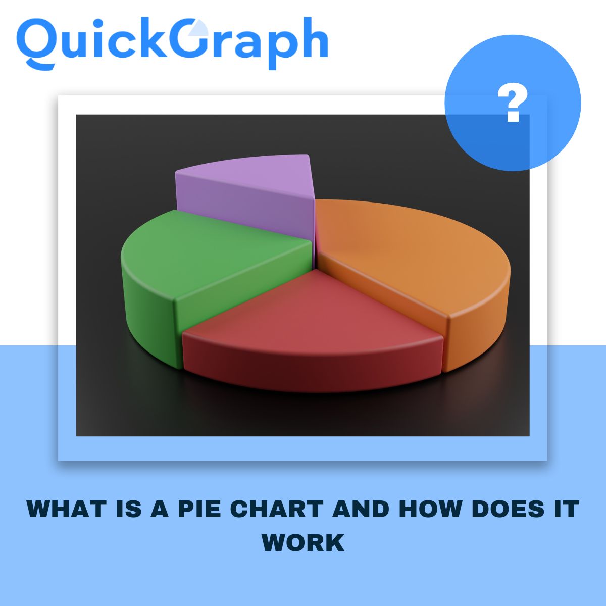
A pie chart is basically one circle split into pieces. Each piece shows how much one category takes up compared to the others. Picture a pizza. The whole pizza is your total data, and each slice is a category. Bigger slice = bigger share. 

Say you’re looking at smartphone brands. A pie chart will instantly show which company has the biggest slice of the market and who’s trailing behind. 

How Does a Pie Chart Work? 

The setup is straightforward. You take each category, turn it into a percentage, and then cut the circle based on those numbers. Since a circle is 360 degrees: 

  • 50% of your data = half the circle, 180°. 
  • 25% = a quarter of the circle, 90°. 
  • All slices together = the full 100%. 

That’s it. One glance and you see how the parts fit into the whole. 

When a Pie Chart Works Best 

Use a pie chart when you want to: 

  • Show how something is divided up (like a budget, survey answers, or customer groups). 
  • Point out one dominant category (when one slice is clearly bigger). 
  • Keep it clean and simple, with only a few slices. 

When a Pie Chart Doesn’t Work 

Skip the pie chart if: 

  • You have more than 5–6 categories. It gets messy. 
  • The slices are almost the same size. Hard to compare. 
  • You want to show changes over time. A line or bar chart is better. 

Think of pie charts as a snapshot. They’re for big-picture breakdowns, not detailed analysis. 

How People Use Pie Charts 

  • Marketing teams: to show where website traffic comes from (SEO, ads, social, referrals). 
  • Finance managers: to explain how budgets are split across departments. 
  • Teachers: to make percentages and fractions visual for students. 
  • Presenters: to simplify reports in a way that clicks with the audience. 

Pros of Pie Charts 

  • Anyone can understand them no data skills required. 
  • They make the largest category stand out immediately. 
  • Perfect for presentations and simple reports. 
  • Great for showing market share, yes/no responses, or budget splits. 

Cons of Pie Charts 

  • Not built for complex datasets. 
  • Tough to compare small differences. 
  • Can’t show trends or time-based changes. 
  • Easy to oversimplify if you force too much into it. 

Pie Charts vs. Other Charts 

  • Pie vs. Bar Chart: Bars are better for exact comparisons. Pies are better for quick proportions. 
  • Pie vs. Donut Chart: Donuts are just pies with the middle cut out handy for labels. 
  • Pie vs. Line Chart: Lines show trends over time. Pies show a single snapshot. 

Final Word 

With Quickgraph AI, creating a clean, professional pie chart takes just seconds. You focus on the story you want to tell, and Quickgraph AI handles the design, colors, and balance making sure your chart is not only accurate but also easy on the eyes.