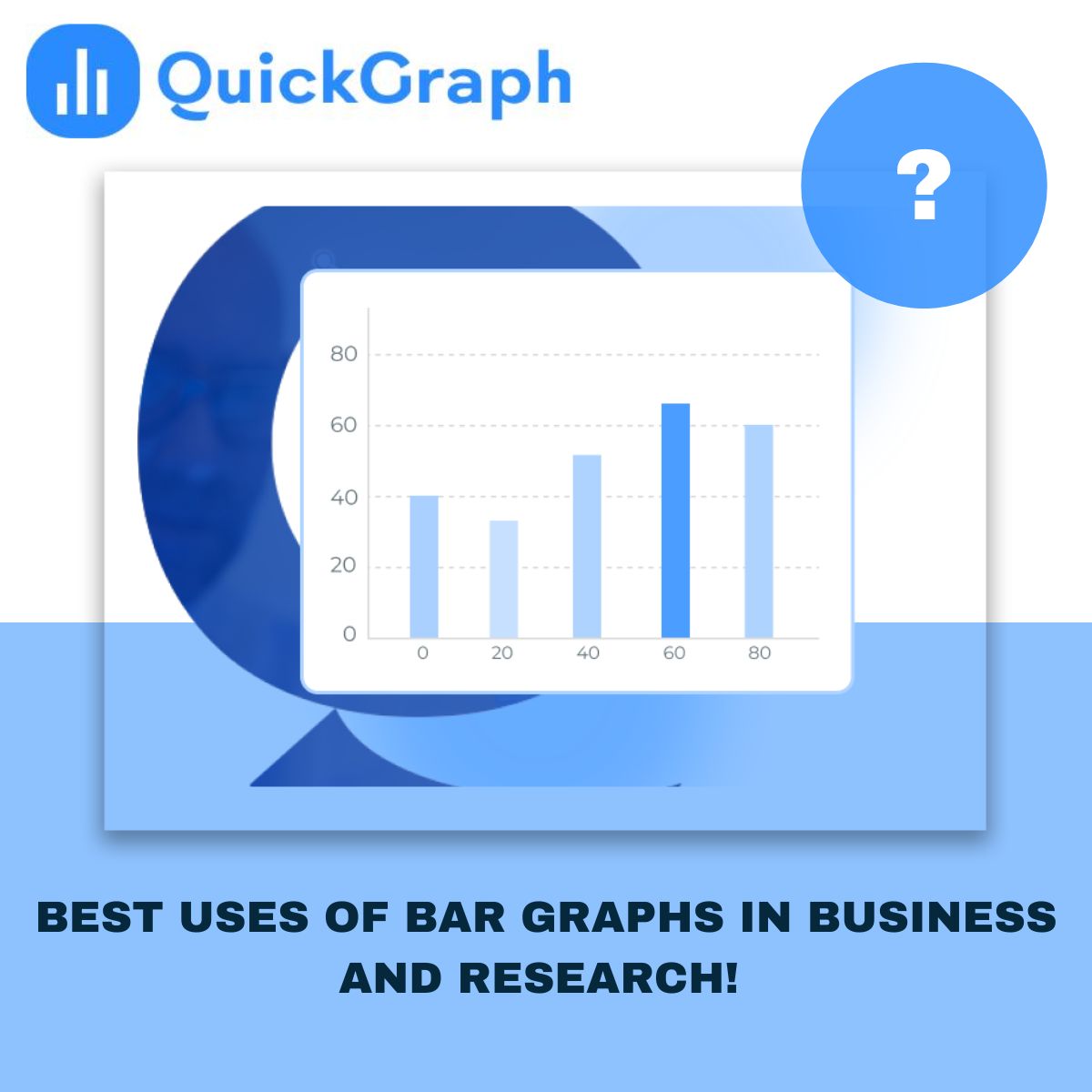
Bar graphs are a simple way to create and even easier to read, that’s why people used it everywhere from business reports to research papers. They make it easy to line up numbers and see how things change over time.
In this guide, we’ll discuss the best ways businesses and researchers can use free bar graph maker, along with practical examples that show why they continue to be one of the most effective charts.
What Is a Bar Graph?
A bar graph uses rectangular bars to represent data values. The length or height of each bar corresponds to the value it represents. They can be displayed vertically or horizontally, depending on what makes the data easiest to read.
The beauty of a bar graph is how simple it is: in just one look, you can see which categories are bigger or smaller, spot changes over time, or notice what really stands out, no complicated analysis needed.
Why Bar Graphs Work So Well
Easy comparison: Bar graphs clearly show differences between categories, making it simple to spot which value is higher or lower.
Quick insights: They reduce large sets of numbers into a format that’s instantly understandable.
Flexible use: They work across industries, from business dashboards to academic studies.
Universal readability: Even non-technical audiences can grasp the message in seconds.
Best Uses of Bar Graphs in Business
1. Sales and Revenue Comparisons:
Businesses often use bar graphs to compare sales by product, region, or time period. For example, you can instantly see which product line generated the highest revenue this quarter compared to last quarter.
2. Market Research and Customer Feedback:
When analyzing survey results, bar graphs are ideal for showing how many people chose each response. For example, if customers rated satisfaction from 1–5, a bar graph can reveal the most common rating at a glance.
3. Performance Tracking:
Companies use bar graphs in performance dashboards to measure employee productivity, marketing campaign results, or customer acquisition by channel. The visual comparison makes it easier for managers to track KPIs and take quick action.
4. Budget Allocation and Expense Analysis:
Finance teams rely on bar graphs to show where money is being spent. Comparing expenses across categories helps decision-makers identify where to cut costs or invest more resources.
5. Competitor Bench-marking:
Bar graphs make competitive comparisons simple. Businesses can evaluate their performance against industry averages or competitors’ benchmarks (without needing to share every detail in complex tables).
Best Uses of Bar Graphs in Research
1. Comparing Experimental Results:
Researchers often test multiple groups or variables. Bar graphs make it simple to compare results, whether it’s test scores, clinical trial outcomes, or experiment success rates.
2. Showing Frequency Distributions:
When working with categorical data, bar graphs display how often each category appears. For example, a psychology study might use a bar graph to show how many participants selected each answer option.
3. Tracking Changes Over Time:
While line graphs are best for continuous trends, bar graphs work well for comparing time-based data in distinct intervals, like monthly publication counts or yearly survey participation.
4. Highlighting Significant Differences:
In research, it’s crucial to point out differences that matter. Bar graphs help highlight which groups stand apart in a way that’s clear for readers, reviewers, or stakeholders.
5. Presenting Complex Data Simply:
Research papers can feel heavy with endless tables and stats. A bar graph cuts through the noise and shows the key findings in a way anyone can get right away.
Vertical vs. Horizontal Bar Graphs
Vertical bar graphs are best when showing changes over time or when category names are short.
Horizontal bar graphs are useful when categories have longer names or when comparing many items side by side.
Both styles deliver the same core benefit: making differences between values easy to see.
Best Practices for Using Bar Graphs
Keep the bars even: If the bars are all the same width, the chart looks cleaner and is easier to read.
Stick to a color plan: Too many random colors can distract people, so keep it simple and consistent.
Start at zero when you can: A zero baseline makes comparisons more accurate—unless you have a good reason to do otherwise.
Don’t overload the chart: Too many categories can make it messy. Show only what people really need to see.
Label everything clearly: A good title and easy-to-read labels help your audience get the point right away.
Final Word:
Bar graphs might be simple, but that’s what makes them so useful. In business, they help leaders see results and compare performance without getting lost in numbers. In research, they turn complex findings into visuals that anyone can understand.
If you want your data to stick, a bar graph is a classic choice that always works.