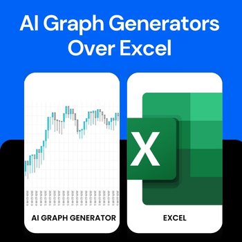
For years, Microsoft Excel has been the go-to tool for creating charts and graphs. From students working on assignments to professionals preparing business reports, Excel has been everywhere. But things are changing fast. Today, more people are switching to AI graph generator like QuickGraph AI to visualize data faster, smarter, and with far less effort.
So why is this shift happening? Let’s break it down.
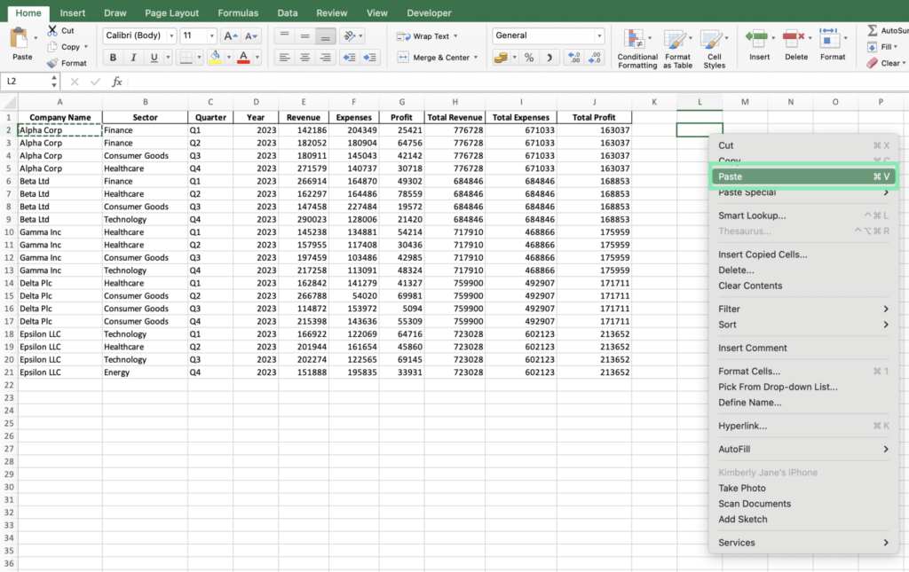
1. Excel Was Built for Spreadsheets, Not Speed
Excel is powerful, but it was designed primarily for data storage and calculations, not instant visualization. Creating a clean, meaningful chart often requires:
- Formatting raw data
- Choosing the right chart type manually
- Adjusting labels, axes, and colors
- Fixing layout and readability issues
For beginners, this process can be confusing. For professionals, it’s time-consuming.
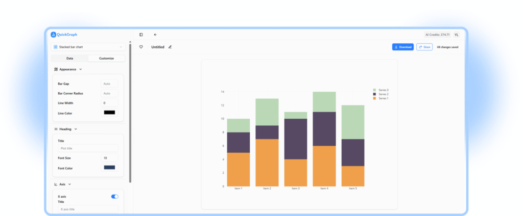
AI graph generators like QuickGraph AI remove this complexity. Instead of spending minutes (or hours) formatting spreadsheets, users can simply input data or text and instantly get a well-structured graph.
2. AI Graph Generators Understand Your Data
One of the biggest advantages of AI tools is context awareness.
Excel does exactly what you tell it to do nothing more. If you choose the wrong chart type, Excel won’t stop you. The result? Misleading or ineffective visuals.
QuickGraph AI, on the other hand, analyzes your data and understands:
- Whether a bar chart, line graph, or pie chart fits best
- How to structure data for clarity
- How to present insights visually, not just numbers
This makes AI tools especially useful for students, marketers, analysts, and decision-makers who want insights, not just charts.
3. Text-to-Graph Is a Game Changer
With Excel, everything starts with cells, rows, and formulas.
With QuickGraph AI, everything can start with plain text.
For example:
“Monthly sales from January to June: 20k, 25k, 30k, 28k, 35k, 40k”
Instead of manually entering this into a spreadsheet, AI can convert it directly into a visual graph. This text-to-graph capability is one of the main reasons people are moving away from Excel for everyday data visualization.
4. No Learning Curve, No Technical Skills
Excel has a learning curve. Advanced charts require:
- Knowledge of chart tools
- Data formatting rules
- Functions and formulas
AI graph generators are built for simplicity.
QuickGraph AI allows users to:
- Create graphs without formulas
- Skip complex menus
- Avoid design and formatting decisions
This makes it ideal for:
- Students working on assignments
- Teachers preparing learning materials
- Marketers creating reports
- Business owners who want quick insights
You focus on the data. AI handles the rest.
5. Faster Workflow = Better Productivity
Time matters.
Creating a single chart in Excel can take several steps. Multiply that by multiple datasets, revisions, or presentations, and productivity drops.
AI graph generators:
- Reduce chart creation to seconds
- Allow quick edits and regenerations
- Help users test multiple visual formats instantly
With tools like QuickGraph AI, teams can move from raw data to decision-ready visuals in a fraction of the time.
6. Better for Modern Use Cases
Excel still works well for accounting, budgeting, and heavy calculations. But modern data needs are different.
Today’s users want:
- Quick visuals for presentations
- Charts for blogs, websites, and social media
- Simple graphs for reports and dashboards
AI graph generators are designed for modern digital workflows, while Excel remains rooted in traditional spreadsheet use.
7. Accessibility Across Devices
Excel often requires:
- Desktop software
- Licensing
- File sharing and version control
QuickGraph AI works online, making it:
- Accessible from any device
- Easy to share visuals instantly
- Ideal for remote teams and students
This flexibility is another key reason users are choosing AI-powered tools.
8. The Future of Data Visualization Is AI
The shift from Excel to AI graph generators isn’t about replacing spreadsheets entirely. It’s about using the right tool for the right job.
Excel is still valuable for calculations and data management. But when it comes to:
- Speed
- Ease of use
- Smart visualization
- User-friendly design
AI tools like QuickGraph AI clearly have the advantage.
Conclusion
More people are choosing AI graph generators over Excel because they want simplicity, speed, and smarter visuals. Tools like QuickGraph AI eliminate the frustration of manual chart creation and make data visualization accessible to everyone not just Excel experts.
As data continues to grow and decisions need to be made faster, AI-powered visualization isn’t just a trend. It’s the future.