If you’ve ever looked at business reports or dashboards, you’ve probably seen colorful charts that show trends over time. One of the most popular formats for this is the area chart maker. It’s a simple but powerful way to show not just the trend, but also the magnitude of change. Whether you’re tracking sales, website traffic, or market share, an area chart can help you see the story behind the numbers.
In this guide, we’ll break down everything you need to know: what area charts are, when to use them, the different types, real-world examples, and how you can create one quickly with an online area chart maker.
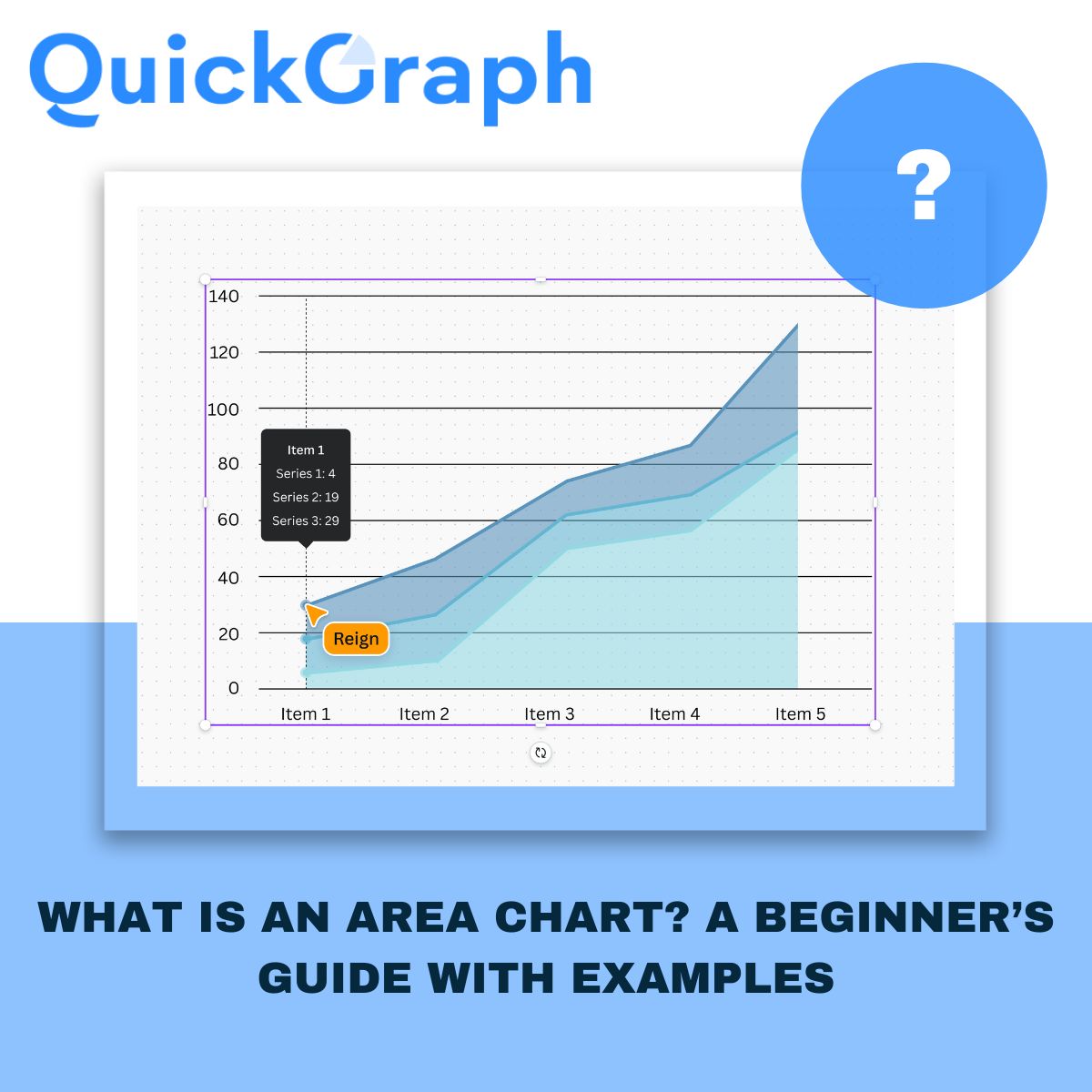
What Is an Area Chart?
An area chart is basically a line chart with shading under the line. That shaded area makes the data feel more “filled in,” so you can easily see how values grow, shrink, or compare across time.
Instead of just a thin line, the shaded region communicates volume. For example:
- A line chart might show that your website traffic is trending up.
- An area chart shows not just the trend but also how much traffic is stacking up month by month.
In short: line charts show the trend, area charts emphasize the magnitude of that trend.
Why Use an Area Chart?
Not every dataset needs an area chart. But when you want to highlight both direction and scale, it’s the right choice. Here are some common use cases:
- Business growth: Show how revenue is increasing each quarter.
- Website traffic: Compare organic vs paid visitors over time.
- Market share: Visualize how competitors stack up in your industry.
- Financial data: Highlight profits, expenses, or cumulative changes.
- Forecasting: Display projections with shaded areas for confidence intervals.
Tip: If the exact numbers are the focus, a bar or line chart might be better. But if you want to communicate growth and “volume,” go with an area chart.
Types of Area Charts
Area charts aren’t one-size-fits-all. There are variations depending on what you’re trying to show.
1. Simple Area Chart
The most basic version: a single line with shading underneath. Perfect for showing how one variable changes over time.
2. Stacked Area Chart
This version layers multiple data series on top of each other. It helps compare how different categories contribute to the total.
3. 100% Stacked Area Chart
This shows proportions as a percentage of the whole, always summing to 100%. It’s best for highlighting changes in relative contribution.
4. Overlapping Area Chart
Two or more area charts with transparency overlap, letting you compare multiple data sets without stacking.
Real-World Examples of Area Charts
Let’s make this concrete. Here are some simple scenarios where area charts shine:
- E-commerce: Tracking how total sales add up, with different product categories stacked by volume.
- Marketing analytics: Seeing how campaigns drive overall traffic while comparing paid ads vs SEO.
- Finance: Showing profits vs expenses, with areas revealing when one overtakes the other.
- SaaS growth: Visualizing how monthly recurring revenue grows alongside churn.
Area Chart vs Line Chart: When to Use Which?
This is a common question. Since both start with a line, how do you know which to pick?
- Use a line chart when precision matters. If you need to highlight exact values or multiple intersecting trends, lines are clearer.
- Use an area chart when you want to emphasize the magnitude. The shaded area makes growth look more substantial and visually impactful.
Quick rule of thumb: Line charts are about direction. Area charts are about volume.
How to Create an Area Chart
The good news is you don’t need to be a designer to create one. Here’s how you can build an area chart step by step:
- Collect your data – Time-series or categorical data works best.
- Choose your tool – You can use Excel, Google Sheets, or an online area chart maker.
- Select “Area Chart” from the visualization menu.
- Customize the look – Add colors, adjust transparency, and label axes.
- Highlight trends – Use stacked or 100% stacked if you’re comparing categories.
- Publish or export – Share it online, embed in a dashboard, or add to reports.
Common Mistakes to Avoid with Area Charts
Even though they’re simple, area charts can be misused. Here are pitfalls to avoid:
- Too many layers: A stacked chart with 6+ categories becomes impossible to read. Stick to 3–4 at most.
- Poor color choices: Overlapping areas need transparency, or it looks messy.
- No labels: Without axis labels and context, the shaded area can be misleading.
- Comparing unrelated data: Only use area charts for datasets that actually add up or make sense together.
Best Practices for Effective Area Charts
If you want your charts to not just look good but also be useful, follow these quick tips:
- Keep it simple — don’t clutter with too many categories.
- Use contrasting colors that don’t overwhelm.
- Make sure the baseline (X-axis) starts at zero, otherwise the area exaggerates changes.
- Add clear titles, labels, and legends.
- Always ask: Does the shaded area help tell the story?
Final Thoughts
Area charts are one of those visualization tools that combine clarity with impact. They’re easy to read, they highlight growth, and they help stakeholders quickly see the big picture.
Whether you’re a business owner tracking sales, a marketer analyzing campaigns, or a data analyst building dashboards, an area chart is a smart way to communicate both trends and volume.
And the best part? You don’t need advanced software. With a free area chart maker like Quickgraph AI, you can create professional charts in minutes, ready to share in presentations, reports, or websites.