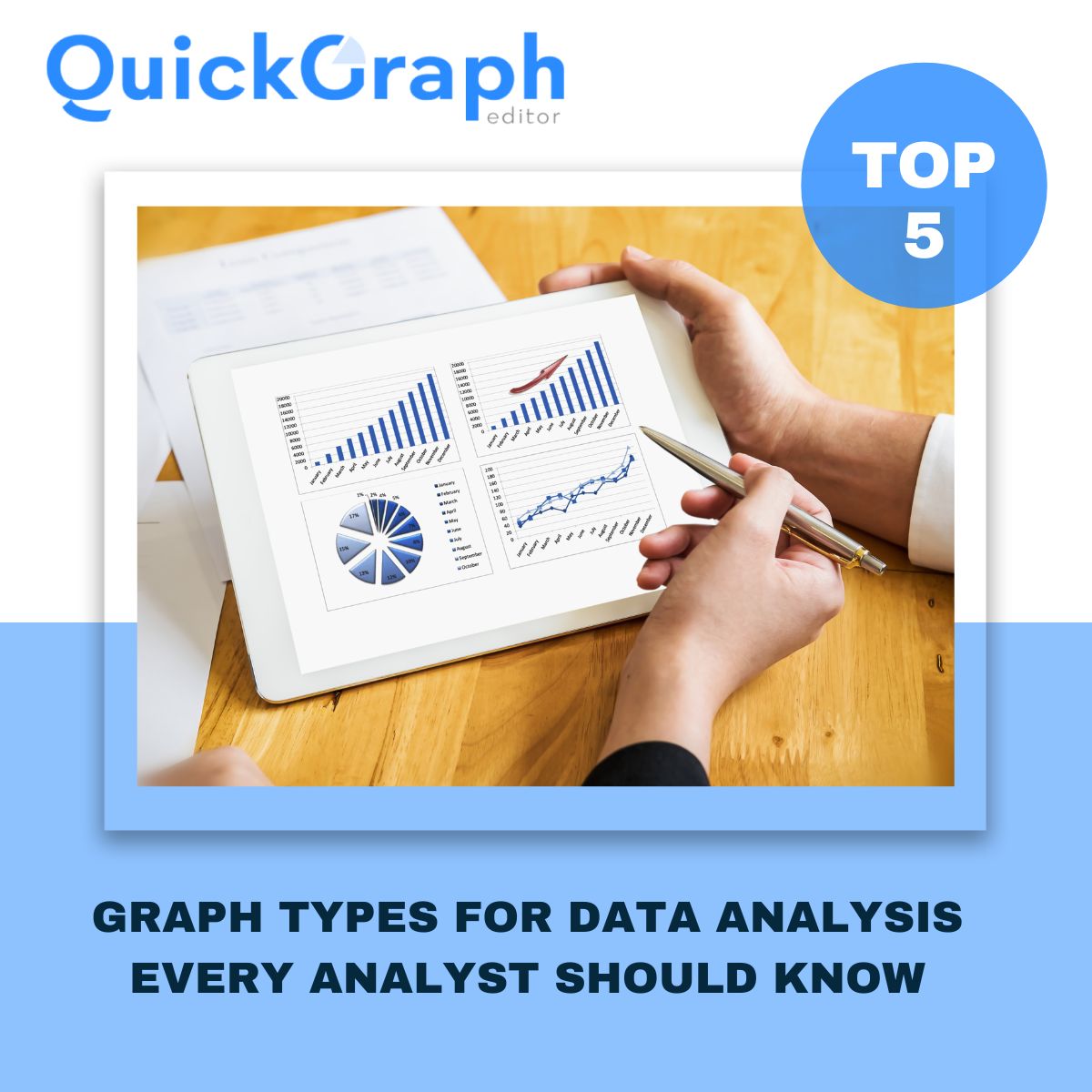
When you’re looking at raw numbers, it’s not always clear what they mean. You can scroll through spreadsheets all day and still miss the connection between two things. A scatter plot makes that connection visible. It’s one of the simplest charts out there just dots on a graph but the insights you can get from it are powerful. With a Scatter Plot Maker, you can quickly turn data into visuals without complicated tools.
If you’ve ever seen a chart filled with dots and wondered how to make sense of it, this guide will clear it up. I’ll explain what a scatter plot is, why people use it, some terms worth knowing, and a few examples that make the whole idea click.
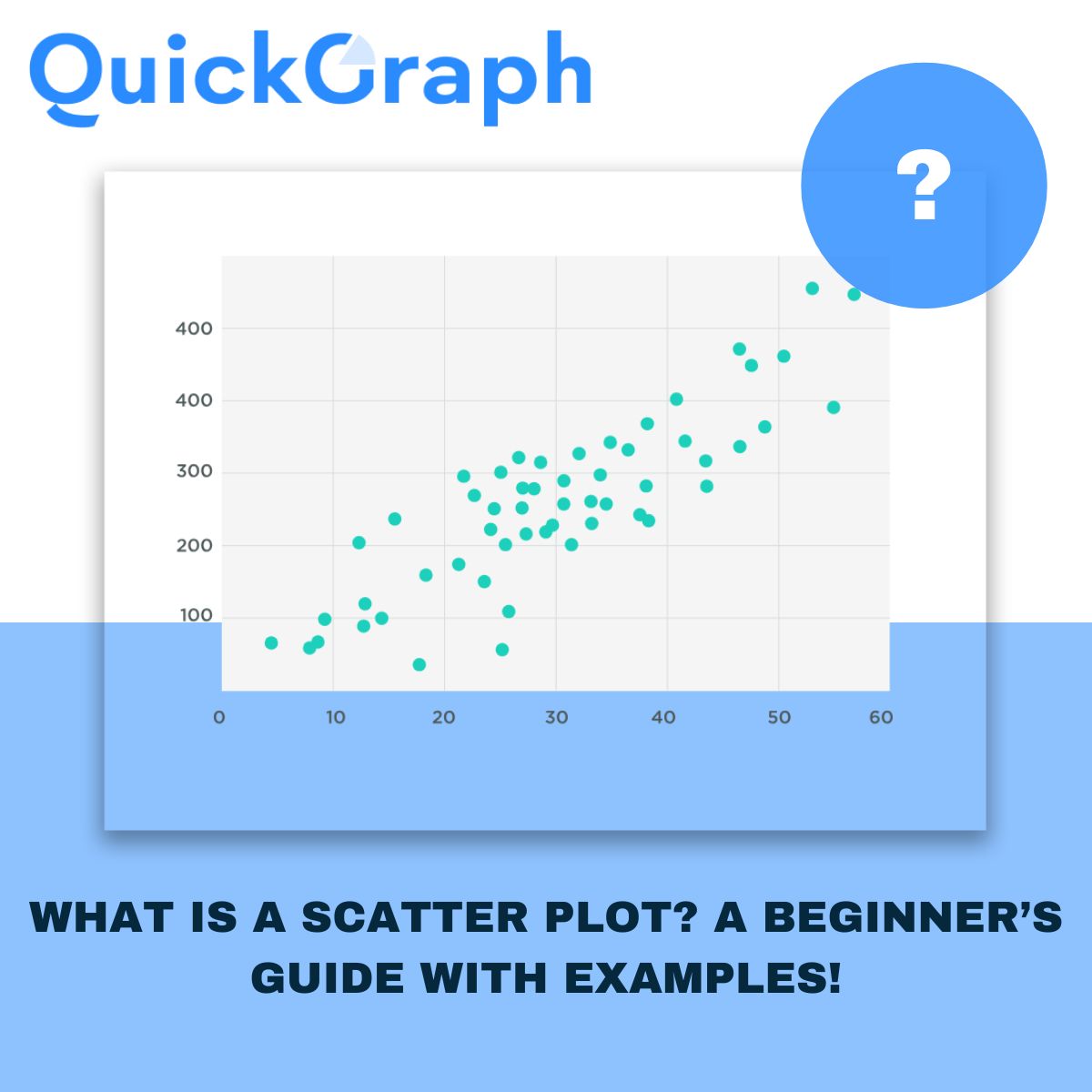
What Is a Scatter Plot?
A scatter plot is a chart that compares two variables. One variable sits on the bottom axis, the other on the side. Each dot shows how those two values come together for one data point.
Picture it with students. Hours studied go on the bottom, test scores go on the side. Each student is one dot. The more dots you add, the easier it is to see the overall pattern.
Why Do We Use Scatter Plots?
Scatter plots are useful because they give you answers fast. You can see if two things rise together, if one goes up while the other goes down, or if there’s no relationship at all. They help you find outliers those unusual dots that don’t follow the pattern. And most importantly, they make decisions easier. Businesses, teachers, doctors, and marketers all use scatter plots to figure out what’s really driving results.
Key Terms to Know
A few words come up often when you’re reading scatter plots:
- Correlation: The relationship between the two variables. Positive means they rise together, negative means one goes up while the other goes down, and no correlation means the dots look random.
- Trend line: A line that cuts through the dots to show the overall direction.
- Outliers: The dots that sit far away from the main group. They don’t follow the trend and often need a closer look.
Scatter Plot Examples
Marketing teams use scatter plots all the time. Imagine plotting ad spend against website leads. Each campaign is a dot. If the dots climb as spend increases, that shows your budget is working. If not, you know it’s time to adjust.
In healthcare, a doctor might compare patient age with recovery time. A scatter plot can make it clear that older patients generally take longer to heal.
Teachers often use them too. Hours studied versus test scores is a classic example. If the dots slope upward, it’s proof that more study time usually means better results.
And in business, you could look at customer income compared to purchase value. A scatter plot may reveal that higher-income buyers are leaning toward premium products, which is gold for shaping marketing strategy.
When to Use a Scatter Plot?
Scatter plots work best when you want to see if two variables are related. They’re especially useful when you have a lot of data points and want to spot trends quickly. They also make outliers obvious, which can help you avoid mistakes or uncover opportunities.
They’re not perfect for every case though. If you only have one variable, or if you want to track changes over time, a different chart like a line graph makes more sense.
Common Mistakes to Avoid
The most common issue with scatter plots is overcrowding. Too many dots and the chart becomes messy. Another mistake is forcing a trend where none exists. Sometimes the data doesn’t show a relationship, and that’s fine. And don’t ignore outliers—they might be errors, but they might also tell you something important.
Final Thoughts
A scatter plot may look simple, but it’s one of the clearest ways to spot patterns in data. It helps you see whether two things are connected, where the outliers are, and what trends matter most.
You don’t need advanced software to create one either. With an online Scatter Plot Maker like Quickgraph AI, you can plug in your data and build a chart in minutes. Start with something small like sales versus ad spend and you’ll see how quickly the dots start telling a story.
Once you get used to reading scatter plots, you’ll realize how valuable they are for making better decisions, whether you’re running campaigns, teaching students, or growing a business.