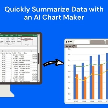
Raw data is rarely the real problem. The real challenge starts when you need to quickly turn that data into something others can understand and that’s where an AI Chart Maker becomes essential.
In most cases, the data already exists. The delay happens because people spend too much time figuring out:
This is where an AI chart maker changes the workflow completely.
Instead of manually cleaning data, selecting graph types, adjusting labels, and redesigning visuals, tools like QuickGraph AI help users convert raw information into easy-to-understand charts within seconds.
And more importantly it helps people summarize data faster so they can make decisions faster.
Most users still follow an outdated process:
Export data → clean spreadsheet → choose chart type → create graph → edit design → interpret trends → prepare final summary
This often leads to problems like:
Large datasets take time to organize properly before visualization. Even simple tasks like sorting columns or removing unnecessary values can slow everything down.
Many people choose pie charts when bar charts would work better. Others use complex visuals that confuse viewers instead of simplifying insights.
Even if the data is correct, messy charts reduce credibility. Small labels, bad color combinations, and unclear formatting make charts difficult to understand.
When teams wait hours for reports, opportunities can be missed. Businesses need faster access to insights.
An AI chart maker removes unnecessary manual work by automating the entire visualization process With QuickGraph AI, users can simply upload data or enter prompts like:
“Compare monthly sales performance for 2025.”
“Show customer satisfaction trends over six months.”
“Create a revenue growth chart by quarter.”
The platform quickly generates clear charts based on your any request. This saves time and helps users focus on insights instead of formatting.
Start by uploading your spreadsheet, dataset, or numbers. QuickGraph AI can quickly process:
Instead of manually organizing everything, the AI identifies usable patterns faster.
One of the biggest reasons people waste time is choosing the wrong visualization format. QuickGraph AI automatically selects chart formats such as:
This reduces errors and improves clarity.
The biggest advantage of using AI for data summarization is speed. Instead of manually reviewing hundreds of rows, QuickGraph AI helps identify:
Users can instantly understand what matters most.
For example:
Data summaries often need to be shared.
QuickGraph AI automatically creates cleaner visuals by improving:
This means users can directly use charts in:
Time spent: 2–4 hours
Time spent: 2–5 minutes
That time difference becomes massive for businesses handling reports regularly.
Track revenue, sales performance, and KPIs faster.
Analyze campaign performance quickly.
Turn research data into visual summaries easily.
Create client reports faster.
Present clean data visuals to investors.
Simplify complex datasets.
Many chart tools only focus on creating visuals. QuickGraph AI focuses on outcomes.
It helps users:
When teams spend less time building charts, they spend more time acting on insights. That directly impacts productivity and business growth.
How can AI summarize data faster?
AI tools automatically analyze datasets and generate charts instantly, reducing manual work.
What is the best AI chart maker for business reports?
QuickGraph AI helps users create professional charts quickly without manual formatting.
Can AI create charts from spreadsheets?
Yes, users can upload spreadsheets and generate charts automatically.
Your data already contains valuable insights. The problem is how long it takes to uncover them. With QuickGraph AI, you can transform raw numbers into clear visuals in minutes not hours.
Whether you’re preparing reports, presentations, research findings, or business updates, QuickGraph AI helps you summarize data quickly and professionally.
Try QuickGraph AI today and turn raw data into actionable insights faster.
Is QuickGraph AI free to use?
QuickGraph AI offers flexible pricing options depending on your needs.
Can I export charts for presentations?
Yes, charts can be exported for reports, presentations, and client meetings.
Do I need design skills to use QuickGraph AI?
No, the platform automates chart formatting.