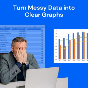
The current data-driven world presents analysts with excessive data which exceeds their ability to manage it. The real challenge of data analysis emerges when analysts attempt to convert their spreadsheets and complex datasets into understandable and practical insights. The process of making charts and graphs through traditional methods creates delays in this workflow.
The increasing number of analysts who adopt AI graph maker tools demonstrates their value to QuickGraph AI. The data visualization tools from these platforms enable users to enhance their productivity while creating new methods for displaying and understanding information.
The Problem with Traditional Chart Creation
Analysts have used manual tools since they began analyzing data which includes spreadsheets and advanced visualization programs. The tools provide strong capabilities but present multiple operational difficulties which include:
- Time-consuming setup
- Manual formatting and adjustments
- Choosing the right chart type
- Risk of human errors
- Difficulty in explaining insights clearly
Analysts who possess expertise need to spend several hours on chart improvements which should require only a few minutes. This issue becomes critical when projects have approaching deadlines.
What’s Changing with AI Graph Maker Tools?
The design of AI graph makers enables users to create visual data representations without facing any obstacles. Users need to input their data or describe their requirements instead of selecting chart types and formatting axes and adjusting layouts.
Tools like QuickGraph AI allow analysts to:
- Generate charts instantly using prompts
- Automatically choose the best visualization type
- Apply clean, professional styling
- Reduce errors in interpretation
- Focus more on insights rather than design
The name of the shift is one of convenience or comfort but of efficacy and intelligibility.
Scenario 1: Tight Deadlines in Business Reporting
Imagine an analyst working on a monthly performance report. The dataset is ready, but creating multiple charts for revenue, growth trends, and customer behavior takes hours.
With an AI graph maker, the same analyst can input prompts like:
Example Prompt:
“Draw a dual chart comparing baseline, 2007 and 2011.”
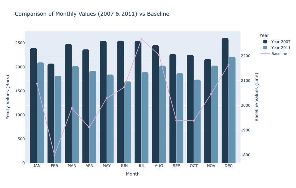
Within seconds, QuickGraph AI generates a clear dual comparison chart, making it easy to analyze differences across time periods without manually building multiple visuals.
This saves valuable time and allows the analyst to focus on interpreting results rather than building visuals.
Scenario 2: Non-Designers Creating Professional Charts
Not every analyst has a design background. Many struggle with making charts look visually appealing and easy to understand.
AI tools solve this by automatically applying best practices in visualization:
- Proper spacing and alignment
- Clear labels and titles
- Color consistency
- Readable layouts
With QuickGraph AI, even beginners can create charts that look presentation-ready without needing design skills.
Scenario 3: Reducing Human Errors
Manual chart creation often leads to small but critical mistakes:
- Incorrect data selection
- Misaligned axes
- Wrong chart types
- Inconsistent formatting
These errors can mislead decision-making.
AI graph makers reduce these risks by automating the process. The system analyzes the data and suggests the most accurate visualization, ensuring consistency and correctness.
Scenario 4: Faster Decision-Making
In many industries, speed matters. Whether it’s finance, marketing, or operations, decisions often depend on how quickly insights are presented.
AI graph tools enable real-time visualization. Analysts can instantly generate charts during meetings or discussions, making it easier to:
- Explain trends
- Highlight key metrics
- Support arguments with visuals
This leads to faster and more confident decision-making.
Scenario 5: Handling Complex Data Easily
Large datasets with multiple variables can be difficult to visualize manually. Choosing the right chart type becomes confusing.
AI tools simplify this by analyzing the structure of the data and automatically selecting the most suitable format whether it’s a scatter plot, bar chart, or line graph.
With QuickGraph AI, users don’t need to overthink technical decisions. The tool does the heavy lifting.
Why Analysts Prefer AI Over Traditional Tools
The shift toward AI graph makers is not just a trend it’s a practical choice driven by real benefits:
1. Time Efficiency
What once took hours can now be done in seconds.
2. Ease of Use
No steep learning curve or technical expertise required.
3. Accuracy
Reduced chances of manual errors.
4. Better Communication
Clear and visually appealing charts improve understanding.
5. Scalability
Handle large and complex datasets effortlessly.
The Role of QuickGraph AI in This Shift
Among the growing number of AI tools, QuickGraph AI stands out by focusing on simplicity and speed. It is designed specifically for users who want quick, reliable, and high-quality visualizations without complications.
Instead of navigating multiple settings, users can simply describe their needs. The tool transforms that input into a clean, meaningful chart almost instantly.
This makes it ideal for:
- Business analysts
- Students and researchers
- Marketers
- Startup teams
Anyone who works with data can benefit from this approach.
The Future of Data Visualization
As AI continues to evolve, the way we interact with data will become even more intuitive. Analysts will spend less time on technical tasks and more time on strategy and insights.
AI graph maker tools are just the beginning of this transformation.
The future is not about replacing analysts it’s about empowering them.
Conclusion
Analysts have started using AI graph creation tools because these tools resolve actual problems which include their need to work within time limits and handle complicated tasks and present their results in understandable ways. QuickGraph AI enables users to spend their time on essential tasks which involve understanding and presenting their research findings because it automates repetitive work associated with data visualization.
The current situation requires organizations to implement advanced technological solutions because data volumes continue to expand at unprecedented rates. The organization requires advanced tools because they have become critical to their operations.
AI graph creation software has emerged as the preferred solution for organizations.