In a competitive business landscape where every decision counts, companies are turning to business analytics not as a luxury, but as a necessity. It’s no longer about intuition it’s about interpreting real data to discover what’s working, what’s not, and where to go next. Whether it’s refining a marketing campaign, forecasting sales, or streamlining operations, analytics equips every team with the clarity to move forward with purpose.
But analytics isn’t just about numbers it’s about interpreting data the right way. That’s where QuickGraph AI comes in. Our platform offers over 30+ powerful chart types that transform complex data into clear visuals, helping businesses uncover hidden insights.
Why Business Analytics Matters for Every Company
Data is everywhere sales figures, customer behavior, website traffic, marketing performance but without proper analysis, it means nothing.
With business analytics, companies can:
- Track key performance indicators (KPIs)
- Forecast future trends
- Optimize processes and cut unnecessary costs
- Improve customer satisfaction
- Make data-driven decisions with confidence
However, many companies fail to unlock the full potential of analytics due to common data analysis mistakes.
Let’s talk about that.
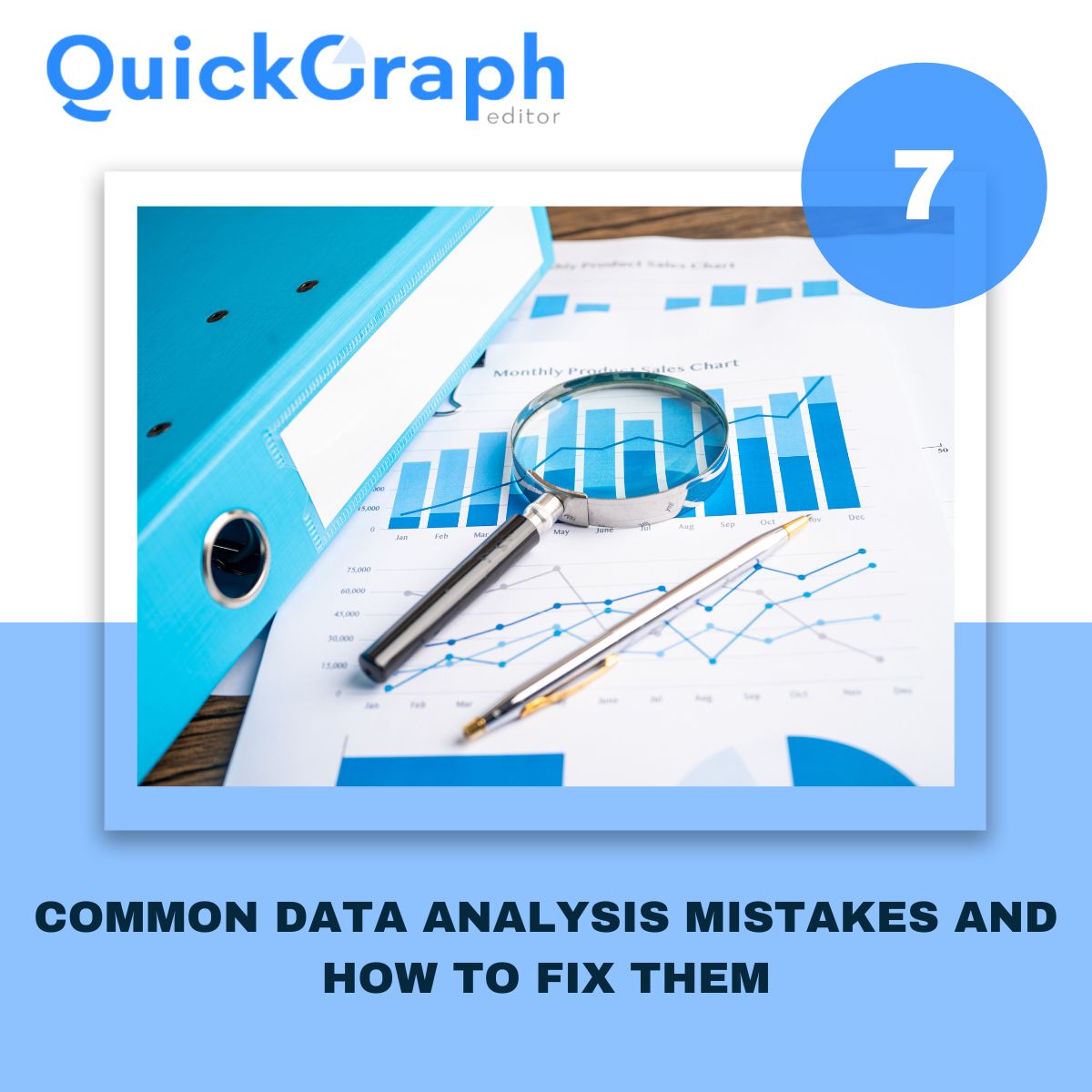
Avoiding Mistakes in Data Analysis
Before you can make smarter business decisions, you must ensure your data analysis is accurate and unbiased. In our recent blog, “7 Common Data Analysis Mistakes and How to Fix Them,” we highlighted errors like:
- Using the wrong chart type for the data
- Ignoring outliers that skew results
- Overcomplicating visuals that confuse instead of clarify
- Failing to clean the data before analyzing
- Misinterpreting correlation as causation
QuickGraph AI helps eliminate these mistakes by guiding users toward the right visualization tools. With AI-driven suggestions, it becomes easier to avoid errors and focus on clarity and impact.
Powerful Visual Tools for Smarter Insights
Choosing the right graph is just as important as the data itself. At QuickGraph AI, we provide over 30+ chart types, each designed to solve specific business problems:
- Funnel Chart – Analyze marketing and sales pipelines
- Heat Map – Visualize customer engagement or geographic trends
- Gauge Graph – Track real-time performance against business goals
- Waterfall Chart – Understand profit, loss, and margin breakdowns
- Gantt Chart – Plan and track complex projects
- Sunburst & Treemap – Explore data hierarchies clearly
- Bubble Chart – Compare variables and spot correlations
These visualizations help avoid misinterpretations and reveal what truly matters in the data.
Real Business Use Cases
Let’s see how business analytics applies in real scenarios:
- Marketing Teams track ad performance, conversion rates, and ROI using bar graphs, pie charts, and line graphs.
- Sales Managers use funnel charts and indicator graphs to improve deal flow.
- Operations Teams rely on Gantt and waterfall charts to ensure efficiency.
- Finance Analysts use box plots and histograms to assess risks and profits.
- Executives review dashboards powered by radar and heat maps for fast decision-making.
In each case, clean, mistake-free analysis + clear visual tools = smarter outcomes.
Why Choose QuickGraph AI?
We make business analytics simple, visual, and AI-powered. Here’s what sets us apart:
- No coding required – Just paste your data and select a chart
- Smart chart recommendations based on your dataset
- Export-ready visuals for reports, presentations, or dashboards
- Custom styling options for your brand or team
You don’t need to be a data scientist to make smart decisions you just need QuickGraph AI.
Conclusion
Don’t let messy spreadsheets and confusing charts hold you back.
Start using QuickGraph AI today and visualize your way to better business decisions.